How to practice calligraphy quickly and well, here are the secret techniques for adults to write beautifully!
Some people always complain that their hands don’t work as they should, or lament that they don’t have time to practice calligraphy. To tell you the truth, these are not reasons for ugly handwriting. Because in fact, many people have been practicing for a long time or even many years, but their handwriting is still ugly. One of the reasons is that the handwriting lacks a "main pen", or they know the main pen but do not give the main pen enough space to "place". The following is through Specific examples of characters are used to illustrate this problem: the main stroke is the "main stroke" of the character. The main stroke must be "placed". If it is long and prominent, the character can become lively. Otherwise, the strokes will be evenly distributed. The structure is rigid and rigid. Since you want the main pen to "place", you must give the main pen enough space!
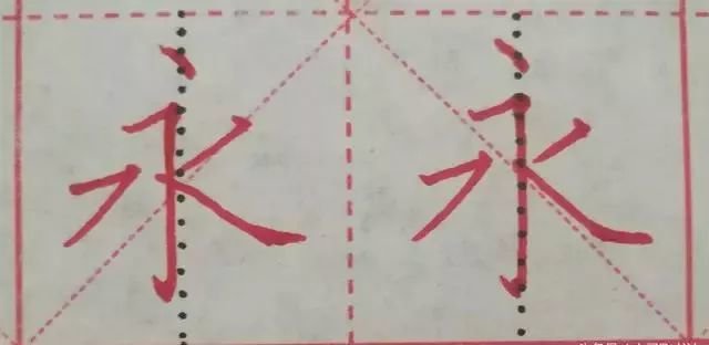
For example, "Yong", the main characters are vertical hook and nip. The letter should be written long and stretched, and should be placed to the right. How can I relax? First, let’s observe the black line in the picture below. It is the vertical center line of the square, which divides the square into two equal spaces. Na, if you want to release it to the right, you must occupy more space. Then, the vertical hook must be slightly to the left and written on the left side of the black vertical center line! As shown in the picture on the left, in this way, the space for typing becomes larger and the writing becomes more stretched. If it is written like the picture on the right, written vertically on the vertical center line, Na will only be cramped and restrained, how can it still be stretched? right?
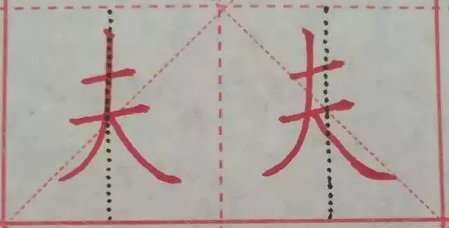
Let's look at the word "husband" again. The main strokes are vertical and horizontal strokes. If the vertical pen is written along the black vertical center line, it will definitely occupy the space of the Na pen. However, if it is written like the picture on the right, the Na pen can be fully and freely stretched. Therefore, the best way to move vertically is to move left, to the left of the vertical center line! This is also called the "avoid" and "give in" principles. It fully proves that writing strokes cannot be evenly distributed, but should be interspersed and avoided according to actual conditions. This problem is particularly prominent in the writing of primary school students. Some children even write vertical strokes on the right side of the vertical center line! It directly takes up Na's space! No wonder the words are ugly!
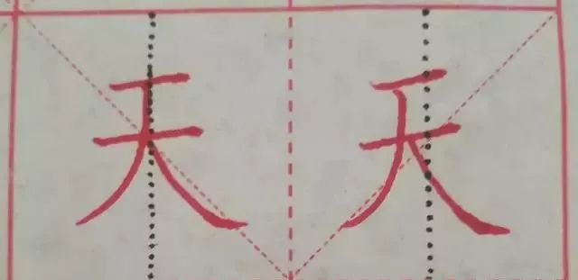
Let’s look at the character “天” again. The main strokes are vertical strokes and strokes. Especially the strokes should be relaxed and stretched. Please look at the pictures below. Which one is more interesting? Obviously, the one on the right. Because the vertical stroke on the right side is tilted to the left in order to avoid the stroke! The purpose is to give the pen enough space to "place" it. In the picture on the left, the words are evenly distributed and the characters look dull. This is still good, some people even write the vertical apostrophe on the right side of the black vertical center line! It’s weird if the words are not ugly!
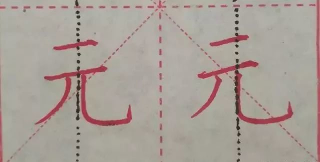
In the picture below, the main character for the character "Yuan" is a vertical hook! So don’t write the two horizontal lines above as long. Observe the pictures on the left and the right, which one is more prominent and obvious? There is no doubt that it is the picture on the right. Because the vertical curved hook in the picture on the right occupies more space, it is because the left hook has made room for it. You see, the left hook is a little to the left, away from the black vertical center line. In the picture on the left, the stroke is not further to the left, and the space is evenly distributed with the vertical hook. Of course, the main character of the vertical hook cannot be shown. Not only the stroke, but also the two short horizontal lines on the character are evenly distributed. Both sides of the vertical centerline certainly look dull. In the picture on the right, it is obvious that the two horizontal lines are leaning to the left, with only one purpose: to make the vertical hooks free. Why, because the vertical hooks are the main focus!
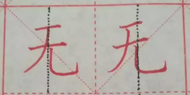
The "wu" in the picture below is somewhat similar to the "yuan" above. This word is also one of the words with the highest error rate. There are two things that are easy to make mistakes: First, it is impossible to find out which stroke is the main stroke, and the main stroke should be a vertical hook. But many people make the two horizontal strokes above too long. They should be very short. The second is that although the main writer has been found, he will not avoid it. For example, in the picture on the left, the starting point of the vertical stroke is written on the black vertical center line, which evenly distributes the space with the vertical hook. The main stroke of the vertical hook is not reflected well enough. In the picture on the right, it is very obvious, because the vertical tilt deviates from the vertical center line to the left, thus liberating the vertical hook on the right, allowing the vertical hook to fully extend freely! You see, the vertical pen of the vertical hook crosses the vertical center line and is written slightly to the left of the vertical center line. Writing in this way makes you feel energetic!