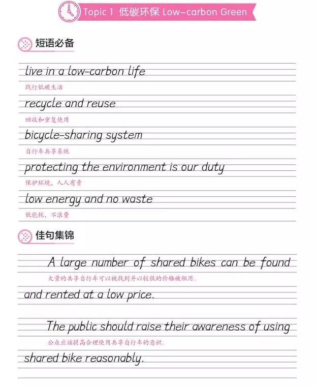
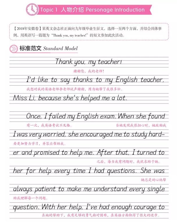
Hengshui body is standardized and neat, with clear handwriting and strong visual impact. This article will analyze for you the writing standards and techniques of Hengshui body in English. The picture below shows the handwritten Hengshui body written by middle school students:

1. Use a pen
Black fountain pen or black 0.7 gel pen.
2. Use paper
Use lined writing paper in the early stage, alternately write on lined writing paper and paper without lines after a period of time, and finally use paper without lines. Because the college entrance examination answer sheet has no rules.
3. Sitting posture.
Be sure to practice in a position that is comfortable for you. No specific requirements are imposed, it is appropriate for personal comfort and health.
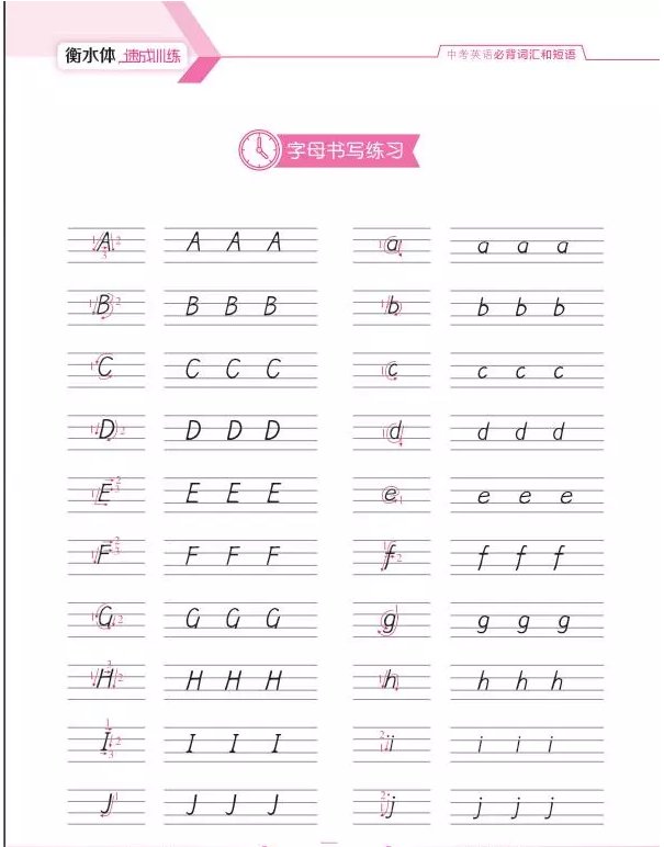
4. Display of 26 letters in uppercase and lowercase stroke order.
1. Display of the stroke order of capital letters. The stroke order of Hengshui letters is as shown in the figure below. The order of writing is in numerical order and in the direction of the arrow.
2. Grid position, Hengshui body position description: use the traditional four lines and three grids to illustrate.
(1) The 26 English capital letters are all the same height and occupy the middle and upper spaces. When writing, the upper edge should not touch the top line, but should be slightly higher than the second horizontal line. The lower edge must touch the third line.
(2) What these lowercase letters such as acei mnors uv and uv have in common are that they are written on the top grid between the second and third lines from top to bottom, and each letter should be as round as possible when writing. (i is special, the top point is next to the second line, as shown in the figure below)
(3) b d h k l t is completed on line 3, and the height must be consistent. Keep it as round as possible
(4) The six letters f j g p q y are completed slightly below the third line, and the height remains consistent.
(5) The arc part of the lowercase letter b d g pqty and the connected straight line part should be closely connected and cannot be separated too far. The arc part cannot be written in an ellipse or shuttle shape. The tails of the lowercase letters g j y can be slightly bent, and cannot be hooked back to the top, otherwise it will affect the neatness.
(6) The vertical lines in the lowercase letters b d f hkI t are written straight. If the letters are slightly tilted when writing, all the tilts should be consistent.

5. Font inclination, size and spacing.
The angle between the overall inclination of the letters and the right angle of the horizontal line is between 75 and 85 degrees. Note: The inclination and size of the first letter determine the inclination and inclination of subsequent letters, and the inclination of uppercase and lowercase letters is the same. When writing words, the spacing between letters should be even and appropriate. Don't be too close together or too far apart. 1mm is more appropriate. When writing a sentence, there must be an appropriate and even distance between words. A space should be as wide as a lowercase letter a, about 3mm in size.
6. The width of uppercase letters is about 5mm, and the width of lowercase letters is about 3mm (except letters i, 1, m, and w).

7. Don’t write consecutive strokes.
Many people have formed the habit of writing continuous strokes when writing. The continuous strokes may be unclear when scanned by a computer, causing misjudgment. Therefore, when writing, you must develop the habit of not writing continuous strokes. The following pictures are error examples
eight. Points to note in composition text
(1) The title is centered
(2) Although the end of the line is not required to be neatly marked, there should not be too much space left when the unfinished sentence reaches the end of the line.
(3) The letters are consistent in size (including upper and lower case), and the slope is consistent throughout.
(4) The first lines and paragraphs should be marked correctly.
(5) At the beginning of the paragraph, there should be space for 3 to 4 lowercase letters a of the same size.
(6) Everyone should be aware of the usage of punctuation marks. If you are not sure, you can refer to the guidance and analysis of English punctuation usage in the "Learning Copybook English Standard Writing Tutorial" published by the University of Electronic Science and Technology of China Press. Punctuation marks should be written in the lower right corner of the word at the end of the sentence as much as possible, not in the center, and ensure that the spacing between all words is consistent. Try to think carefully before writing, remember to make corrections and blackouts, and keep the paper neat and tidy. As shown below:

Summary: Hengshui body pursues neatness and roundness, and each letter needs to be written clearly. It is not necessary to practice specific letters at the beginning of practice, but to practice writing straight lines and circles first. Most English letters are a combination of these two. , you should first ensure that the straight lines are horizontally and vertically, rounded and without defects. There is no difference between the practice of paragraphs and the practice of words and letters. The only thing to pay attention to is the distance between letters and words.


