Regular script fonts are regular and square, with certain patterns and specifications. This pattern and specifications are very suitable for beginners to learn, and it is also a font that is easily accepted by beginners. In addition, regular script is not as flowing as running script, nor as elegant as cursive script. Regular script also has its own calmness, generosity, and tolerance. So, let us take a look, how can we make regular script better?
1. Horizontal, horizontal and vertical
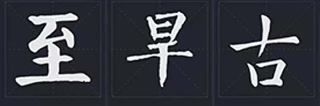
The "horizontal level" we usually talk about refers to the horizontal drawing being stable, not horizontal. The horizontal direction is 5-10 degrees upward to the right, which is called "oblique posture" in calligraphy. "Vertical" means that the vertical painting is strong, but it does not mean vertical. According to the font shape, it can be inclined, straight, curved or straight. As shown below:
2. Tighten up and loosen downThe strokes in the upper part of the glyph are more compact and the lower part is sparse. As shown below:
3. Upper opening and lower closingMouth characters, or characters with a flat mouth, such as Shan character base, Cao character head, etc., should be slightly wider at the top and narrower at the bottom. As shown below:
When the lower part of the character has extended strokes such as left, right and long horizontal strokes, the upper structural unit should be tightened; the lower part should be stretched left and right to support it, which is called "ground support". As shown below:When there are stretching strokes in the upper part of the character, the lower structural unit should be tightened; the upper part stretches left and right to cover the lower part, which is called "Tian Cover". 6. Reach left and give way to rightTo give way to the right, the horizontal stroke on the left side of the character is divided into two sections by the vertical stroke, with the left being longer and the right being shorter. 7. Thin on the left and thick on the rightWhen multiple vertical lines are arranged in a character, the left vertical line is thinner and the right vertical line is thicker.
8. Short on the left and long on the rightWhere there is a long mouth frame, the left vertical part is short and flat, and the right vertical part is long and thick. 9. Left disconnected and right connected
The mouth frame or the small horizontal line between two vertical strokes is usually connected to the left vertical stroke, not the right vertical stroke. If there is a middle vertical line passing through a small horizontal line, the small horizontal line is usually suspended between the left and right vertical lines. 10. Left small lift
In the left-right structure, when the left is small and the right is large, the small left should be slightly above the middle of the large right. 11. The whereabouts of right little one
In the left-right structure, when the right is small and the left is large, the small right person should live slightly lower than the middle of the large left person. 12. Narrow on the left and wide on the right
The left ear is narrow and slightly shorter to match the right; the right ear is slightly wider and has a vertical needle length to match the left. 13. Hang left and right
When there are multiple vertical strokes in the character, the left vertical stroke cannot be written as a hanging needle. 14. Look left and right
Pay attention to the shapes of the structural units and small strokes on the left and right to make them vivid and closely connected. 15. Symmetry
Based on the center vertical line, the length, height, width and width of the left and right strokes should be coordinated to achieve balance. 16. Surrounded by lower left and upper left, with the inner part slightly to the right.
When surrounded by the upper left or lower left, the internal structure should be written slightly to the right, so that the center of gravity of the whole word is in the middle.17. Surrounded by the upper right, slightly left inside
Surrounded by the upper right, the internal structural units should be written slightly to the left, so that the center of gravity of the whole word is in the middle.
18. Suppress the low and suppress the high
The line connecting the tip and tail is a diagonal line (the other two points on the left and right cannot be written the same as it), which is also related to the diagonal trend. 19. Even gaps
When there are multiple horizontal or vertical arrangements, try to make the upper and lower or left and right gaps even. 20. Hook to center
For curved hooks and horizontally folded oblique hooks, it is better that the pen position of the hook tip is aligned with or close to the center line of the structural unit or the character.
21. Stable surroundings
For characters with a square frame, the outer frame should be stable and square, and should not be tilted into a parallelogram shape.
22. Full to the left
The structural units within the box should fill the interior space and be slightly to the left. 23. No painting vertical
When there are no strokes in the mouth, the lower right corner of the mouth frame extends horizontally to cover the vertical one. 24. There are paintings and drawings
When there are strokes in the mouth, the lower right corner of the mouth frame extends vertically to cover the horizontal strokes. 25. Cross centering
The intersection point should be on the center line of the structural unit or character. 26. Avoid repetition
When there are more than two strokes, only one stroke needs to be extended and other points will be changed. 27. The pen breaks the connection of ideas
Although each stroke is independent, the movement path between the upper stroke and the lower stroke must be natural and there is an internal connection. 28. Pointing into the frame
When it consists of an upper frame and a lower frame, the tip of the frame is usually inserted into the frame. 29. Tuck in and release outward
The middle is gathered together, and the outer edges of the characters are spread out, which is the opposite of the Yan style characters. 30. Turn upright
In characters with vertical and apostrophe connected, the starting position of apostrophe is usually to the right of vertical.