Xingkai, also known as "Chinese Xingkai handwriting font", is a running script font that emphasizes the writing style (rules) of regular script, which is more free than regular script and more regular than running cursive. Or: It is a practical handwriting font that simplifies the writing strokes of Chinese characters on the basis of regular script, enhances the writing shadow, expresses the writing interest, appropriately speeds up the writing speed, slightly changes the writing stroke order, and has the characteristics of being easy to recognize and learn. What are the techniques for practicing calligraphy in regular script? 15CiLian.com tells you:
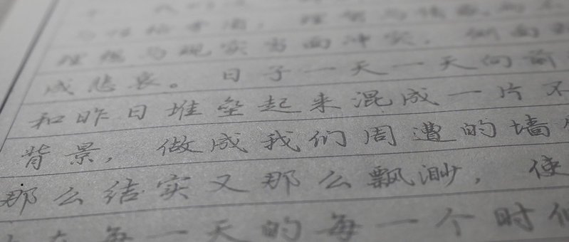
First, read the copybook often, carry it with you, and try to figure it out when you have nothing to do. If you only look at it when you are writing, and the ink will dry if the pen or brush is left in the air for a long time, you will feel cramped and unable to observe carefully.
Next, you need to be confident when writing. It is a big taboo to always look at each stroke and write one after another. It is a big taboo to write blindly at a glance, which is called "copying", and neither of these will work. Huang Tingjian said that he can only start writing if he can see the word reappearing in front of his eyes when he closes his eyes. If you don’t have that much time, you can first read one stroke and then write one word, and the second time, read one word and write one word. Gradually practice until you can read one line and write one line, and the stroke structure of the words is memorized in your mind. When I was practicing calligraphy, I found it really difficult to do this. I was always dishonest and impatient, and I wasted a lot of time on this. You must not imitate me, take your time, learn one word a day, which is 360 words a year. There are ten characters. Although there are many Chinese characters, there are many similarities in structure and radicals. Gradually, you can draw inferences about other cases.
Then, if you practice calligraphy with calligraphy, it is best not to choose a monument at the beginning. It is best to choose one with ink color and the original handwriting is best. Learn how the master uses ink and pen. Some rules of writing cannot be seen in the stele.
What should you pay attention to when practicing Xingkai? Things to note when practicing calligraphy
First, you must persevere in practicing calligraphy. You cannot fish for three days and dry the net for two days;
Second, when practicing calligraphy, you should not change calligraphy stickers frequently. You should practice one copybook before practicing others;
Third, the most taboo thing about practicing calligraphy is that if you haven't mastered the basic skills yet, you want to create your own style, which will only make your writing look different.
Demonstration of calligraphy skills in regular script
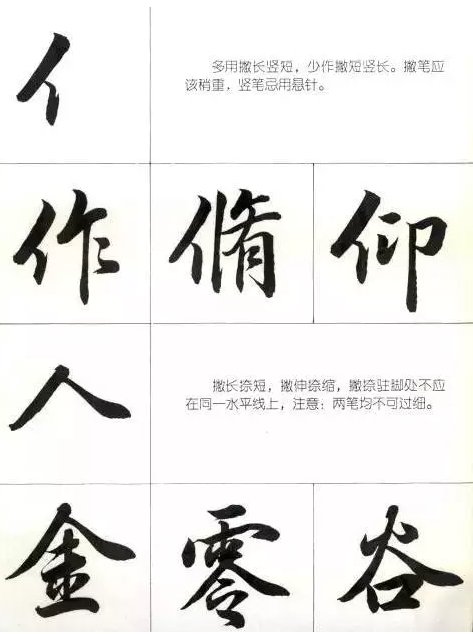
任, it is mostly used to write long and short, and less to use short and long. The writing stroke should be slightly heavier, and avoid using a hanging needle when writing vertically.
For people, the length should be extended and the short should be extended. The footing should not be on the same horizontal line. Note: the two strokes should not be too thin.
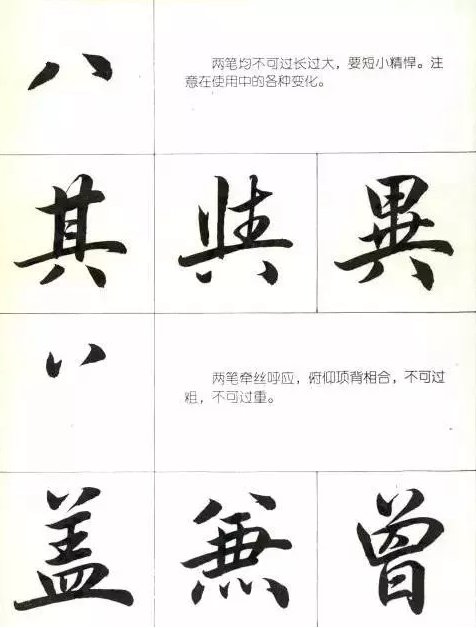
8. Neither stroke should be too long or too big, but should be short and concise. Note the various changes in use.
丷, the two strokes echo each other, pitch and back, and should not be too thick or too heavy.
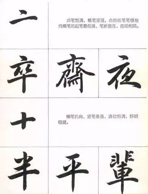
亠, the dot stroke is full and the horizontal stroke is strong. The closing stroke of the dot points to the front end of the starting stroke of the horizontal stroke.
10. The horizontal strokes are shoulder-resistant, the vertical strokes are vertical, full of energy, clear and steady.
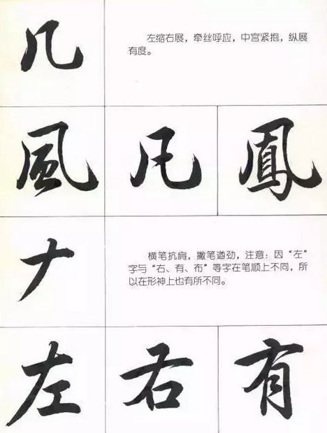
A few, the left is contracted and the right is expanded, the threads are pulled to echo, and the vertical expansion is measured.
ナ, the horizontal stroke resists the shoulder, and the stroke stroke is vigorous. Note: Because the characters "left" and "right, you, cloth" have different stroke order, they are also different in form and spirit.
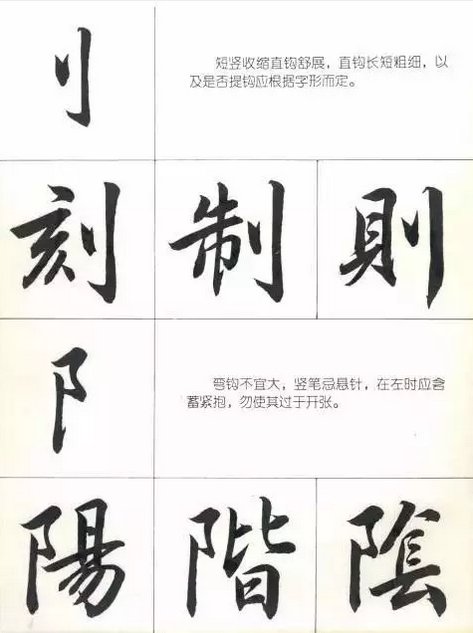
Qian, short vertical contraction, straight hook extension, the length and thickness of the straight hook, and whether to lift the hook should be determined according to the glyph.
The curved hook should not be large, and the vertical pen should not hang the needle. When it is on the left, it should be hugged implicitly and do not open it too much.
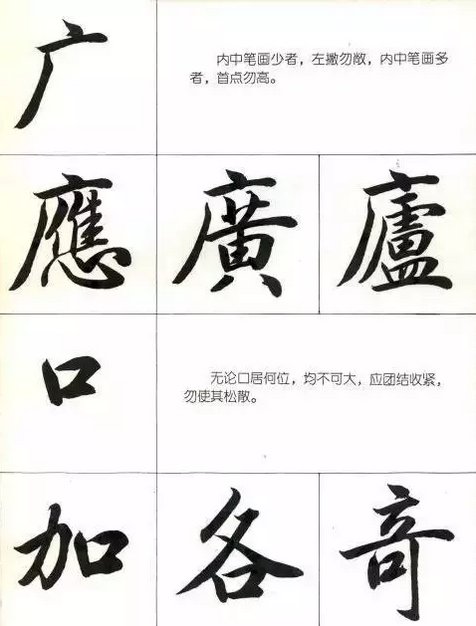
If it is wide, if there are few strokes in the middle, it should not be left-handed; if there are many strokes in the middle, the first point should not be high.
The mouth, no matter where it is located, should not be large. It should be united and tightened, and should not be loosened.
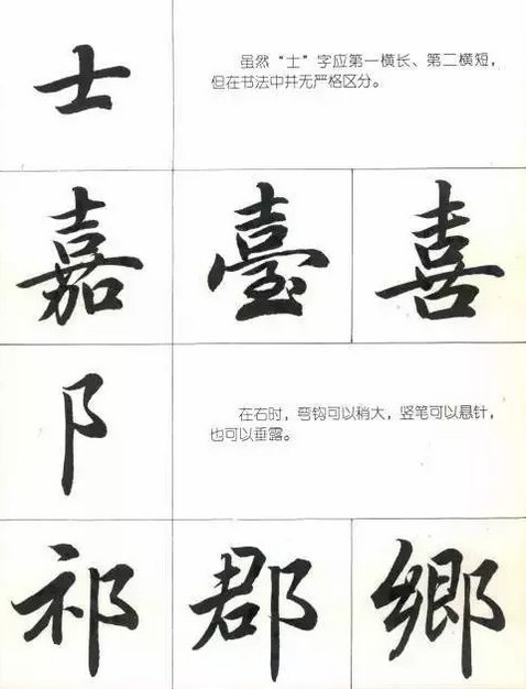
Although the character "Shi" should be the first horizontally long and the second horizontally short, there is no strict distinction in calligraphy.
When it is on the right side, the hook can be slightly larger, and the vertical pen can hang the needle or hang it.
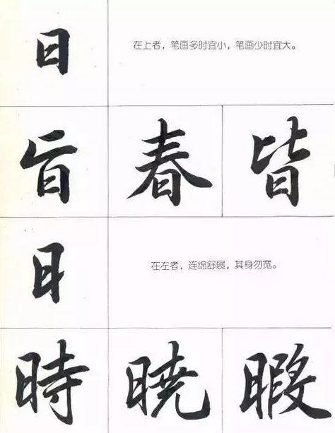
If the day is on the top, the strokes should be small when there are many, and the strokes should be large when there are few.
On the left, the body is stretched continuously without being wide.
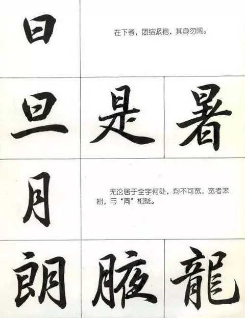
He said, "Those below should unite and hug each other tightly, and do not let their bodies become too wide."
Moon, no matter where it is located in the whole character, cannot be wide. If it is wide, it will be awkward and suspicious of "tong".
He said, "Those below should unite and hug each other tightly, and do not let their bodies become too wide."
Moon, no matter where it is located in the whole character, cannot be wide. If it is wide, it will be awkward and suspicious of "tong".
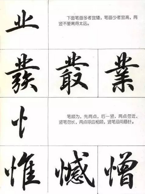
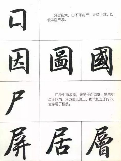
The mouth should not be too big, and the mouth should not be sealed tightly. The end should be moved horizontally and upward to make the middle palace tight.
The body of the corpse is small and compact, and the pen is long and strong. If the pen is turned too inward, it will be difficult to straighten the body; if the pen is turned too outward, the whole character will be loose.
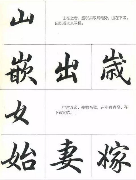
If the mountain is on the top, you should use the slope to get its momentum. If the mountain is on the bottom, you should use the short direction to get the stability.
For women, the middle palace should be tightened and expand and contract accordingly. The one on the left should be narrow, and the one on the bottom should be wide.
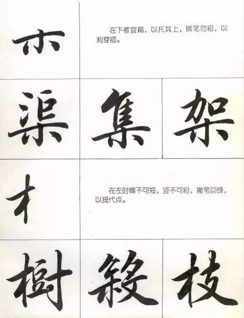
The wood at the bottom should be flat to support the top, and the horizontal stroke should not be thick to facilitate penetration.
When wood is on the left, it should not be short horizontally or thick vertically. The pen should be turned back to the front to lift the point.
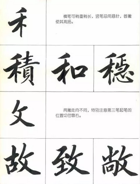
He, the horizontal stroke can be a little heavier and a little longer, avoid using a hanging needle for the vertical stroke, and make the first stroke high.
In writing, the two strokes go in different directions. Pay special attention to the starting position of the third stroke and never go to the right.
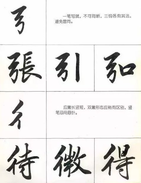
The bow is written in one stroke without interruption. Each of the three hooks has its own method to avoid duplication.
彳 should be long and short in the vertical stroke. The shape of the double stroke should be slightly different. Do not use a hanging needle in the vertical stroke.
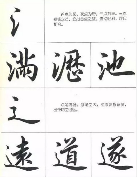
氵, the first point is the starting point, the second point is the belt, and the three points are the response. The three points of sharp light want to point to the first point, flowing lightly and sharply, echoing and matching.
Lift the pen, point the pen high, do not bend the pen too far, hold back the twists and turns appropriately, and do not strike too far.
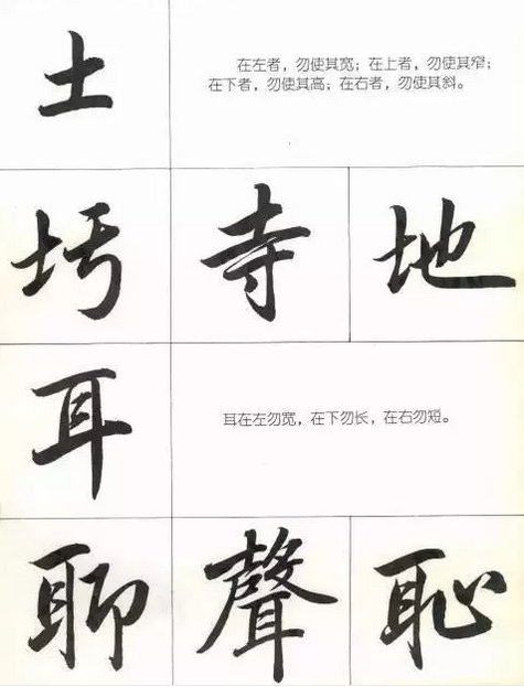
If the earth is on the left, do not make it wide; on the top, do not make it narrow; on the bottom, do not make it high; on the right, do not make it slanted.
The ears should not be wide on the left, long on the bottom, and short on the right.
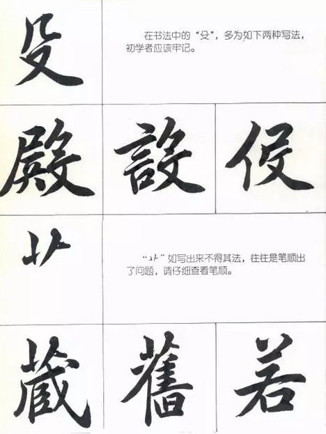
"殳" in calligraphy is mostly written in the following two ways, which beginners should keep in mind.
Fuck, if you write it incorrectly, there is often something wrong with the stroke order. Please check the stroke order carefully.
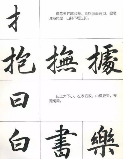
For strokes, the horizontal stroke should be shoulder-resistant and avoid being short, and the straight hook should be thin and powerful. Pay attention to the angle when lifting the stroke, and the stroke should not be too long.
It says that the upper part should be bigger and the lower part should be smaller, the left side should be closed and the right side should be extended, the inner cross should be short, and the horizontal distance should be the same.
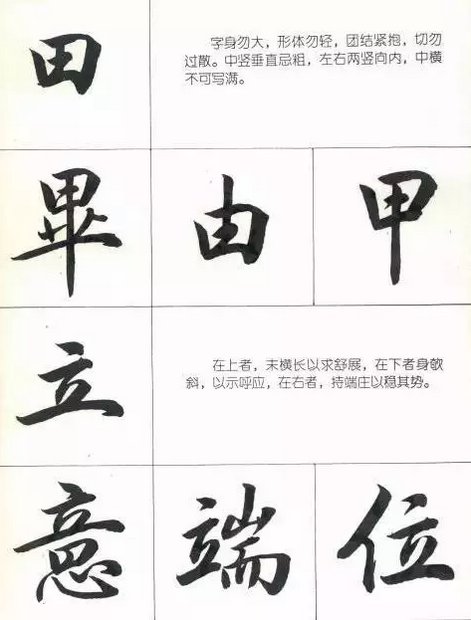
Tian, the body of the character should not be big, the shape should not be light, unite and hug tightly, and don't be too scattered. The middle and vertical lines should not be thick, the left and right vertical lines should be facing inward, and the middle and horizontal lines should not be full.
Standing, the one on the top is horizontally long in order to stretch, the one on the bottom is slanted to show echo, and the one on the right is dignified to stabilize its posture.
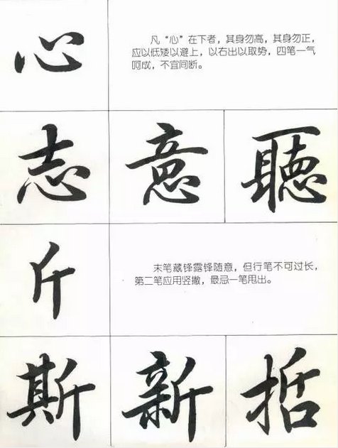
Heart, if the "heart" is down, the body should not be high or upright. It should be low to avoid going up, and go out to the right to gain momentum. The four strokes should be completed in one go and should not be interrupted.
Jin, the last stroke hides the edge and exposes the edge freely, but the stroke should not be too long. The second stroke should be written vertically, and the last stroke should not be thrown out.
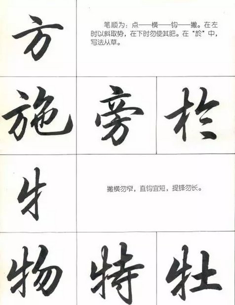
Square, the stroke order is: dot - horizontal - hook - left. When it's on the left, use it diagonally to gain momentum, and when it's down, don't make it fat. In "Yu", the writing method is Congcao.
For cattle, the horizontal stroke should not be narrow, the straight hook should be short, and the lifting tip should not be long.
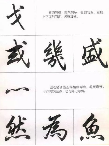
For Ge, the oblique hook should not be thick, the pen should not drop when you lift it, and whether the hook is lifted or not should be determined by the upper and lower glyphs, and each should be perfect.
"Xi", the four strokes of the strokes should be continuous and echo each other, and the strokes should be broken to connect the meaning. It can also be written as three points, or it can be simplified as horizontal.
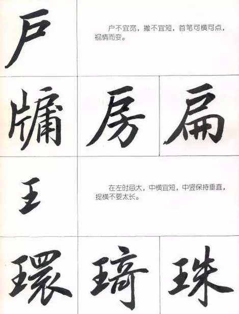
The household should not be wide, and the strokes should not be short. The first stroke can be horizontal or pointed, depending on the situation.
King, when on the left side, avoid being too big, the middle horizontal position should be short, the middle vertical position should be kept vertical, and the lifting horizontal position should not be too long.
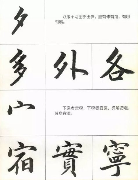
On the evening of the evening, all the troops should not attack at once. They should stretch and contract, bend and expand.
If it is wide at the bottom, it should be narrow, and if it is narrow at the bottom, it should be wide. The horizontal stroke should not be thick, and the body should be short.
For the quail, the body should not be wide, the horizontal strokes should be even and dense but not heavy, and the vertical pen should not use a hanging needle.
The stone on the left should not be wide, the stone on the top should not be large, and the stone on the bottom should not be slanted.
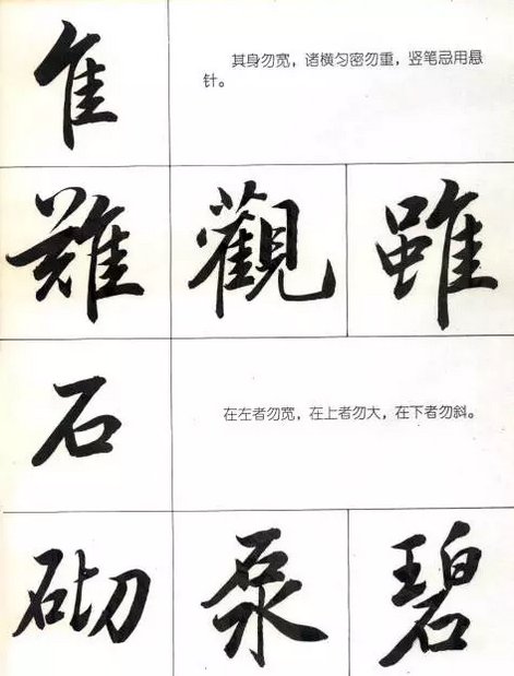
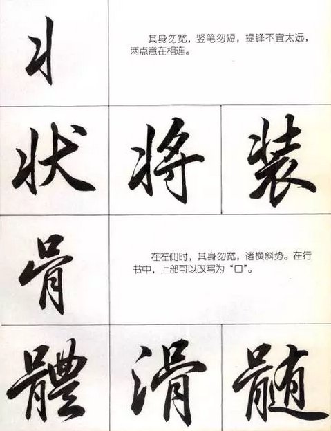
Pi, the body should not be wide, the vertical pen should not be short, and the tip should not be too far away. The two points are intended to be connected.
When the bone is on the left side, the body should not be wide, and the body should be horizontal and oblique. In running script, the upper part can be rewritten as "口".
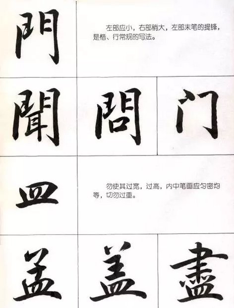
For the door, the left part should be small and the right part should be slightly larger. The tip of the last stroke of the left part is the conventional writing method of regular script and xing.
Do not make the dish too wide or too high. The strokes inside should be even and dense, and do not make it too heavy.
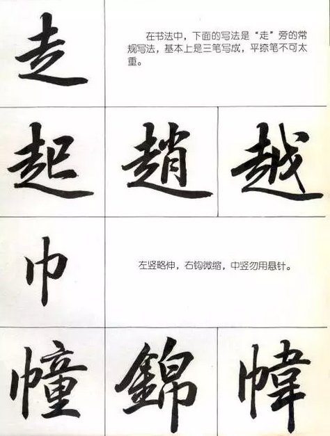
Walk, in calligraphy, the following writing method is the conventional writing method next to "walk". It is basically written in three strokes. The flat stroke should not be too heavy.
For the scarf, the left vertical hook is slightly extended and the right hook is slightly retracted. Do not use a hanging needle in the middle vertical position.
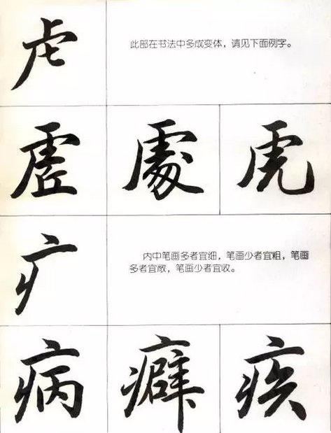
虍, this part has many variations in calligraphy, see the example below.
For 疒, those with many strokes should be thin, those with few strokes should be thick, those with many strokes should be open, and those with few strokes should be closed.
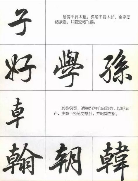
Zi, the hook should not be too thick, the horizontal stroke should not be too long, the whole word should be united and hugged tightly, and should be smooth and flying.
, the body should not be wide, and all horizontal strokes should be made to resist the shoulder to echo the right side. Pay attention not to hang the needle when lowering the vertical stroke, and move it slightly to the left.
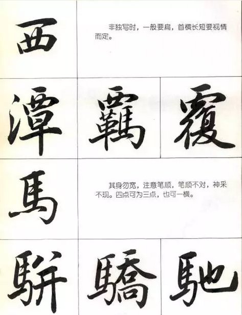
West, when not written alone, is generally flat, and the length of the first horizontal line depends on the situation.
Horse, its body should not be wide, pay attention to the order of strokes, if the order of strokes is wrong, the expression will not show up. Four points can be three points or one horizontal point.
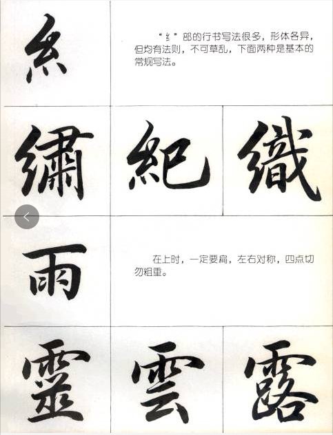
There are many ways to calligraphy in cursive writing, with different shapes, but they all have rules and cannot be messed up. The following two are basic conventional writing methods.
When the rain is rising, it must be flat, symmetrical from left to right, and not thick or heavy at the four points.
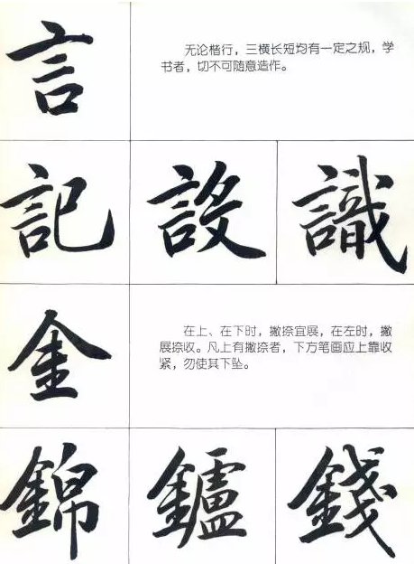
In words, regardless of regular script, there are certain rules for the length of the three horizontal lines. Those who learn calligraphy must not make random mistakes.
When gold is on the top or bottom, it is better to expand and hold back. When it is on the left, it is to hold back and expand. If there is an upper stroke, the upper stroke should be tightened to prevent it from falling.
