Huang Ziyuan (1837-1918) was a calligrapher and industrialist in the late Qing Dynasty. A native of Qing'anhua County. His courtesy name was Jingyu, and in his later years he called himself Dansou. Born in the seventeenth year of Daoguang (1837). In the sixth year of Tongzhi (1867), he passed the imperial examination and won the second place in the palace examination next year. He was granted the rank of Jinshi and was awarded the title of Editor of the Hanlin Academy. In the ninth year, he served as the co-examiner of Shuntian Township Examination. In the 12th year, he served as deputy examiner of Jiangnan Provincial Examination. He was demoted because of his affairs and was transferred to the Hanlin Academy for review.
During the reign of Emperor Guangxu, Huang Ziyuan successively served as censor of Henan Province and Shaanxi Province, and was briefly appointed as the prefect of Gansu and Ningxia. Ding Mu is worried about returning home. In the 20th year of Guangxu (1894), the Sino-Japanese Sino-Japanese War of 1894-1894 broke out. Wu Dacheng, the governor of Hunan at that time, led the Hunan army to participate in the war in Shanhaiguan area, and he accompanied the army as counselor. After defeating Niuzhuang, he fled back from the sea. From then on, he lived in Changsha and lectured successively at Xiangshui School Classics Hall and Chengde Academy. He also founded Bao Shancheng Machinery Manufacturing Company with Wang Xianqian and others to manufacture machinery, electric lamps and other parts. He died of illness in Changsha in the seventh year of the Republic of China (1918).
Huang Ziyuan learned calligraphy from his grandfather De Lian when he was young. He often wrote with his wrist hanging to exercise his arm strength. At first, I imitated the Yan body, and then I imitated the Liu body and the European body. Although calligraphy has been changed many times, it cannot find its own way, and it has not been praised by scholars. However, it has learned from the strengths of other calligraphers and has become its own style. The mother of Emperor Tongzhi died of illness, and Huang Ziyuan was ordered to write a divine tablet. He knelt down and wrote it with his hand hanging. He was so neat and well-proportioned that he was praised and given the title of "Zi Sheng". In his later years, he imitated "Xuanmi Pagoda", "Liquan Ming", "Zhengqi Song", etc., which were sold through Zhou Moxiang's woodcut rubbings and were widely circulated as teaching materials for Mongolian calligraphy at that time.
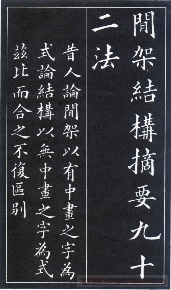
Huang Ziyuan is good at regular script and has strict layout. The horizontal, vertical, horizontal, and vertical points are clear and even, and the rigid construction is neat and beautiful. This book is an explanation of Huang Ziyuan's regular script collection and couplet writing. Huang Ziyuan (2837-1926), a native of Anhua, Hunan, was named Jingyu. He was once promoted to Jinshi and ranked second, served in the Hanlin Academy, and later served as an examiner for provincial examinations, chief editor of Wuyingdian, and associate of the National History Museum. Xiu, as well as the censor of Shaanxi Province and the prefect of Ningxia Prefecture in Gansu. After he was fifty years old, he left his job and returned to Hunan, where he lectured on school classics one after another and established various academies in virtue. He first learned calligraphy from Yan Zhenqing, and then from Liu Gongquan and Ouyang Xun. He learned from the strengths of others and established his own method. He is familiar with the rules of writing and tying characters in traditional calligraphy, and he has already made a distinguished family. His regular script strokes are well-proportioned and precise, his structure is rigorous and dignified, he is both proficient in legality and bright and pleasing to the eye. Wen Tianxiang's "Song of Righteousness" in regular script is his exquisite work.
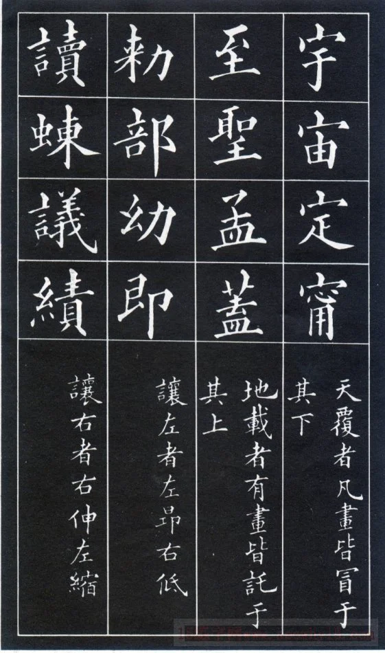
Above is the word Baogai, and the rest of the strokes should be capped below it. Such as: universe, universe, determination
There is a support-like word below, and the rest of the strokes should be supported on it. Such as: Zhi, Meng, Sheng
For words with the left half as the main part, the left side should be higher and the right side should be lower. Such as: department, young, that is
For words with the right half as the main part, the right side should be longer and the left side should be shorter. Such as: performance, discussion, reading
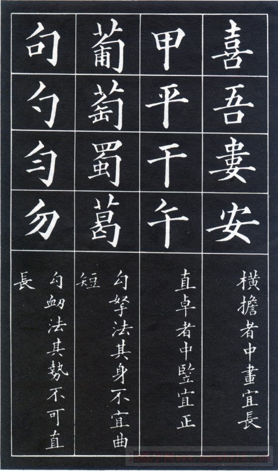
If there are characters with vertical strokes running through the middle, the middle vertical stroke should be straight and not crooked. Such as: Jia, Ping, Qian, Wu
The hook pen should not be bent or short. Such as: grape, grape, Shu, Ge
The hook-up pen should not be straight and long. Such as: sentence, even, don't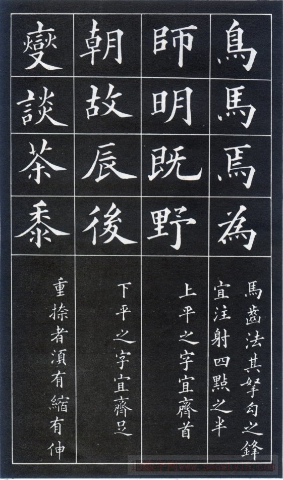
The hook of the horse tooth is facing the four points. Such as: birds, horses
The tops of characters drawn flat on top should be flush with each other. Such as: Shi, Ming, Ji, Ye,
The words drawn flat on the bottom should be aligned with the bottom. Such as: Chao, Gu, Chen
There are several characters that are painted, which should be contracted and expanded. Such as: talk, tea, millet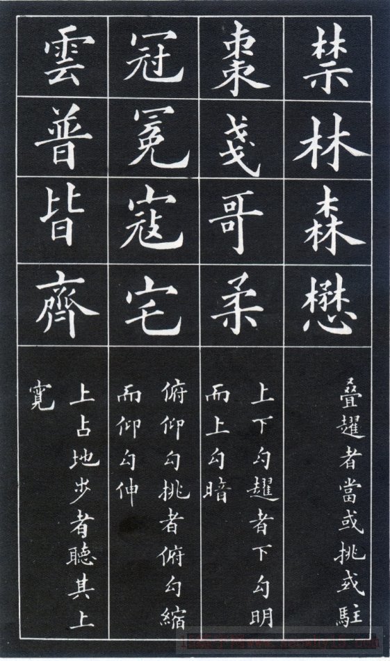
There are hooks above and below, the lower hook should be obvious and the upper hook should be hidden. Such as: Brother, Rou
For words with a downward hook and an upward hook, the downward hook should be short and the upward hook should be long. Such as; crown, bandit, house
For words that are dominated by the upper part, the upper edge should be wider. Such as: universal, all, uniform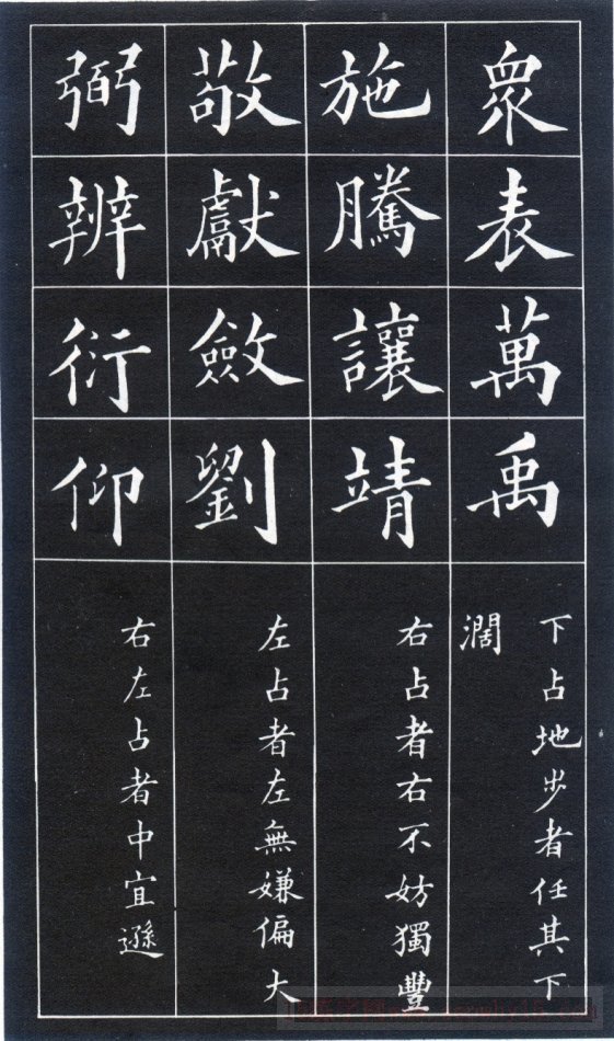
For words with the lower part as the main part, the lower part should be wider. Such as: Biao, Yu
For words with the right part as the main part, the right part can be fuller. Shi, Teng, Jing
For characters with the left part as the main part, the left part should be larger. Such as: Jing, Lian, Liu
For characters that are mainly left and right, the middle should be small. Such as; Bi, Bian, Yan, Yang
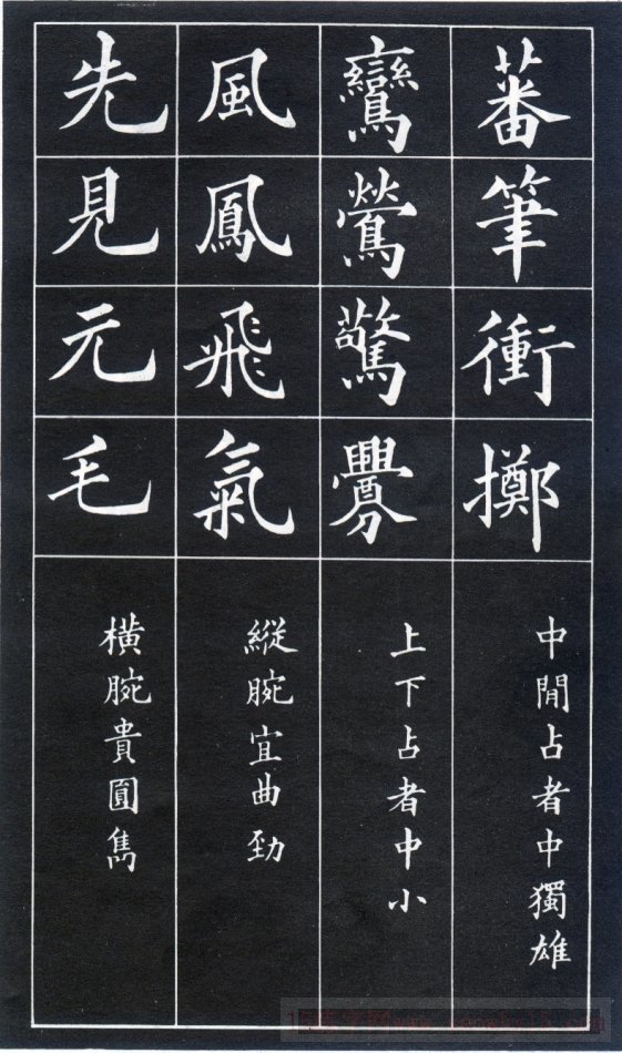
For characters that are centered in the middle, the middle part should be large. Such as: throw, fan;
For words that are mainly up and down, the middle should be small. Such as: warbler, widow
The vertical wrist pen should be curved and strong. Such as: wind, flying, air
The horizontal wrist pen should be round and handsome. Such as: Xian, Jian, Yuan, Mao 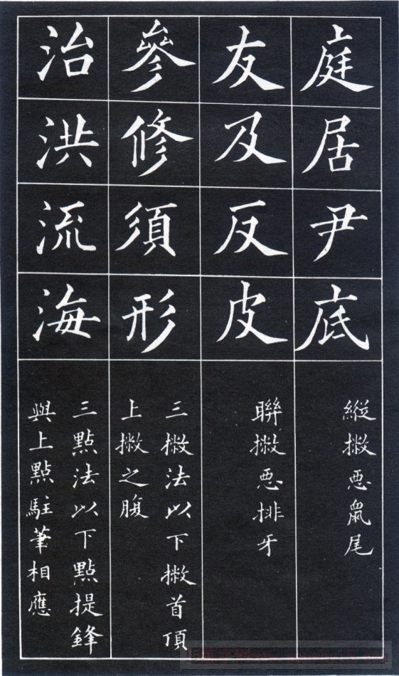
The worst thing to avoid is a mouse's tail. Such as; court, home, bottom
If there are several apostrophes written side by side, do not write them like a row of teeth. Such as: friend, and, anti, skin
For words with three consecutive strokes, the lower stroke should touch the middle of the upper stroke. Such as; Xiu, Shen, Xu, Xing
When writing three points, the tip of the lower point should correspond to the end of the upper point. Such as: control, flood, flow, sea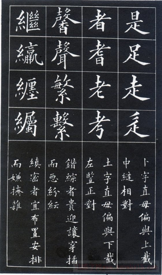
The word "Bu" should be written straight and not slanted, and should be opposite to the middle of the upper section. Such as: yes, foot, walk
The word "Tu" should be written straight and not slanted, and it should be aligned with the vertical painting on the left side of the lower section. Such as: Zhe, Lao, Kao
Characters with intricate structures should be interspersed with corresponding concessions, but should not be messy. Such as: Fan, Xin
Characters with a tight structure should be arranged appropriately and should not appear crowded and cluttered. Such as: follow, entangle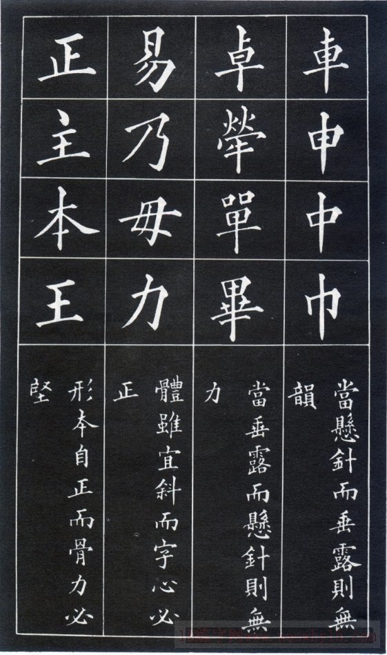
If the strokes of the hanging needle are like dewdrops (the ending is like a dewdrop or round shape), it will not be beautiful. Such as: Che, Shen, Zhong, Jin
When it hangs like a needle, it looks weak. Such as: Zhuo, single
Although the font is slanted, the center of the word should be straight. Such as: Yi, Nai, Mu, Li;
The font is originally correct and must be written with strength; such as: Zheng, Zhu, Ben,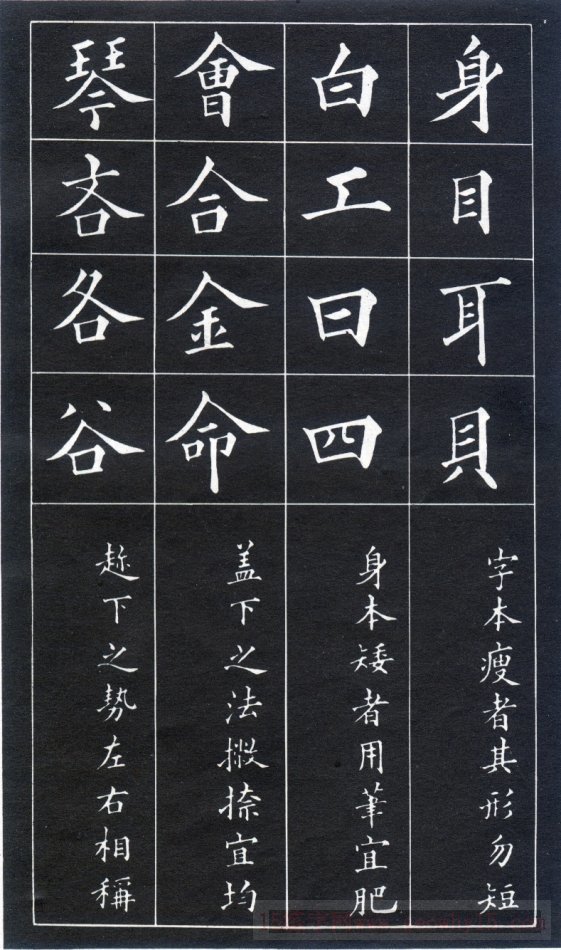
The characters are thin by nature, so don’t write them too short. Such as: body, eyes, ears, shell;
The characters are already short, so they are written thicker. Such as: white, work, day, four
Gaixia (referring to people) should be written so that the strokes and strokes are even. Such as: Hui, He, Metal, Ming;
When (ㄨ) is written, it should be proportional to both sides. Such as: Qin, stingy, Ge, Gu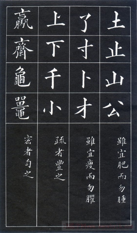
Although fat characters are suitable, they should not appear bloated; such as: soil, mountain, public, and stop.
Although thin characters are appropriate, they should not appear too thin. Such as: le, cun, cai, divination
Characters with fewer strokes should be written more fully; such as: 上, 下, 千, 小
Words with many strokes should be written evenly. Such as: win, tripod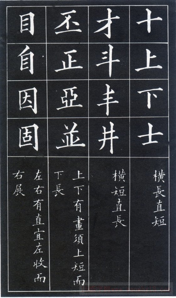
Long horizontally and short vertically. Such as: ten, up, down, scholar
Short horizontally and long vertically. Such as: Cai, Dou, Feng, Jing
Characters with horizontal strokes above and below should be short at the top and long at the bottom. Such as: Pi, Zheng, Ya
There are vertically drawn characters on the left and right, the left side should be contracted and the right side should be stretched. Such as: eye, self, cause, solid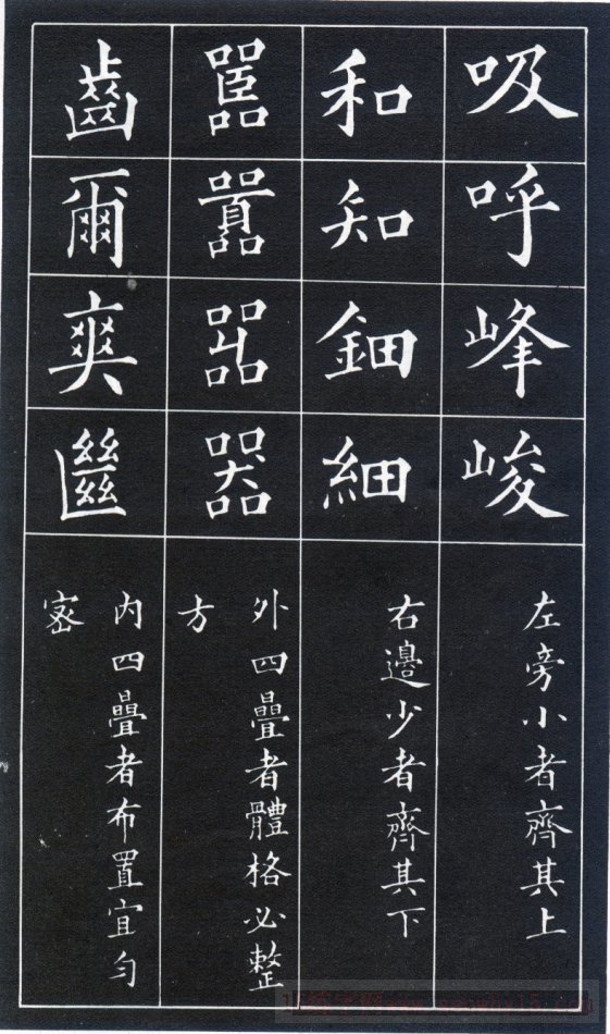
The small characters on the left radical should be taken together with the upper ones, such as: inhale, exhale, peak, and steep.
The small characters on the right radical should be aligned with the bottom. Such as harmony, knowledge, detail
There are four stacks of characters (four mouths) on the outside, and the entire character shape should be square. Such as: clamor, device
There are four stacks of characters inside, which should be arranged evenly and closely. Such as: cool, teeth
The hook of the horse tooth is facing the four points. Such as: birds, horses
The tops of characters drawn flat on top should be flush with each other. Such as: Shi, Ming, Ji, Ye,
The words drawn flat on the bottom should be aligned with the bottom. Such as: Chao, Gu, Chen
There are several characters that are painted, which should be contracted and expanded. Such as: talk, tea, millet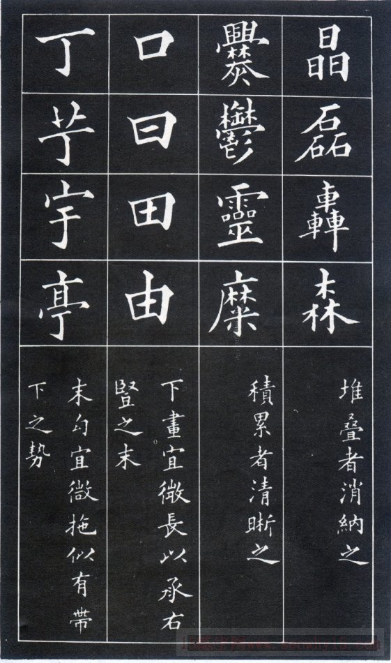
The stacked characters should also be dissolved and consolidated, neither crowded nor loose; such as: Jing, Lei, Sen.
The accumulated characters should be drawn clearly. Such as: Mi, zero, extravagant
The lower horizontal drawing should be slightly longer to connect with the end of the right vertical drawing. Such as: mouth, day, field,
The last hook should be slightly longer so that it seems to have a downward trend. Such as: Ding, Yu, Ting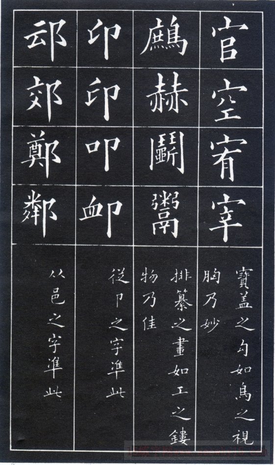
The hook of the treasure cover should be written like a bird looking at its own breast; such as: official, empty, slaughter,
It would be nice if the strokes arranged in the compilation look like fine carvings. Such as: he, partridge, vend (yu)
From the word "卩", use this as the standard; such as: seal, knock, but
From the word "邑" (right), use this as the standard; such as: Jiao, Zheng, Lin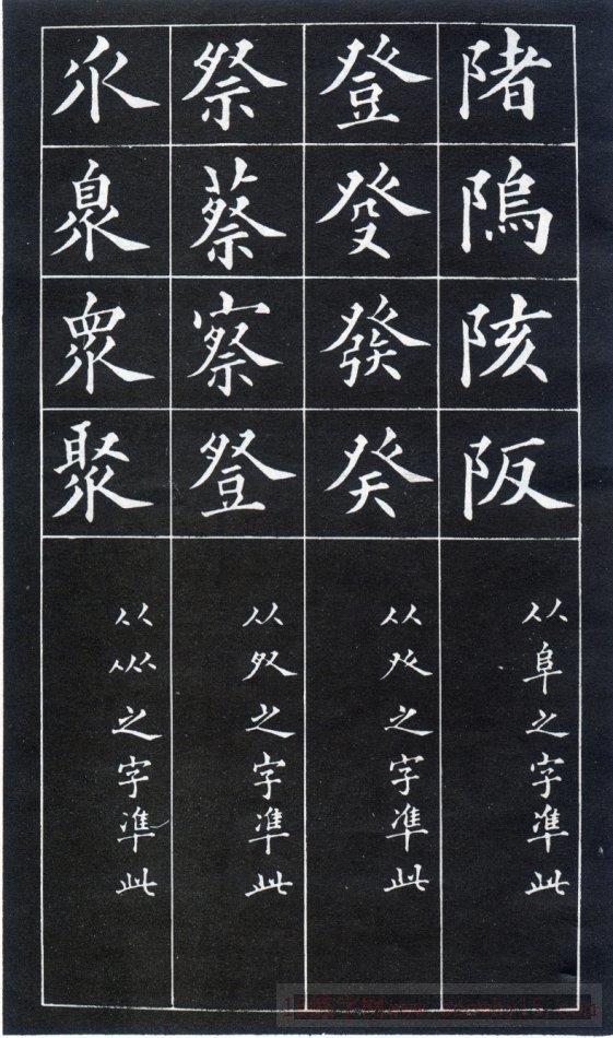
From the word "阜" (zuo 阝), this is used as the standard. Such as: Han, Wei
From the word "Deng" prefix, use this as the standard. Such as: climb, stool
From the words starting with "ji", use this as the standard; such as: Ji, Cai, Cha
From the characters at the bottom of the character "Ju", use this as the standard; for example: Ju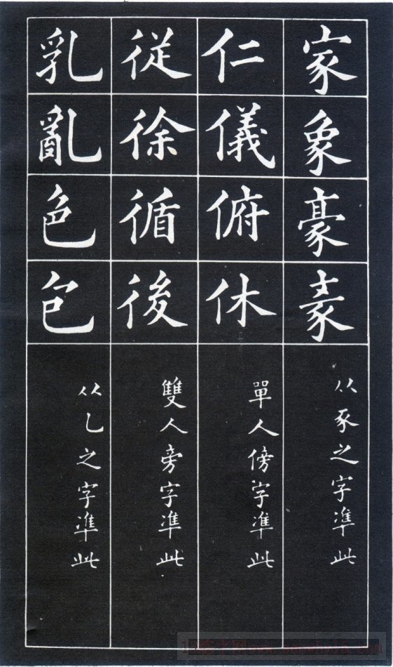
From the word "豕", use this as the standard; such as: Jia, Xiang, Hao
From the word "任", use this as the standard; such as: benevolence, etiquette, obedience, and peace.
From the word "彳", use this as the standard; such as: Xu, Xun, Xing, very
From the vertical hook in the character "Luan", use this as the standard. Such as: milk, chaos, color, bag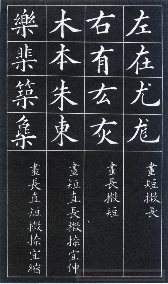
The horizontal length is shortened; such as: right, you, gray
Characters that are short horizontally and long vertically should be extended. Such as: wood, Ben, Zhu
Characters that are long in horizontal strokes and short in vertical strokes should be shortened. Such as: Le, Ji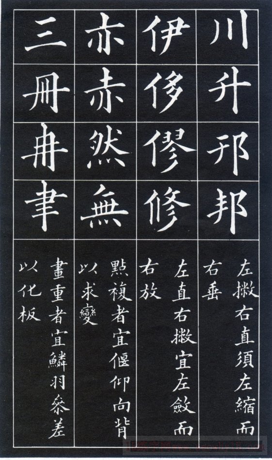
Characters with a left-hand stroke and a vertical stroke on the right should be short on the left-hand side and long on the right-hand side. Such as: Sichuan, Sheng, Bang
The left hand is drawn vertically and the right hand is drawn horizontally. The left hand should be drawn vertically and the right hand should be extended. Such as: Yi, Xiu, Xiu
For words with several points, the directions of each point should be different to make them change. Such as: Yi, Chi, Ran
There are several characters drawn horizontally, and the length of each horizontal line should be different so that it does not look dull. Such as: three, ran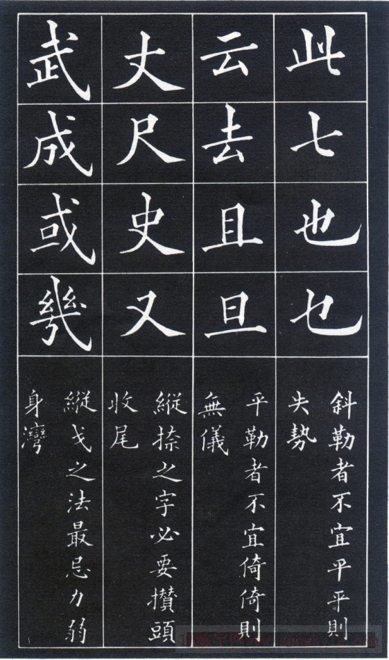
Don't write the diagonal strokes flat. If they are flat, there will be no momentum. Such as: seven, also
If a Ping Le painting is written slanted, it will not be straight. Such as: Yun, Qu, Qi, Dan
To write the zigzag character, you need to accumulate the strokes and close the tail strokes. Such as: Zhang, Chi, Shi, and
The most taboo thing about Zongge is being weak and crooked. Wu, Cheng, or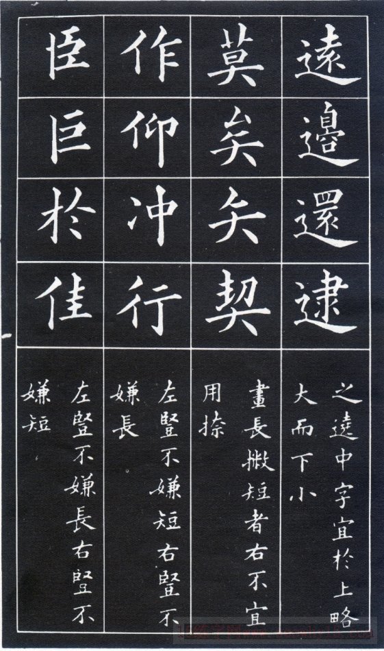
The characters that go above should be slightly larger at the top and smaller at the bottom. Such as: far, return, catch
For characters that are long and short, it is not appropriate to use Na on the right side. Mo, Ye, Ya, Qi
The left vertical position is not too short, the right vertical position is not too long; such as: doing, looking up, rushing, walking
The left vertical one is not too long, the right vertical one is not too short. Such as: Chen, Ju, Jia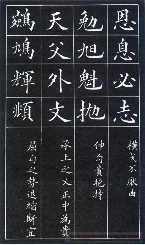
Hengge's strokes are not afraid of bends. Such as: grace, interest, must, ambition
The hook should be held in a zigzag position. Such as: Mian, Xu, Pao
The word "人" attached to the above should be right in the middle. Heaven, Father, Outside, Wen
The posture of the bent hook pen should be reduced. Such as: Dove, Hui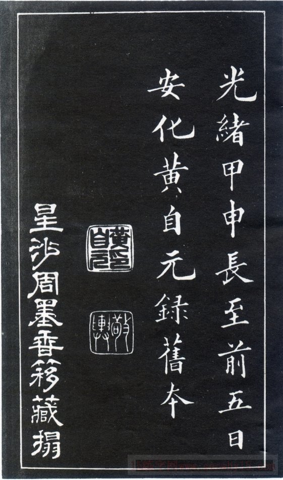
(1) Above is the word Baogai, and the rest of the strokes should be capped below it. Such as: universe, universe, determination
(2) There is a support-like character below, and the rest of the strokes should be supported on it. Such as: Zhi, Meng, Sheng
(3) For words with the left half as the main part, the left side should be higher and the right side should be lower. Such as: department, young, that is
(4) For words with the right half as the main part, the right side should be longer and the left side should be shorter. Such as: performance, discussion, reading
(5) For words with cross arms, the middle horizontal part should be longer; such as: Xi, Wu, An
(6) For characters with vertical strokes running through the middle, the middle vertical stroke should be straight and not crooked. Such as: Jia, Ping, Qian, Wu
(7) The hook pen should not be bent or short. Such as: grape, grape, Shu, Ge
(8) The hook-up pen should not be straight and long. Such as: sentence, even, don't
(9) The horizontal short and the long; such as: Zuo, Zai, You, Long
(10) The horizontal length is shortened; such as: right, you, gray
(11) For characters that are short horizontally and long vertically, the strokes should be extended. Such as: wood, Ben, Zhu
(12) Characters that are long in horizontal strokes and short in vertical strokes should be shortened. Such as: Le, Ji
(13) Long horizontally and short vertically. Such as: ten, up, down, scholar
(14) Short horizontally and long vertically. Such as: Cai, Dou, Feng, Jing
(15) Characters with horizontal strokes above and below should be short at the top and long at the bottom. Such as: Pi, Zheng, Ya
(16) For characters with vertical drawings on the left and right, the left side should be contracted and the right side should be stretched. Such as: eye, self, cause, solid
Huang Ziyuan's "Ninety-Two Methods of Intermediate Structure Summary" (8 photos)
(17) Characters that are drawn on the left and drawn vertically on the right should be short on the left and long on the right. Such as: Sichuan, Sheng, Bang
(18) If the left hand is vertical and the right is left, the left hand should be drawn vertically and the right hand should be extended. Such as: Yi, Xiu, Xiu
(19) For words with several points, the directions of each point should be different to make them change. Such as: Yi, Chi, Ran
(20) There are several characters drawn horizontally, and the length of each horizontal line should be different so that it does not look dull. Such as: three, ran
(21) A word composed of two equal parts should be evenly spaced on the left and right. Such as: Yan, Gu
(22) A character composed of three parts, with the middle being upright. Such as: Yu, Xie, Shu
(23) A character composed of upper and lower parts, each accounting for half, with slight changes in the middle. need, stay
(24) For characters composed of upper, middle and lower parts, the head and tail should be stretched appropriately. Such as: Zhang, Yi, Su, Lei
(25) The small characters on the left radical should be matched with those on the top, such as: inhale, exhale, peak, and steep.
(26) The small characters on the right radical should be aligned with the bottom. Such as harmony, knowledge, detail
(27) There are four folds of characters (four mouths) on the outside, and the entire character shape should be square. Such as: clamor, device
(28) There are four stacks of characters inside, which should be arranged evenly and closely. Such as: cool, teeth
(29) Don’t write the diagonal strokes flat. If they are flat, they will lose momentum. Such as: seven, also
(30) If a Ping Le painting is written slanted, it will not be straight. Such as: Yun, Qu, Qi, Dan
(31) When writing a zigzag, you need to accumulate your strokes and gather your tail strokes. Such as: Zhang, Chi, Shi, and
(32) The most taboo thing about Zongge is being weak and crooked. Wu, Cheng, or
(33) Heng Ge’s strokes are not afraid of bending. Such as: grace, interest, must, ambition
(34) The hook should be held in a zigzag position. Such as: Mian, Xu, Pao
(35) The word "人" attached to the above should be exactly in the middle. Heaven, Father, Outside, Wen
(36) The force of bending the hook pen should be reduced. Such as: Dove, Hui
(37) The hook of the horse tooth is facing the four points. Such as: birds, horses
(38) If the characters are painted flat on top, their tops should be aligned. Such as: Shi, Ming, Ji, Ye,
(39) Characters drawn flat on the bottom should be aligned with the bottom. Such as: Chao, Gu, Chen
(40) There are several characters that are drawn, which should be contracted and expanded. Such as: talk, tea, millet
(41) There are several characters with hooks. Some of them need to raise the hook, and some need to hide the tip of the pen. Such as: forbidden, forest, forest
(42) For words with hooks above and below, the lower hook should be obvious while the upper hook should be hidden. Such as: Brother, Rou
(43) For words with a downward hook and an upward hook, the downward hook should be short and the upward hook should be long. Such as; crown, bandit, house
(44) For words that are centered on the upper part, the upper edge should be wider. Such as: universal, all, uniform
(45) The vertical wrist pen should be curved and powerful. Such as: wind, flying, air
(46) The horizontal wrist pen should be round and handsome. Such as: Xian, Jian, Yuan, Mao
(47) The most taboo thing is to look like a mouse’s tail. Such as; court, home, bottom
(48) If there are several apostrophe characters side by side, do not write them like a row of teeth. Such as: friend, and, anti, skin
(49) For words with three consecutive strokes, the lower stroke should touch the middle of the upper stroke. Such as; Xiu, Shen, Xu, Xing
(50) When writing three points, the tip of the lower point should correspond to the end of the upper point. Such as: control, flood, flow, sea
(51) For words with the lower part as the main part, the lower part should be wider. Such as: Biao, Yu
(52) For characters with the right part as the main part, the right part can be fuller. Shi, Teng, Jing
(53) For characters with the left part as the main part, the left part should be larger. Such as: Jing, Lian, Liu
(54) For characters that are mainly left and right, the middle should be small. Such as; Bi, Bian, Yan, Yang
(55) For characters that are centered in the middle, the middle part should be large. Such as: throw, fan;
(56) For words that are mainly up and down, the middle should be small. Such as: warbler, widow
(57) The character "Bu" should be written straight and not slanted, and should be opposite to the middle of the upper cut. Such as: yes, foot, walk
(58) The word "Tu" should be written straight and not slanted, and it should be aligned with the vertical painting on the left side of the lower section. Such as: Zhe, Lao, Kao
(59) Characters with intricate structures should be interspersed with corresponding concessions, but should not be chaotic. Such as: Fan, Xin
(60) Characters with a tight structure should be arranged appropriately and should not appear crowded and messy. Such as: follow, entangle
(61) If the strokes of the hanging needle look like dewdrops (the ending is like a dewdrop or a round shape), it will not look beautiful. Such as: Che, Shen, Zhong, Jin
(62) When something hangs like a needle, it appears weak. Such as: Zhuo, single
(63) Although the font is slanted, the center of the character should be straight. Such as: Yi, Nai, Mu, Li;
(64) The font is originally correct and must be written with strong bones; such as: Zheng, Zhu, Ben, Wang
(65) Characters are inherently thin, so don’t write them too short. Such as: body, eyes, ears, shell;
(66) The characters are originally short, so they are written thicker. Such as: white, work, day, four
(67) Gaixia (referring to people) should be written so that the strokes and strokes are even. Such as: Hui, He, Metal, Ming;
(68) When (ㄨ) is written, it should be proportionate. Such as: Qin, stingy, Ge, Gu
(69) Although fat characters are suitable, they should not appear bloated; such as: soil, mountain, public, and stop.
(70) Although it is appropriate to be thin, don’t look too thin. Such as: le, cun, cai, divination
(71) Characters with fewer strokes should be written fuller; such as: Shang, Xia, Qian, Xiao
(72) Words with many strokes should be written evenly. Such as: win, tripod
(73) Stacked characters should also be dissolved and consolidated, neither crowded nor loose; such as: Jing, Lei, Sen
(74) The accumulated characters should be drawn clearly. Such as: Mi, zero, extravagant
(75) The lower horizontal painting should be slightly longer to connect with the end of the right vertical painting. Such as: mouth, day, field,
(76) The end hook should be slightly longer so that it seems to have a downward trend. Such as: Ding, Yu, Ting
(77) The characters that go up should be slightly larger at the top and smaller at the bottom. Such as: far, return, catch
(78) For characters that are long and short, it is not appropriate to use Na on the right side. Mo, Ye, Ya, Qi
(79) The left vertical line is not too short, and the right vertical line is not too long; such as: doing, looking up, rushing, walking
(80) The left vertical line is never too long, and the right vertical line is never too short. Such as: Chen, Ju, Jia
(81) The hook of the treasure cover should be written like a bird looking at its own breast; such as: Guan, Kong, Zai,
(82) The strokes arranged in the compilation should look like fine carvings. Such as: he, partridge, vend (yu)
(83) From the word "卩", use this as the standard; such as: seal, knock, but
(84) From the word "邑" (you阝), use this as the standard; such as: Jiao, Zheng, Lin
(85) From the word "阜" (zuo 阝), this is used as the standard. Such as: Han, Wei
(86) From words starting with "Deng", use this as the standard. Such as: climb, stool
(87) From the words starting with "ji", use this as the standard; such as: Ji, Cai, Cha
(88) From the characters at the bottom of the character "Ju", use this as the standard; for example: Ju
(89) From the word "豕", use this as the standard; such as: Jia, Xiang, Hao
(90) From the word "任", use this as the standard; such as: benevolence, etiquette, bending, and rest.
(91) From the word "彳", use this as the standard; such as: Xu, Xun, Xing, very
(92) From the vertical hook character in the character "Luan", use this as the standard. Such as: milk, chaos, color, bag


