1. Three creative principles
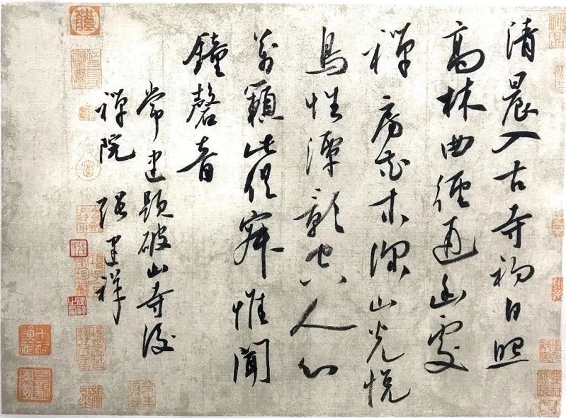
1. The lines are strong and clear - passion comes from the proficiency of the lines. Lines are a combination of force and momentum. The strokes should be calm and smooth, steady and light, with emphasis on strokes (i.e. trends). The direction of the typesetting should be based on the size of the font, the oblique direction of the lines, and the overall vertical trend.
2. The structure is strange and stable - pay attention to the center of gravity. Side, escapement, density, height.
3. The composition is varied but consistent - bamboo style (several words and one section) with gaps between the sections; bead style (center line); snake style (swinging left and right); sparse shadow style (sparse and bright).
2. Seven major layout points
1. One word cannot make a line.
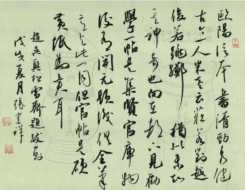
2. There are echoes between words, the upper part connects the lower part, the left part reflects the right part, and the line spacing and character spacing cannot be equal. The book eye should be placed in the center, but it can be larger, so that the words are consistent with the surroundings.
3. The overall exhibition is suitable for works with heavy ink marks. It is suitable for the purpose of relaxation in the home.
4. There should be no typos in the work, and variant characters should not be too obscure.
5. The overall layout of the work emphasizes the top and the bottom.
6. To evaluate the quality of a work mainly depends on the overall visual effect: rhythm, ink color, and pen use.
7. They are arranged in twos and threes, seeming to disperse and then continue, and the Qi veins are consistent. This is the wonderful layout.
3. Ten keys to writing
1. Attack from all sides. With the help of the attack from all sides, the ink color naturally shows the shades, wet and dry, dry and wet, thick and light, light and thick, thousands of changes, making the work full of rhythm.
2. Combination of hardness and softness. Hard strength-----iron and silver hook (thick): soft strength-----moving clouds and flowing water (thin).
3. Cherish ink like gold. Regular script requires one dip in ink to write one character, or even a number; cursive writing requires writing 3-5 characters in one stroke, and the brush hair needs to be restored at the end of each stroke, requiring the paper to be adjusted.
4. Suddenly enlightened. The blank spaces can be wide or narrow, and the wide spaces give people a sense of sudden openness. Art is the process of creating contradictions and resolving them.
5. Use both middle and side. The center has the advantage to establish his strength, and the wing forward has the advantage to seek changes. The center is the requirement of rationality and the core of calligraphy aesthetics; the side is the embodiment of emotion and a means of calligraphy to connect with the gods.
6. Think carefully. Before creating, you must think deeply and think over it repeatedly to be "confident".
7. Complete it in one go. Calligraphy is an expression of emotion, not an expression of skill. You should write in a good state both physically and mentally. When writing, write freely and in one go.
8. Well-proportioned. Generally speaking, the line spacing of works should be wide and the word spacing should be tight. Words should not be placed side by side and should be staggered. There should be gaps between the sections, the arrangement and combination should be rhythmic, the large and small characters should be mixed, and the book eye in the middle should be highlighted.
9. The writing is interesting. Calligraphy is silent music and invisible dance. Seek echoes in the changes to make the whole harmonious and have strong rhythm and visual impact. Use a clumsy pen well, use the pen slightly slowly, have stillness in the movement, and write with interesting ink.
10. Pay attention to Qi Guanqi. The spirit of calligraphy refers to the echo between dots and strokes and different characters, and the trend between characters.
4. Twelve pen details
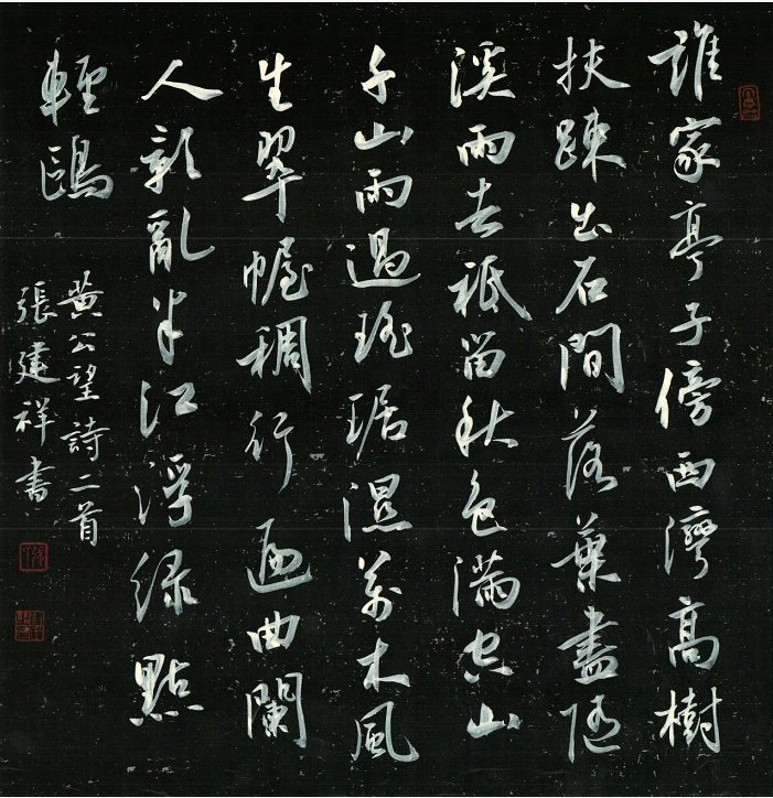
1. There are no horizontal strokes in cursive writing. Cursive writing with horizontal lines should be as short as possible and have a vertical feel. Can be replaced by dashed or thin lines.
2. Avoid the phenomenon of flat dragging, dry brushing, and the same thickness caused by quick strokes.
3. The ink is dull and lifeless. Use thick ink when writing again, and the strokes of thick ink characters should be clearly explained.
4. Avoid the word "eye" in the word to avoid too many "eyes".
5. The middle line is the focus of the work. In a work, there should be several prominent, wonderful and individual words. This is also called "book eye".
6. Long line calligraphy is very important. Be careful when closing the pen. Generally, use a dry pen at the end of the stroke.
7. Characters with heavy pen and ink should not be of equal area. There should be a transition in the weight of the characters and avoid clumping.
8. Thin pens should be tough, and thick pens should be strong. It is necessary to have a thick brush that cuts the silver ditch, and a thin brush that is flowing like clouds and flowing water.
9. The ink is slightly slower when it is dry, slightly faster when it is wet, slightly slower when it is thick, and slightly faster when it is fine. The cursive script has the meaning of regular script, and the regular script must be written in regular script.
10. When handing over a pen, the beginning and end should be clear, and each pen should be explained clearly.
11. Pay attention to the lifting and pressing: neat but not straight, straight but not straight, straight within the curve, and curve within the straight. To "hold the pen and press down."
12. Use the center forward and side forwards simultaneously, attack from all sides, use the center forward for the thin spots, and use the side forwards for the thick spots.
5. Four key points for signing the contract
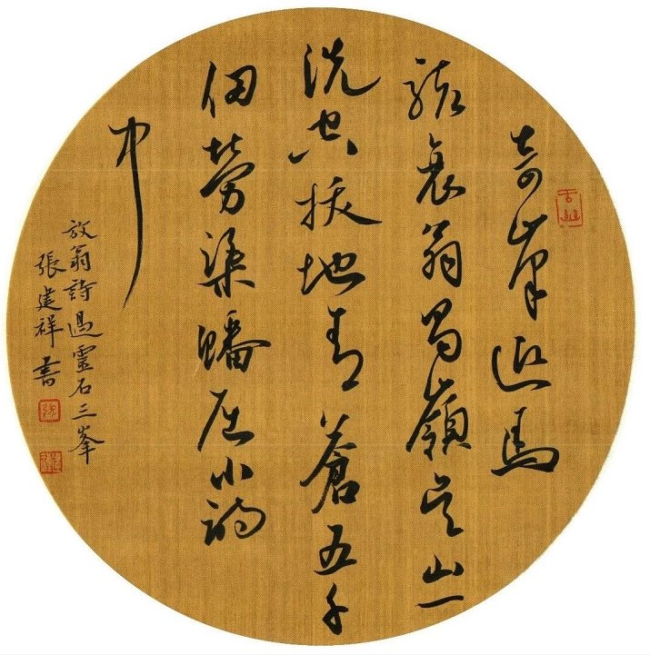
The signature is an integral part of the text and should not be underestimated. Key points:
1. The signature should be less than half the size of the main text. The two lines of inscription should be high on the right and low on the left, and do not change pens.
2. Don’t leave too much space when signing, and pay attention to the proportion of weight to weight.
3. Place the stamped work under glass and a book.
4. It is best not to have more than three seals.
This article is published by 15CiLian.com, please indicate when reprinting: https://www.seowhy15.com/a/406.html


