

Click here to enter
Click here to enter
1. The golden rule in calligraphy practice
There are more than 90,000 Chinese characters in total. If we do not master certain rules, we will need to spend a lot of time and energy practicing repeatedly, but we may not be able to achieve the effect. Of course, the rules we are talking about here are just facing them. A relatively classic rule, of course, this rule is also an exception. We just say that most of them conform to it, so as to help us quickly learn to practice calligraphy and master the skills. Let’s take a look at one of these golden rules [Don’t be afraid of short left vertical strokes] , the right vertical axis is not too long]
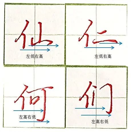
The so-called [left vertical stroke is not afraid of being short, right vertical stroke is not too long] that is to say, when there are vertical paintings on the left and right at the same time (vertical paintings include vertically extending strokes, such as vertical hooks, vertical lifts, etc.), the vertical painting on the left should be written The short vertical strokes on the right side should be stretched appropriately (to put it bluntly, they should be written longer), such as [he] and [men] in the picture. When the right part is not a vertical stroke, it is best not to write the length as long as possible. It exceeds the vertical painting on the left, such as [Xian] and [Benevolence] in the picture. Have you got it?
Here I mainly use a single person as an example to explain this golden rule. Do other people follow this rule?
2. Why do you feel awkward writing?
Why do you feel awkward when writing? This awkwardness means that when you write, you feel that it is not smooth enough. If it is not smooth, it will naturally affect your writing speed and you will not write well. It is difficult for us to practice regular script in our daily life. To write stroke by stroke, we need a certain speed and maintain the beauty of the length as much as possible, so what should we do?
The reason why you are "awkward" may be because you have made a mistake in the stroke order. For the words as shown in the picture, I tried my best to show the string guide. We can clearly see the stroke order and compare ourselves. Is there any difference between my normal writing and this stroke order? Generally speaking, when I write these words, if I follow this stroke order, my hand will be very natural and effortless.
Of course, the so-called stroke order here does not mean the stroke order specified in the standard Chinese characters. It means that if you follow this stroke order when writing, you will feel more fluent. Once it becomes fluent, Your hands will feel natural and you will be able to write effortlessly. Eventually, you will be able to write quickly and beautifully.
In addition, do you also know which characters’ stroke order may cause your writing to be “awkward”?
3. Daily writing can be appropriately "abbreviated" to improve writing speed
Our Chinese characters have undergone a lot of evolution since ancient times. After the New Culture Movement, our language gradually changed from classical Chinese to modern Chinese characters, and Chinese characters were gradually simplified from traditional Chinese to the current standard characters. However, for us adults, in the daily writing process In , abbreviating some characters or some common parts can improve the writing speed, such as the example characters in the picture below:
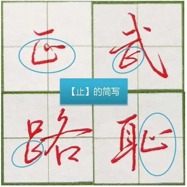
Of course, this kind of abbreviation does not mean random abbreviation. These abbreviations are generally general and highly recognizable. In the abbreviation process, we often draw on the writing habits of running script or cursive script in some ancient posts, such as in the picture. Examples of the characters [正], [武], [路], [Shame], etc. are abbreviations for the same part - Zhi. Since such writing not only improves the writing speed, but does not affect people's understanding, it also has a certain degree of Full of agility.
4. Practical writing skills: changing stroke order
For children, because we need to standardize them uniformly to facilitate and simplify children's learning of Chinese characters, we have promulgated a system of standardizing characters. Some of the characters involved will also be encountered in exams, so for children Generally speaking, it is necessary to master the prescribed stroke order. However, for adults, in the daily writing process, some strokes can be changed in order to improve writing speed and fluency, such as the following band [ The words next to the word 禾
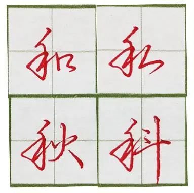
Obviously, the normal stroke order of [禾] should be: left, horizontal and vertical..., but here, the stroke order I wrote is: left, vertical, horizontal and.... This way it is also very smooth to write and conforms to the writing standards of running script. Importantly It will not affect the recognition of Chinese characters and will enhance the appearance. Furthermore, this kind of writing is often seen in ancient posts, especially in cursive scripts, so I think there is no problem in applying it to our daily writing process as adults. What do you think?
5. You may not realize: the "even density" in calligraphy practice
Writing requires "even density". This is not only common in traditional brush calligraphy but also today's hard-pen calligraphy. I would like to take this opportunity to talk with you about my own understanding of "even density" in writing. In view of my personal level It is limited, and there will definitely be some incomplete considerations. I just hope it can serve as a reference for everyone. You are welcome to add to it and brainstorm. Thank you in advance.
Let’s first look at the following four pictures
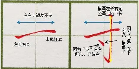
Comparison of four pictures
Comparison of four pictures
[First picture] "One", long and horizontal, left low, right high, is written with the right hand, using the wrist bone as the fulcrum. This shape is naturally formed, and there is no need to deliberately do it. I like writing to be practical, and some words are particularly ornamental. Use The hard pen creates the shape of the calligraphy brush, and it is very vivid and looks very pleasing to the eye. Some people particularly like this kind of thing. Of course, everyone has their own preferences for radish and cabbage. We don’t dare to say anything. It’s all fine anyway, but the emphasis is different. There is no right way. Only when a hundred schools of thought contend can culture be produced, right?
The tail of the horizontal drawing cannot always be tilted up. It must be flattened or pressed down to achieve the purpose of carrying it on the shoulder. The horizontal part is about the same length as the vertical center line of the grid to achieve balance and uniform density.
[Second picture] The key to "inch" lies in the "point". You can imagine that if there is no "point", that is to say, if you write a "ten", should the vertical painting be written in the middle of the horizontal painting? Right, when vertically centered, the two sides of the horizontal drawing are almost the same. Is it also balanced and the density is uniform? However, now there is a little more in the lower left corner, so the horizontal drawing should be closer to the top for balance. At the same time, the vertical drawing should also be to the right, so that the "density" of the entire word appears even. This sentence is a bit abstract at best, but it seems that it is just You can understand it, but what I want to say is that the "density" is evenly distributed. At the same time, if you look closely at the "white cloth", it is actually evenly distributed.
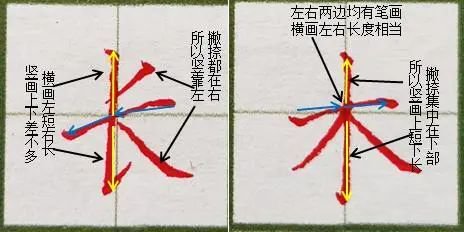
[Third picture] "Long", now the "left and right" are on the right, so the vertical painting is to the left to avoid, the "left and right" are distributed up and down, so the vertical (lifting) part is the same length up and down (bottom Because the drawing is stretched, the vertical part below can also be slightly longer). Feel carefully. If you write like this, do you have a feeling of uniform "density"?
[Page 4] "Wood" and "Bi Na" are both in the lower part, so the horizontal painting is on the top. At the same time, they are distributed one to the left and one to the right, so the vertical painting is in the center. Take another look at "Bai Bai", do you feel it? "Density" is uniform
The above analysis is mainly aimed at some of the common hard-pen calligraphy nowadays. If you have to point out why a certain calligraphy work does not meet the requirements, it will not make much sense. I hope we can [seek common ground while reserving differences]


