How to better learn calligraphy, now we have a detailed text explanation of how to write each character, so that you can practice calligraphy while reading the instructions, and the effect will be better.
If you want to write hard-pen calligraphy well, you must know the stroke order and the strokes of the strokes. Only in this way can the written words be more perfect. Therefore, you must often practice the conversion of stroke thickness. Today I will explain it in detail. Calligraphy list for first graders, start writing good calligraphy now!
The stroke order of entering is: 捺, 捺. The stroke should not be too long. Cut it to the lower right and then draw it out to the lower left. The stroke should be pointed, that is, the stroke should be written with the tip of the stroke. The strokes and strokes intersect above the stroke. Write strokes from light to heavy, and then from heavy to light. Write down and stamp your feet. Skip and press down to make the bottom level.
enter
The general stroke order: horizontal, left, and right. The horizontal line should be middle horizontal, shoulder should be carried (left is low, right is high), and the writing should be vertical and curved. Do not write it as a diagonal and a slant. Start the pen a little higher, cross it in the middle of the horizontal painting, and write 捺 under the horizontal painting from light to heavy, and then from heavy to heavy. When you write it lightly and flatly, it will be slightly longer. Skip and press down to make the bottom level. (The painting I wrote is a bit high).
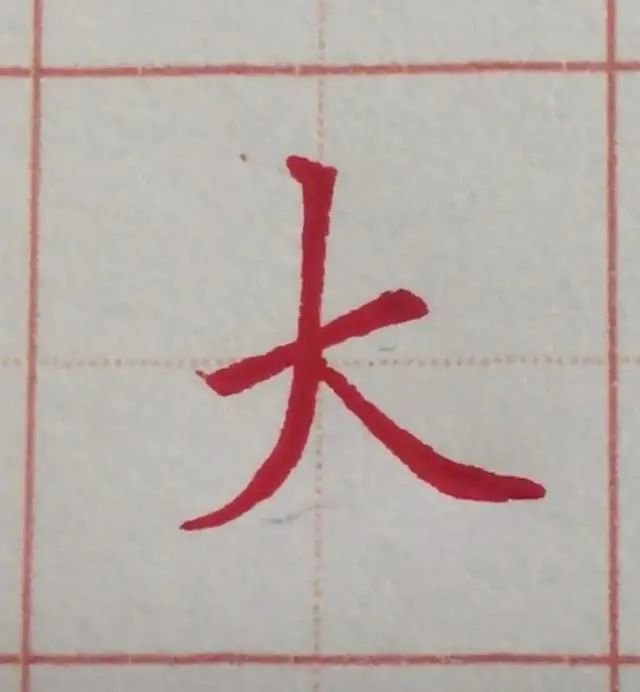
big
The stroke order of Tian is: horizontal, horizontal, left, and right. The first horizontal line is the left pointed horizontal line, shoulder-carrying, and the stroke should be light when starting, then slowly increase the weight during the stroke, and finally pause a little, the second horizontal line is the middle horizontal line, start the pen with a square pen, the two horizontal lines are parallel, the top is short and the bottom is long, and the stroke is Write the tip of the pen in a vertical and curved stroke (slightly slanted vertically), write the stroke from light to heavy under the horizontal stroke, and then write the stroke flatly from heavy to light, with a slightly longer stroke. Keep the lower part flush.
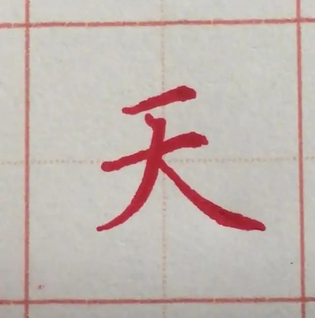
sky
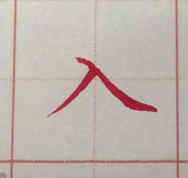
Human stroke order: stroke, stroke. The stroke is an oblique stroke, and the starting point of the stroke is higher than the character "ru". The intersection point of the stroke and the stroke is in the middle of the stroke. Write the stroke from light to heavy, and then write the stroke flatly from heavy to light. The stroke is slightly longer. Keep the lower part flush.
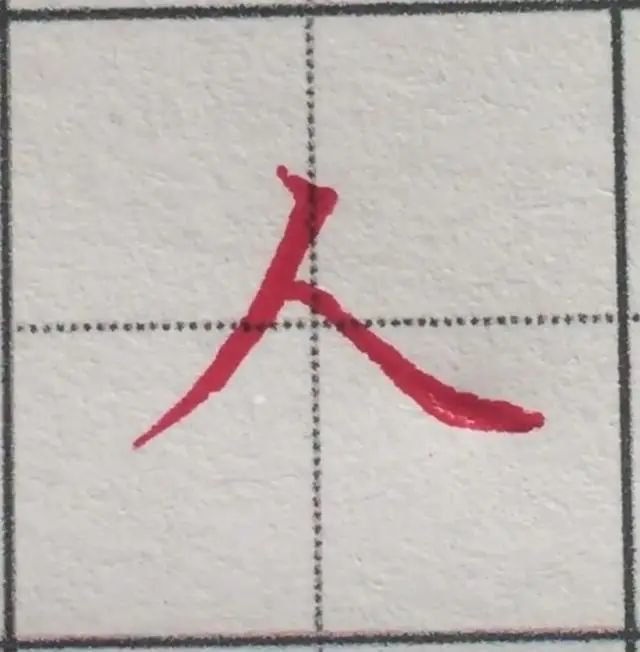
people
The stroke order of fire: dot, stroke (short stroke), stroke, suppress. The point is the right point (it can be forwarded to the upper right, echoing the short stroke), the left stroke is a vertical curved stroke, passing between the point and the short stroke, and under the short stroke, it is written from light to heavy, and then from heavy to light. Write out the foot strokes and leave them slightly longer. Keep the lower part flush.
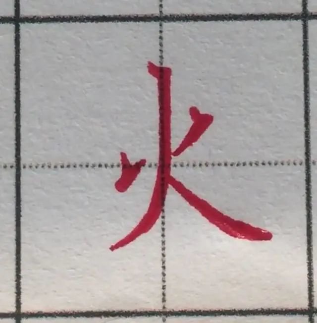
fire
The order of writing strokes: dot, horizontal, left, and back. The first dot is in the middle of the word. The way to write the dot is to put the pen lightly, move the pen to the right and down, and slowly press down hard during the writing process. The dot is in the shape of an oblique raindrop, and the horizontal direction is long. With a slight shoulder shoulder, write the thickness. To change (thin in the middle, thick at both ends, see the long horizontal writing method in the previous lesson), start the stroke slightly below the dot, and the intersection of the stroke and the stroke is perpendicular to the dot painting. Write Na from light to heavy, then write Na foot flatly from heavy to light, leaving it slightly longer. Keep the lower part flush.
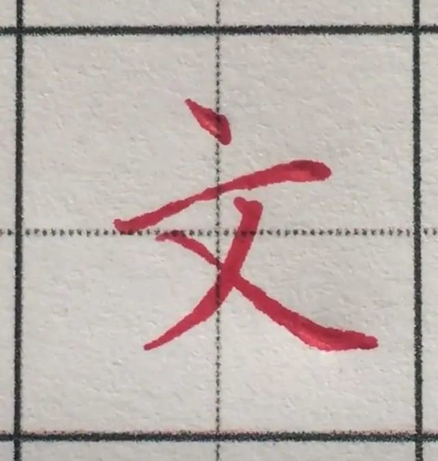
arts
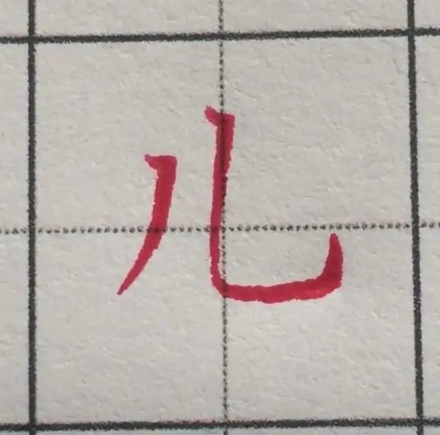
Er's stroke order: left, vertical hook. When writing, write vertically, slightly to the left. The starting point of the vertical hook should be high, the bend should be written as a loose bend, not a square corner, and the horizontal stroke should be longer, and finally the hook should be drawn upward. The distance between the two strokes is moderate.