The head point is high and upright. The first drawing of a character is stipple, and it is located directly on the center of the character. It is generally called the head point. The head point can often express the spiritual momentum of a word. It should be tall and located on the center line of the character. When the character has fewer strokes, the dots should be at a certain distance from the main body of the character. When the character has more strokes, the dots can be appropriately close to the main body.
Center and straight alignment. In a character, when there are middle vertical strokes up and down, or vertical strokes, when writing, you should ensure that the upper and lower vertical strokes are vertical and aligned with each other, so that the center of gravity of the entire character can be stable, otherwise it will be slightly deviated. Or tilting it will destroy the stability of the word.
The dots and verticals are aligned with each other. In a word, there is a head dot and a middle vertical. When writing, the dots and verticals should be aligned with each other to ensure that the upper and lower centers of gravity of the character coincide.
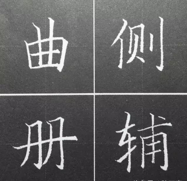
Vertical drawings should be equidistant. When there are multiple vertical drawings appearing side by side in a word, try to ensure that the spacing between the vertical drawings is roughly equal. When there are dots, horizontal strokes, and other strokes between the vertical drawings, the spacing can be appropriately increased. .
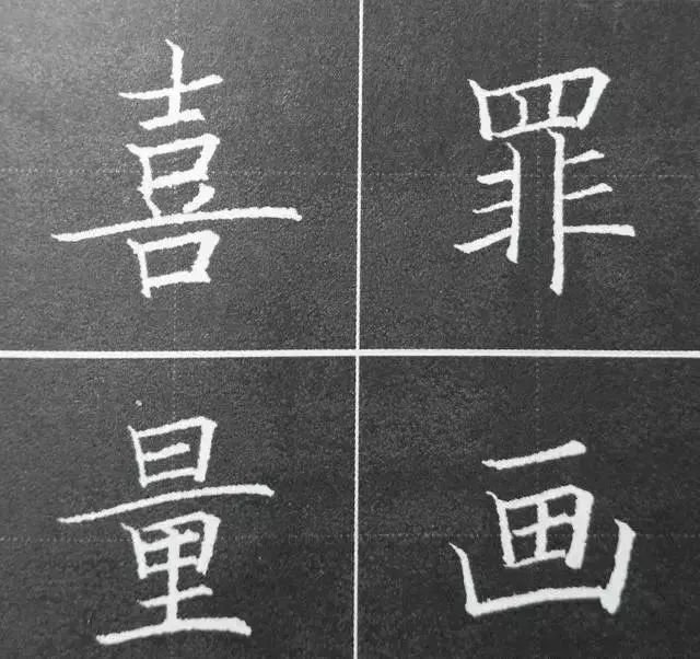
The horizontal strokes should be equidistant. When there are multiple horizontal strokes in a word, try to ensure that the horizontal strokes are parallel and equidistant. When the strokes such as dots, strokes, and strokes are interspersed between the horizontal strokes, the spacing can be appropriately increased.
The fulcrum is in the middle. Generally, the lower half contains an outlined single character or a combined character with an upper and lower structure. The outlined part is often the fulcrum of the entire character. To make the character stable, the hook point must be located on the center line of the entire character.
The middle vertical line should be upright. In a word, if there is a vertical painting in the middle and it runs up and down, the vertical line must be located on the center line and must be vertical. If it is slightly tilted, the center of gravity will be unstable.
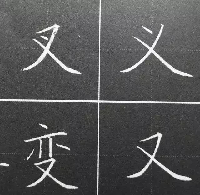
When searching for intersections, if there are crossed characters, the intersection point should generally be located on the center line of the entire character. If there is any deviation, it will affect the overall appearance and make the center of gravity of the entire character unstable.
There are differences in the hanging type. Generally speaking, the hanging type should be used more frequently, while the hanging type should be used with caution. Usually, the hanging type can only be used when the last stroke of a character is vertical.
The bottom horizontal line should be long. When the bottom horizontal drawing is used in a character, it should be stretched as much as possible to support the upper part. The horizontal drawing here can usually play a role in adjusting the center of gravity of the entire character.
Avoid parallel writing. Multiple writings may appear in one word. The length, angle, and curvature of writing should be slightly changed. A simple parallel arrangement will appear dull and boring.