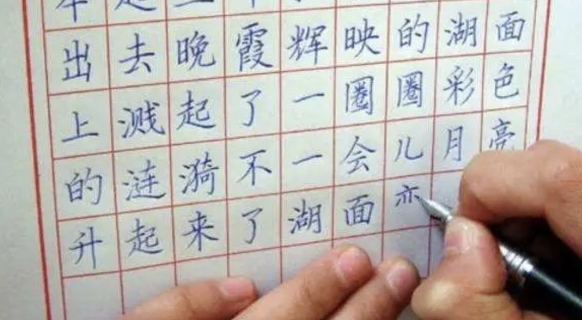
An explanation of the structural key techniques commonly used in hard-tipped calligraphy.

1. For characters with a left-right structure, the left and right sides should avoid each other. The strokes in the middle should be close to each other, and the strokes on both sides can extend outward. Write the left radical smaller and the right radical more prominently. The same is true for structures including left, middle, and right, such as: Ban, Hua, Jiang, Xu, Shu, Wei, etc.
2. "Align top and bottom": Words with a top-bottom structure should have their top and bottom centers of gravity aligned. Regardless of whether they are wide at the top and narrow at the bottom, or narrow at the top and wide at the bottom, their centers of gravity should be on a line. For example: the center of gravity of the words "Chong", "Bao", "Nan" and "Hua" is on the vertical painting; and for example, the center of gravity of the words "window", "home" and "图" is on the stipple painting. The center of gravity of asymmetrical characters is at the intersection, such as: ge, yao, han, ming, etc.
3. "The strokes do not fight": The stipples in regular script should be distributed in an orderly manner, well-proportioned, and not overlapped or crossed. For example, a person's face has regular facial features and clear eyebrows. When writing, pay attention to avoidance of strokes to avoid overlapping and crossing strokes. Words that are prone to failure include: give, rice, Shi, etc.
4. "Arrange evenly": It means that the strokes in a character are evenly distributed, with similar intervals and consistent tightness. For example, in the word "Liang", the horizontal strokes should be evenly spaced; the vertical strokes in the word "zhou" should be evenly spaced, and the three strokes in the word "shan" should be evenly spaced.
5. "The same strokes are different": Calligraphy pays attention to natural beauty. There are differences between words or strokes in a work, just like you can't find two identical trees in a forest, and you can't find two identical trees in one tree. to two identical leaves. For example, for the same strokes, pay attention to the differences in length and direction. For example, the horizontal strokes of "美" are different in length, and the character "Xu" is drawn in different directions.
6. "There is an important point in a word": Everything has its priorities, and calligraphy also pays attention to the distinction between priorities. There are always one to three prominent key strokes in a character. These strokes are generally required to be written in a straight and straight manner. In order to highlight the key points, other strokes are generally required to be written more restrained. Such as: three, see, remove, forever, life and other words.


