
It plays a supporting role in the font structure and needs to be the backbone of an organization, whether it is a family or a corporate team. Then the pillar in the font is the vertical (|). The vertical position should be written straight and strong. From a sensory perspective, all the power of a character is borne by the vertical axis. If the vertical axis is not straight, the character will not be straight. The verticals here are divided into long verticals and short verticals, and the long verticals are further divided into hanging dew verticals and hanging needle verticals. The short vertical is shorter than the long vertical. The writing methods are the same, so there is no need to go into details here. So let’s focus on the long vertical.
Vertical dew: Lift the pen and lower it gently, pause slightly to the right, then stroke vertically downward, pause slightly at the end, then close the pen to the upper left, the end looks like a dew!
Hanging needle vertically: Lift the pen slightly, then gradually lift the tip of the pen downwards, then close the pen to bring out the tip.
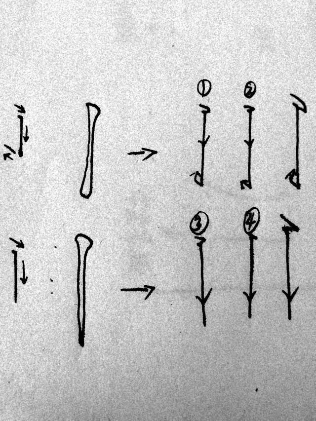
The above is the stroke trajectory. Note that the return strokes of ① and ② are slightly different. You can carefully understand which one is more suitable.
①The dewdrops will be larger when the pen is closed and the dewdrops are hanging down.
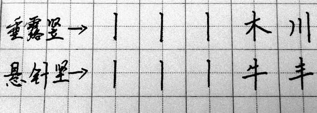
Next, learn a few example words based on strokes:
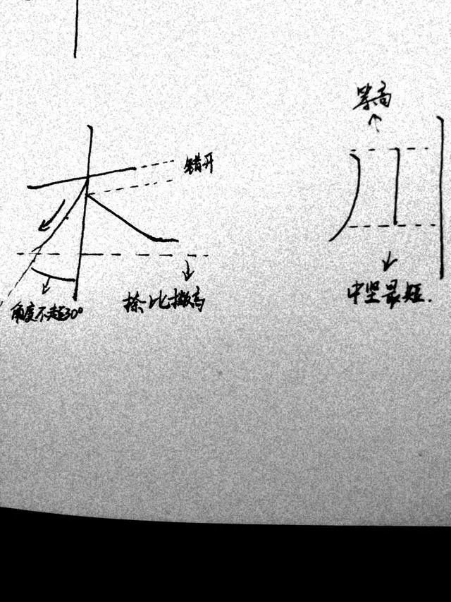
The main thing to pay attention to in the word "wood" is that the horizontal direction should not be too long, the starting points of the left and right sides should be staggered, and the upper and lower positions should be staggered. The end is generally higher or equal to the end. The initial stroke of "Chuan" is parallel to the short vertical stroke, and the short vertical stroke can be slightly higher than the stroke. The short vertical end of the key point should not exceed the end of the sketch, otherwise it will be unbalanced.
The key point of the word "Feng" is the equidistant horizontal stroke. The important thing is the writing method of the last big horizontal stroke, which should be pressed down at the end. Practice more to find a sense of balance, and you will have mastered this word.
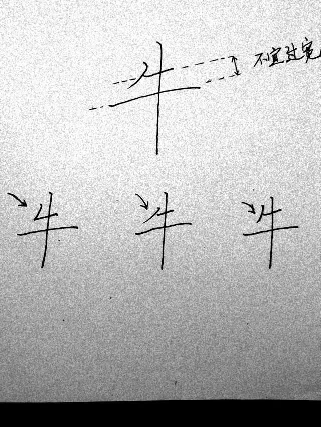
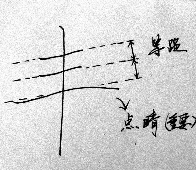
The key to mastering the word "ox" is that the distance between the two horizontal lines should not be too wide. Just fine. But what is very interesting is that different fonts give people different feelings when the shorthand direction is different. During the practice, I found that the contact point between the short side and the short side must not be in the middle of the side. This is a little tip.
The pursuit of beauty is an eternal theme of mankind. The beauty in calligraphy is also endless. Although we don’t try to reach that level, the beautiful words will add to your charm!


