What I want to analyze today is the writing method of vertical hooks in hard-tipped calligraphy, also using teacher Tian Yingzhang’s fonts for analysis. When lifting the pen from the vertical hook, the pen stroke should be drawn downward with a slight arc, so that the vertical hook can be both upright and euphemistic, adding a bit of subtlety to the rigor. When you want to lift the hook at the vertical end, first bend it slightly to the lower left, then lift the pen to the upper left to lift the hook. Don't make the hook tip too long.

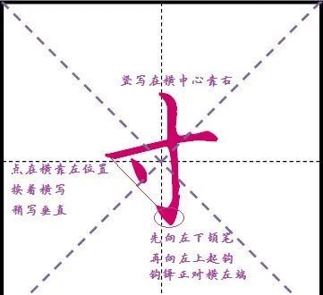
The word "inch" is written horizontally and stretched to length. The intersection point of the vertical hook and the horizontal hook is to the right of the horizontal center, that is, to the right of the vertical center line. The vertical part should be written with a slight arc. When lifting the hook, the hook tip should touch the vertical center line. Don't write it too long, which will take up some space. Click on the left end of the horizontal line next to the horizontal line and write vertically.

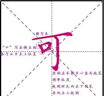
You can write horizontally and long and stretch. The vertical hook starts slightly to the right of the horizontal center, with a slight arc. The hook tip should not be too long and should stop at the vertical center line, otherwise it will occupy the space of the word. The spoken words are written in the middle of the grid, on the upper left side, and pay attention to the three places where the strokes stand out.

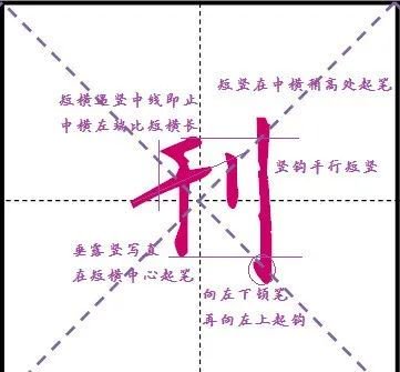
The left part of the middle horizontal line of Qian is longer than the right part. Start the pen vertically in the middle of the short horizontal line. Write straight parallel to the vertical center line. Write hanging dew vertical instead of hanging needle vertical. (For how to write Chui Lu vertical, please click "Let's write together" to view the article "Tutorial on the key pain points of hard-tipped calligraphy, analyze the font of teacher Tian Yingzhang, and it is not difficult to write good calligraphy. (Chui Lu vertical)"). The short vertical position is slightly higher than the medium horizontal position. The starting point of the vertical hook is higher than the stem. When the vertical part exceeds the left side, bend slightly downward to the left and then lift the hook upward to the left. The hook tip should not be too long.

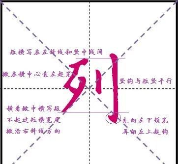
Both the middle and horizontal strokes of the word "bad" should be written along the right diagonal direction, and should not be too long. The folded horizontal part and the middle horizontal part should not exceed the width of the short horizontal part, otherwise it will occupy the short vertical space and the font structure will be very loose. A short vertical stroke is better than a horizontal stroke.


