If someone cannot stand straight, his writing will tilt to one side.
If someone is unjust, his words always appear with a shrug.
The structure of Chinese characters will also affect the way you use the pen. Therefore, we should study penmanship seriously and correct our bad penmanship habits so that we can grasp the rules of Chinese character structure during practice.
Chinese characters are composed of strokes. They are all alive and emotional, and they all occupy part of the space in the characters. If they are not arranged well, you will compete with each other, which not only destroys the harmonious relationship, but also causes stippling. And the various parts are torn apart, without coherence or echo, and even more out of balance, seemingly coherent but spiritually separated.
Ouyang Xun's characters, such as: Hu, end. These two words are integrated into one, and the dots and paintings respond to each other, full of life. Especially the word "end", it seems like two people are in love, looking at each other naturally, and it is handled very well.
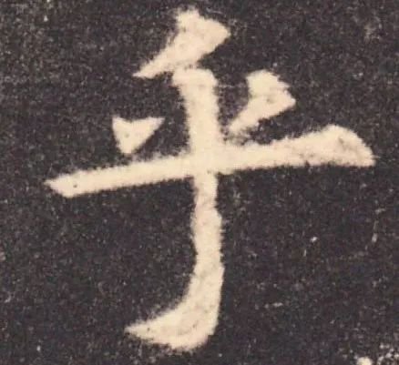
We beginners must first make the Chinese characters move. "Gupan" refers to the dynamics of the Chinese characters. Striving for balance in dynamics is the principle of writing.
The different components within the shape of a Chinese character should respond to each other to achieve a balance of body and momentum of the entire character. Every part of the character is dynamic, and balance is not about being even and steady, but about striving for balance in dynamics. As Ouyang Xun said: instrument, staff.
The slightly tilted left and right parts rely on each other, seeking stability in danger. Without the left part, the right part cannot stand. If all the departments stand upright, the word will lose its lively flavor.
Generally speaking, "Gupan" and "Balance" are the keys to the internal structure of Chinese characters, and must be followed in every word. These two major principles can also be divided into five small rules. These small rules are a good way to achieve dynamic balance.
1. "Backward"
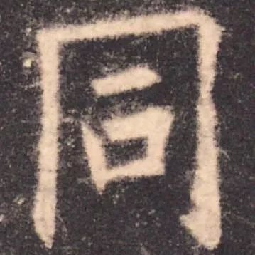
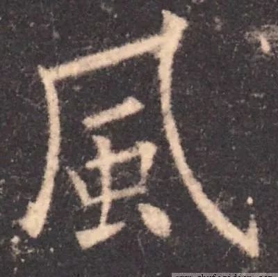
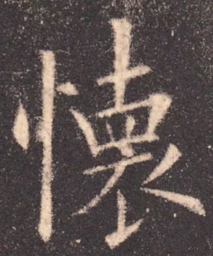
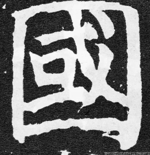
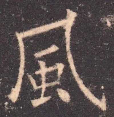
"Toward and backward" refers to the direction and opposite direction between stipple paintings or between various parts of fonts. When facing each other, there is an outward-looking attitude; when facing away, there is a feeling of inward convergence. The purpose of the "toward and backward" rule is to change. Ouyang Xun's fonts are steep and steep, which is formed by the frequent use of the "toward and backward" rule. Such as: Tong, wind, dirty, pregnant.
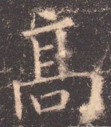
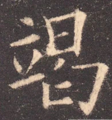
The three characters Nan, Gao and Jie are written using the principle of opposites.
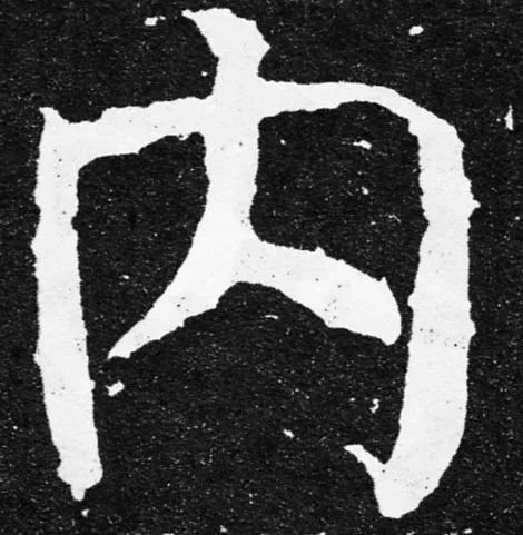
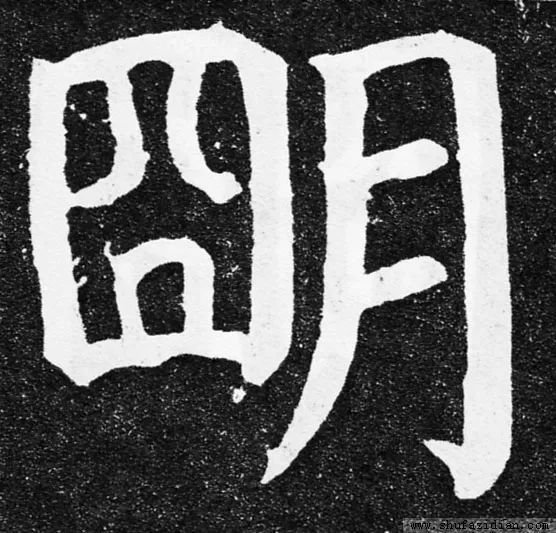
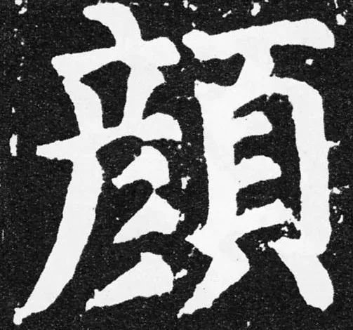
Yan Zhenqing's calligraphy is plump and cheerful, with a majestic and thick style, because he often uses the principle of opposites. Such as: Nei, Ming, Yan, Guo.
The "back-to-back" method is somewhat difficult for beginners to master, so be careful. When using the method of "contrary to each other", pay attention to the contradiction of form and harmony of spirit, and also use the method of "opposite to each other" in combination. The ancients said: "There is no trace of life and death, and the slightest trace is on the back." Scholars should be brave enough to try, use it carefully, and practice a lot.
2. "Retract"
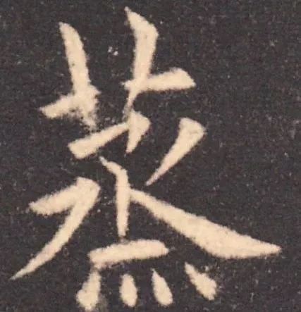
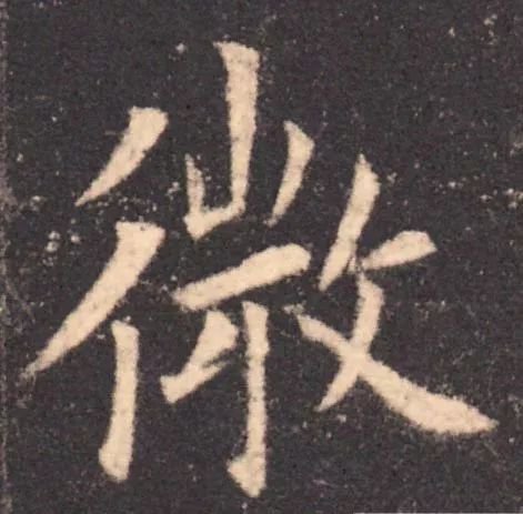
The structure of Chinese characters is most averse to looseness in a flat shape, and "retracting and unfolding" is the most effective method to cure looseness in a flat shape. When a word is closed, it must be released, and when it is released, it must be closed. The two methods must cooperate to break the looseness of the tablet. Ouyang Xun gathered some of the stipples somewhere in the middle of the characters, sometimes in the center, sometimes in the upper or lower parts. This gathering point is not fixed. With this point as the center, stretch out in all directions. Such as steaming, micro, falling, and Wei.
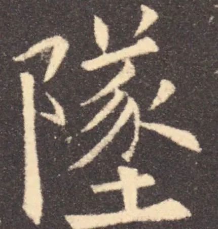
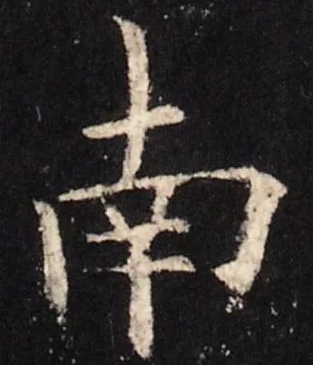
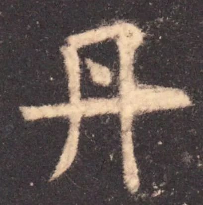
Ouyang Xun also divided the characters into upper and lower parts, or upper, middle and lower parts. He gathered the stipples of some parts and spread the stipples of other parts to form a strong contrast. The polymerized part is closed, and the diffused part is open. For example: Nan, Feng, Sin, Dan and other characters have different opening and closing.
When using the "retract and expand" rule, you should achieve a certain degree of retraction and expansion. Excessive is not good, and insufficient is not good, as it will affect the beauty of the characters. Chinese characters are called square characters, and the degree of expansion and contraction is within the scope of the square.
3. "Density"
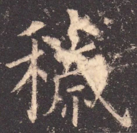
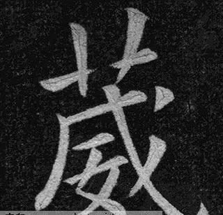
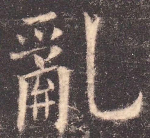
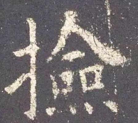
The law of "density" is very useful in the structure of characters. If the spacing between stipples is pursued uniformly, it will appear sluggish and lack variety. Deng Shiru, a calligrapher of the Qing Dynasty, said: "A sparse place can be used for running horses, and a dense place cannot be ventilated." This means that sparse places can be made sparse, dense places can be made denser, and sparseness and density form a strong contrast. When practicing calligraphy, it is necessary to be sparse but not scattered, and to be dense and ventilated. That is to say, denseness can be seen in the sparseness, the shape is sparse but the intention is collected; there is sparseness in the density, and the mental energy is unobstructed. For example, the word "Luan" in European calligraphy is dense on the left and sparse on the right. The strokes in sparse places are thickened, which reduces the white space and makes the sparse parts denser; the strokes in dense parts become thinner, which increases the white space and makes the dense parts sparse. For example, in the word "pick up", the upper part is sparse and the lower part is dense. After the herringbone is bolded, the upper part becomes denser and the lower part feels lighter and sparse.
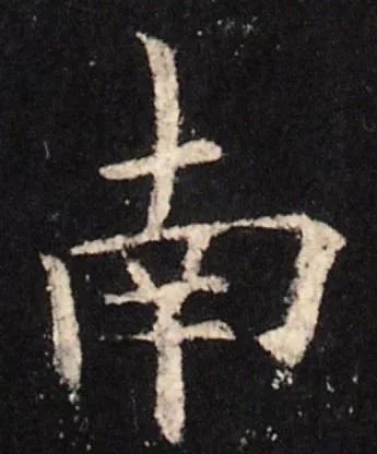
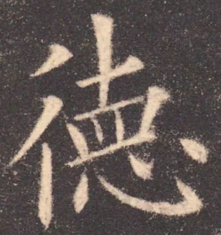
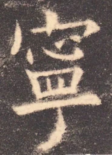
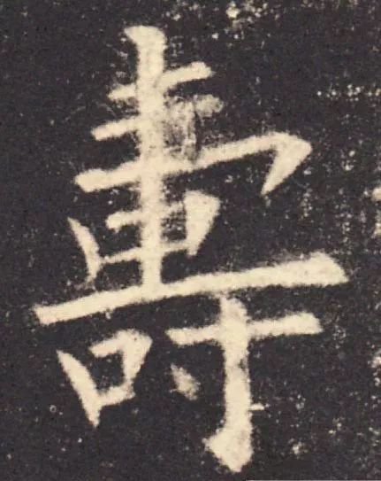
If the strokes cannot be thickened or thinned while writing, you can change the spacing between the strokes. For example, in the word "Europe": "德", the vertical painting of the cross head on the right is elongated, and the horizontal painting is lowered, compressing the lower part and becoming denser, making the entire character dense and dense. If you want to use both density and density methods to form characters at the same time, it can be achieved after learners master it. For example, the European characters "Shou" and "Ning" not only change the thickness of the strokes, but also change the distance between the stipples, making the contrast between density and density more obvious.
4. "Give"
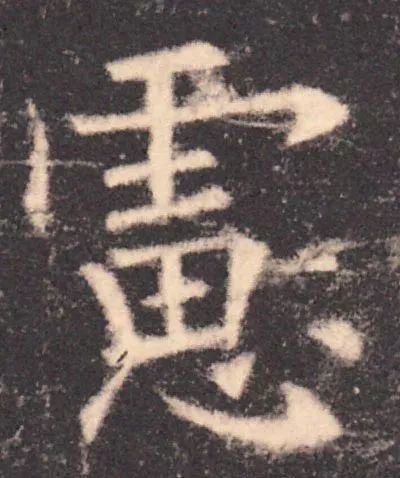
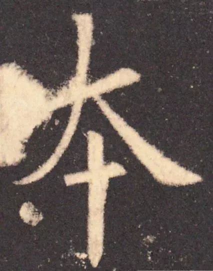
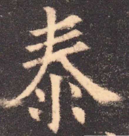
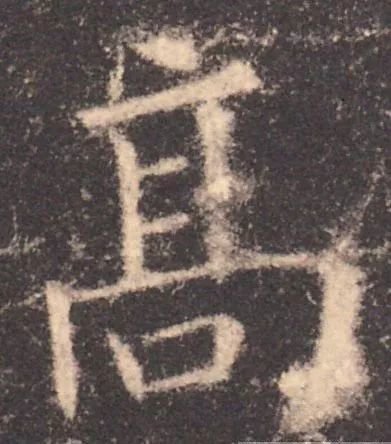
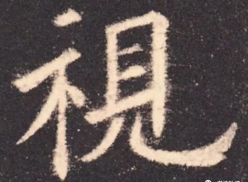
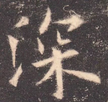
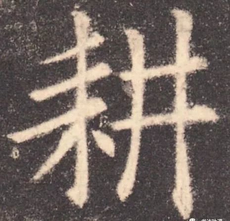
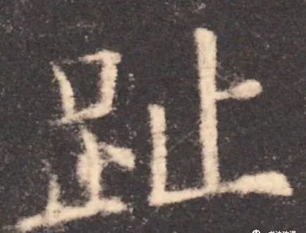
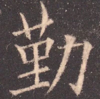
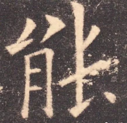
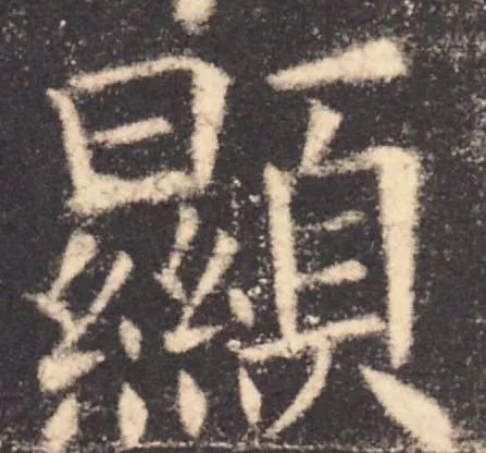
There are single characters and combined characters in Chinese characters. Single-type characters can be stretched in all directions without any worries, while combined characters are composed of two or more single-type characters. This is like a family with many people, who must love and give in to each other. The main single characters in this combined character are stretched as much as possible, and other parts are reduced in shape or shortened in some strokes to make room for the main part. -The parts that generally give way to each other are the radicals, and most of the radicals are on the left, so most of them are left giving way to the right, such as looking, deep, plowing, and toe. There are also those that give way to the left, such as: Qi, Qin, Neng, Xian. There are also those who give way to those who come up. Such as: consider, ben, gao, tai. There are also those that go up and down, such as: quality, sound, poverty, and crown.
Left gives way to right:
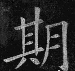
Right gives way to left:
The bottom gives way to the top: