There are about 3,500 commonly used Chinese characters. It would take too long to practice all of them when learning calligraphy. Therefore, I would like to introduce the structural rules of thin gold style to everyone, so that you can have rules to follow when writing and improve the efficiency of calligraphy practice. .
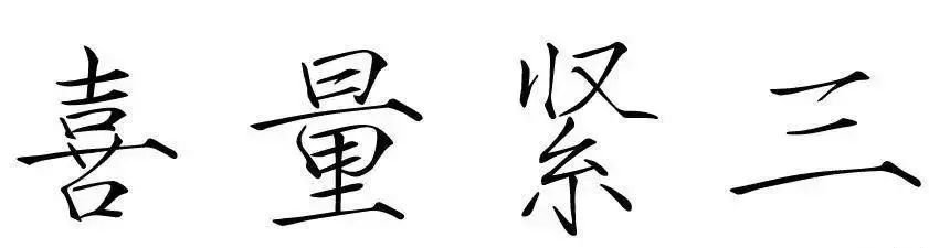
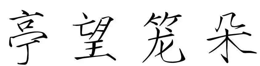
1. Nod high and upright
The head dot is generally the first dot and stroke of a word, and this stroke expresses the spiritual momentum of a word.
Key Points: The point should be directly over the center of the word, should be high, and should be some distance away from the main body of the word.
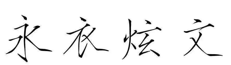
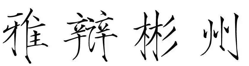
2. Align the points with each other
There is a central vertical pen under the head point. You should consider aligning the two pens with each other to ensure that the upper and lower centers of gravity of the characters coincide.
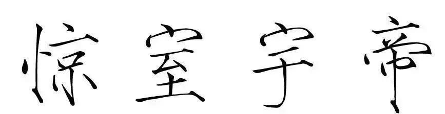
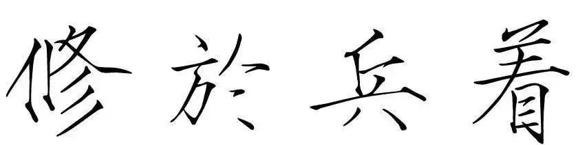
3. Center straight alignment
In a character, the upper and lower parts have a central vertical pen, which should be aligned up and down.
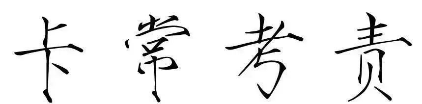
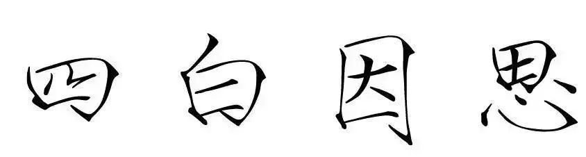
4. Vertical drawing isometric
Multiple vertical paintings are arranged, without interspersed dots, strokes, and strokes, and the spacing should be roughly equal.
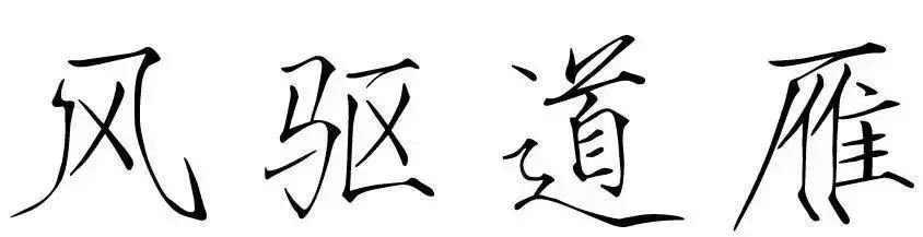
5. Horizontal drawing isometric
There are multiple horizontal strokes arranged in parallel in a character, and there are no interspersed dots, strokes, and strokes. The spacing between horizontal strokes should be roughly equal.
6. Tighten up and loosen down
The structure of most Chinese characters shows a tendency of shrinking at the top and opening at the bottom. Therefore, regardless of the structure, the basic shape of the characters should remain tight at the top and loose at the bottom (compact at the top and open at the bottom).
7. Tighten left and loosen right
The structure of most Chinese characters is not only tight on the top but loose on the bottom, but also tight on the left and loose on the right.
8. Put aside the opening
There are both long strokes and long strokes in a character. The long strokes and long strokes should be opened to roughly the same extent to maintain the balance of the character. However, in words with a left-right structure, the exchange of radicals should be taken into consideration.
9. Symmetrical opening (central dogma)
Each character has a center, which is generally the center of gravity of the character. Therefore, the stroke weight, opening degree, and stroke distance on both sides of the center of gravity should be symmetrical.
10. The main writer exaggerates
The main stroke is the support of the words. Therefore, the main writer must not only write well, but also be prominent, exaggerated, and appropriate.
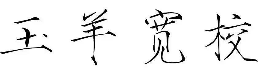
11. The middle palace is compact
The font size of hard-pen characters is smaller, and the center of the characters should be kept tight. Therefore, the overall shape of the character should be inward, and the stippling of the middle part of the palace should be compact.
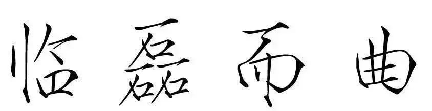
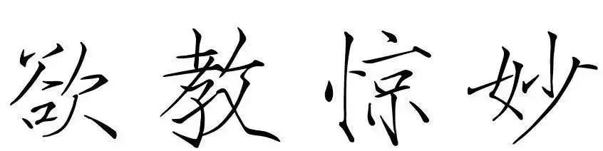
12. Yan does not fly together
If there are more than two similar strokes in a word and they are relatively close to each other, it should be ensured that similar strokes are processed differently to avoid duplication.
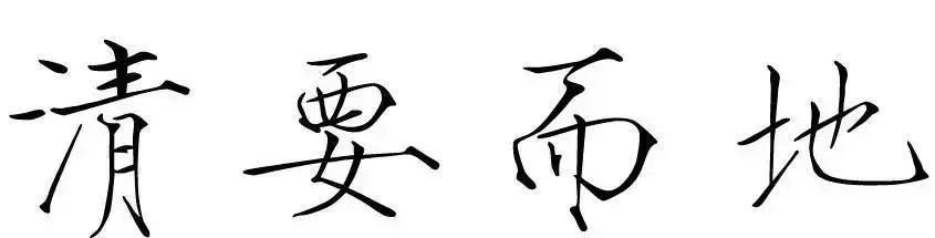
13. Surround but not block
The periphery of the characters surrounding the structure must be able to cover the internal structure to prevent the breath of the characters from escaping. At the same time, attention must be paid to the gap and containment relationship. Peripheral structures cannot be blocked.
Fully enclosed structure:
Semi-enclosed structure:
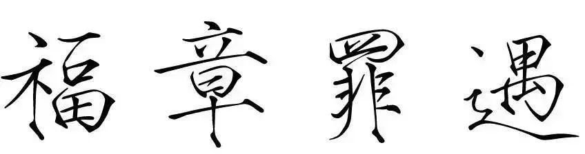
14. Intersperse and echo
When writing words with a combined structure, attention should be paid to the interspersing of strokes to ensure a corresponding relationship to avoid structural independence.
Left and right structure:
Upper and lower structure:
15. Different levels
For characters with complex structures, attention should be paid to the fact that the strokes in the parallel structure should be staggered: some are high and some are short.
Left center right structure:
Upper, middle and lower structure: