
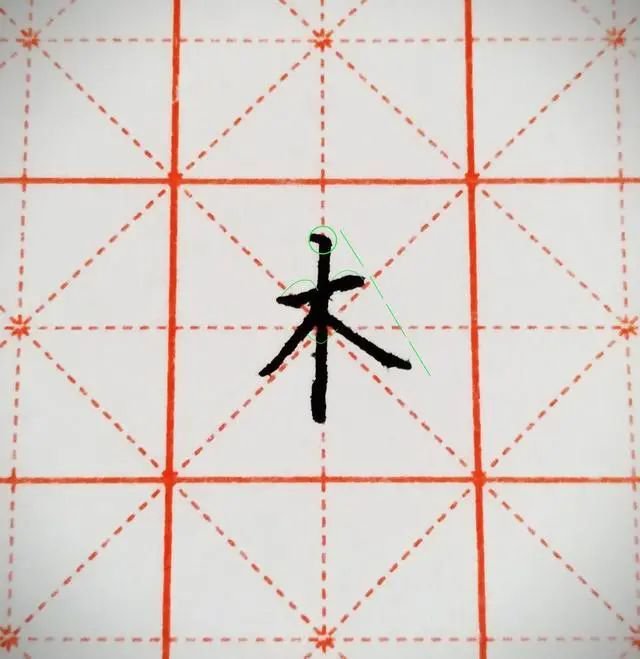
Let me share with you how to write the Chinese character with "wood" in it.
Horizontal drawings should not be too long, with vertical dew hanging in the middle. The pen should be paused when starting, and vertical drawings should be straight. The ratio of the vertical length above the horizontal drawing to the vertical length below the horizontal drawing is about 1:
"Wood" as a single word does not have many strokes, but there are many things that need to be paid attention to. Key points:
① The horizontal strokes cannot be too long, and the starting position of the horizontal strokes is slightly above the midpoint line.
②In the middle is the word "Hanging Dew Ver" (if the last stroke of a character is vertical, it is basically written as "Hanging Needle Ver". In other cases, it is generally written as "Dou Lu Ver"). The pen should be paused when starting the pen, and the vertical stroke should be written upright (this is the most suitable for vertical painting). important point)
③The ratio of the vertical length above the horizontal painting to the vertical length below the horizontal painting is about 1:2.
④The angle between starting to draw and starting to draw is approximately 90°
Detailed explanation: 1. Write the horizontal drawing first, which should not be too long.
2. Then write the vertical painting in the middle. The horizontal painting divides the vertical painting into two parts. The length of the upper part is one-third of the entire vertical painting, and the lower part accounts for two-thirds.
3. When crossing a horizontal stroke with a vertical stroke, write obliquely on the left side, with the stroke at the front, and the position of the stroke and end of the stroke exceeding the starting stroke of the short horizontal stroke.
4. When crossing horizontal strokes and vertical strokes, write oblique strokes on the lower right side. The diagonal strokes bring out the strokes. The closing position of strokes is higher than that of short horizontal strokes. The stroke strokes of strokes are slightly higher than the stroke strokes of offset strokes.
5. To summarize, when writing the word "wood", the stroke should be lower and the stroke higher. (That is, the closing stroke of Ning is higher than the closing stroke of Sliding)
Here are some examples of common mistakes:
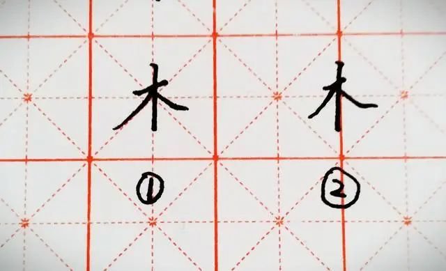
typo writing
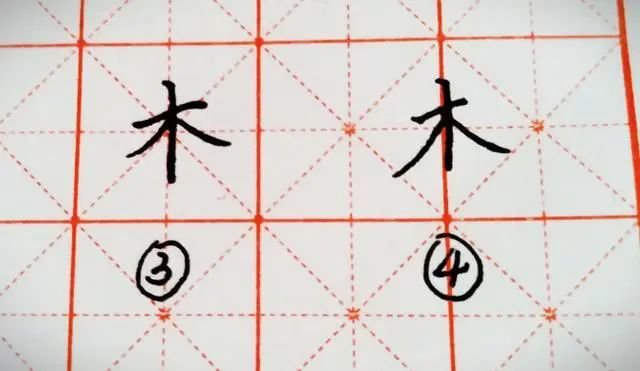
typo writing
Serial number in the picture
1. Obviously, the writing is too long and the strokes are too short. This is the most common mistake that many people make when writing.
2. The horizontal strokes are too short, resulting in the intersection point with the vertical strokes not being balanced and equally divided, and the whole word appears too tight.
3. The horizontal strokes are too long. Although the vertical strokes and the horizontal strokes are balanced and equal, the whole character looks too bloated, and the angle between the strokes below is greater than 90°, making the whole character look increasingly fat and lacking in beauty.
4. The vertical strokes are not written well. They are not straight enough and are too short. The lower part should be lengthened a little longer so that the whole character will appear taller and straighter.
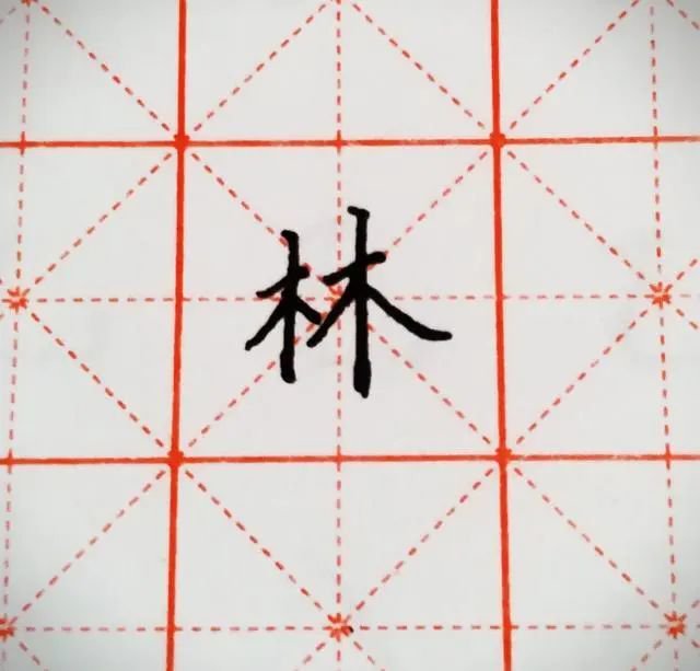
Forest
When writing, you need to pay attention to the left side being smaller and the right side being larger. The strokes on the left side should be changed to stipples, and the strokes should be moved slightly to the upper right. The starting point of the stroke on the left side should be lower than the right side, and similarly the stroke on the left side should be higher than the right side.
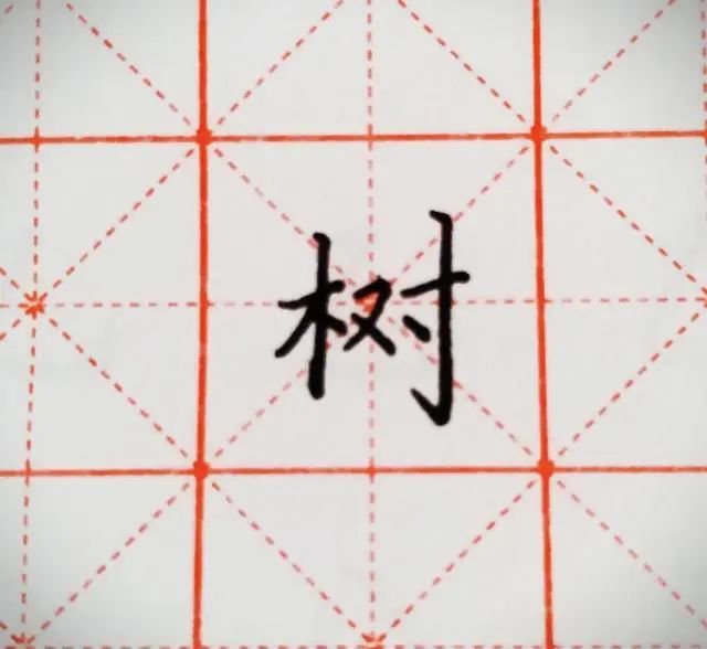
Tree
When writing, you should pay attention to the overall pattern of the characters. The wooden character should not be too far to the right, but should be approximately in the middle of the left to leave enough space to write the rest. The characters in the middle should not be too large or horizontal. The starting position of the pen should be on the horizontal line of the horizontal drawing of the left wood, or slightly lower than the starting point of the pen. On the rightmost part, the starting pen must be higher than the wood, the closing pen must be lower than the left side, and the vertical hook should be longer.
Zha
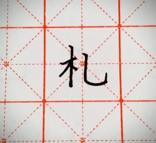
The stippling beside the wooden character Zha has been changed to stipple painting, but it should be noted that unlike the character tree, the vertical hook on the right side of the character Zha cannot be higher than the left side, slightly higher than the horizontal stroke, and the hook cannot be written. It's too far down, basically on the same horizontal line as the vertical strokes of the wood.
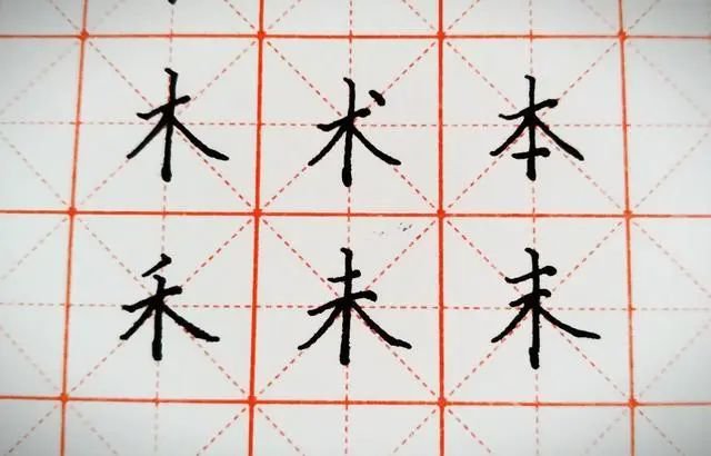
Add one stroke to wooden character
These characters composed of wooden characters and one stroke are basically the same as wooden characters when writing, except that they need to be changed a little bit according to different characters. The stippling of the technique is located on the upper right of the end of the horizontal stroke;
Please note that the word "禾" cannot be written too long, and the vertical strokes above the horizontal strokes must be shorter due to the presence of the short stroke, leaving space for the short stroke;
Pay attention to the original character, the short horizontal line at the bottom cannot be written too far down, nor is it too long, and there must be a certain space on both sides and the left side; pay attention to the "Wei" character and the last character, the length of the upper two horizontal lines changes, and they must be parallel .


