(31): Small on the left and big on the right
【original】
This section is a disease of characters. The left and right are large and small, and they want to stop each other. People tend to make characters with small left and large right, so this and the next two sections are related to the disease.
【Original meaning】
The most common mistake when writing is to write words that are small on the left and large on the right. This is true for many words with a left-right structure. Therefore, you should pay full attention to this when writing.
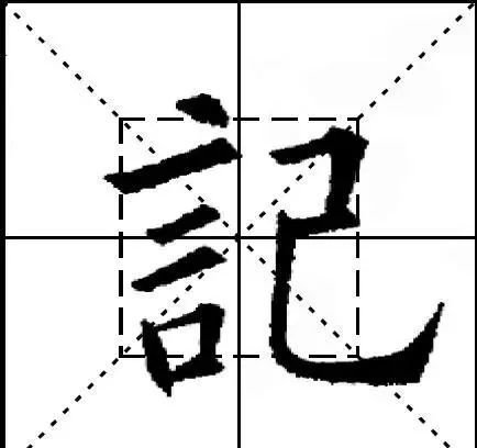
You must pay attention to writing them in similar sizes (this is the original intention of the "Thirty-Six Laws"), such as Ji and Shi. But some characters must be written with the left small and the right large to look good. The left radical should be written small, and the main part on the right should be written large. The left part is yin and the right is yang. The yin and yang and the body characters are beautiful. Like taste.
【New Theory】
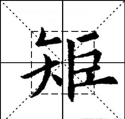
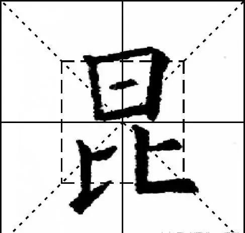
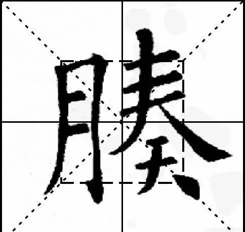
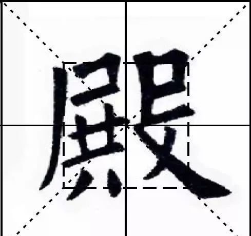
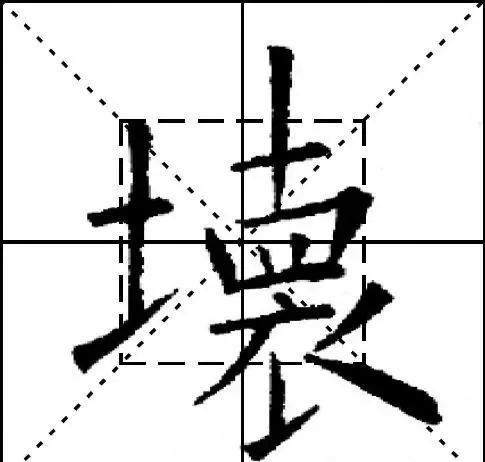
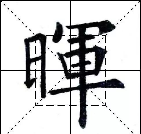
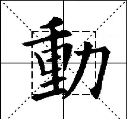
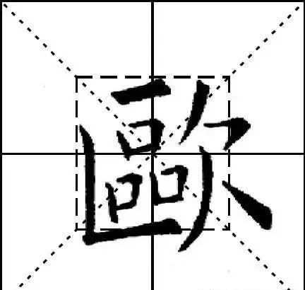
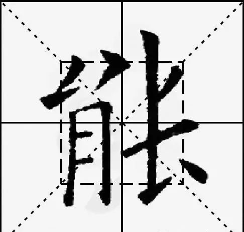
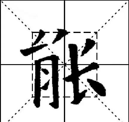
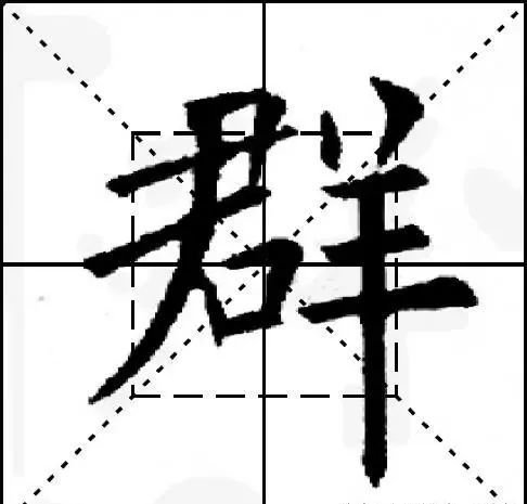
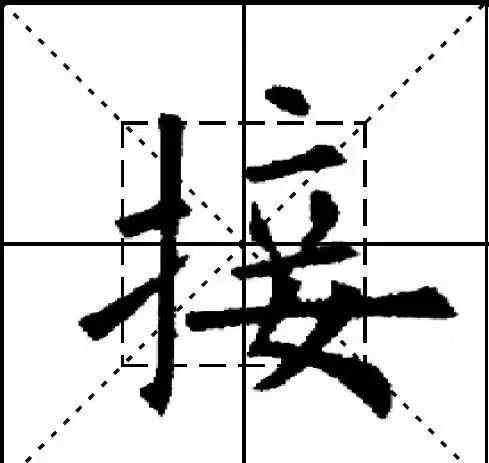
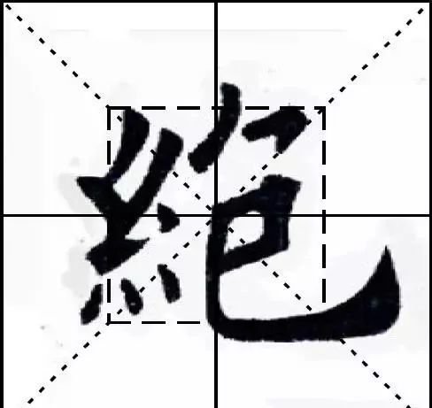
Characters with a left-right structure should generally be written evenly on both sides, and should not be small on the left and large on the right, such as "腠" and "宫". But some characters must be written with the left small and the right large to look good. The left radical should be written small, and the main part on the right should be written large. The left part is yin and the right is yang. The yin and yang combination is beautiful, such as "bad", " Hui". Some characters are more beautiful if they are written larger on the left and smaller on the right, such as "dynamic" and "欧". There are other characters that can be mastered flexibly and can be written beautifully on either side, such as "neng". Therefore, the situation stated in the Thirty-Six Laws is not accurate.
(32): High left, low right, short left, long right
【original】
These two sections are all diseases of words. It cannot be left high and right low, it is called one shoulder. The left is short and the right is long. This is what the "Eight Jue" says: Don't make the left short and the right long.
【Original meaning】
This is also a mistake that is easy to make, that is, writing the characters high on the left and low on the right, short on the left and long on the right. Left high and right low is called "one shoulder"; left short and right long is not recommended in "Eight Jue".
【New Theory】
The "Thirty-Six Methods" is not accurate here. Generally speaking, characters with a left-right structure should be symmetrical on both sides, not high on the left and low on the right, or short on the left and long on the right. However, some characters should be written high on the left and low on the right, especially For characters with smaller components on the left, raising the position of the left side can increase the torque on the left side and create a visual sense of balance. Characters that are short on the left and long on the right are also more common, mostly determined by the structure of the character itself. There is a saying: the left part is high and the right part is low. The left and right parts are flat and not beautiful. The left part is yang and the right is yin. The clear distinction between yin and yang produces ecstasy.
(33): 褊
【original】
Students who learn European calligraphy tend to write long and narrow characters, so this method requires them to end neatly, converge closely, and be arranged in order, which will give them an old-fashioned feel. "Shupu" says that being secretive means being old-fashioned, so being noble means being naive.
【Original meaning】
People who learn Ou Kai script tend to write long and narrow characters because Ou Kai script takes advantage of the vertical style. Strive to write words neatly and closely, evenly arranged and stacked, and the density, size, length, width and width are all reasonable. This is the best way. "Shupu" says that precision is laoqi (here it means sophistication), that is, nobleness is qi.
【New Theory】
褊 (biǎn) means small and narrow. If the European style is not wide, it is often written as narrow, which conforms to the golden section. It is boxy and has no aura. In fact, characters with upper and lower structures are often like this. The aspect ratio is about 3:2 (3/5=0.6, close to 0.618), which is a golden rectangle. The aspect ratio of characters with left and right structures is usually 2:3, which is also a golden rectangle. Due to different glyphs, the ratio is not static, and is usually between 4:3-3:2 (3:4-2:3).