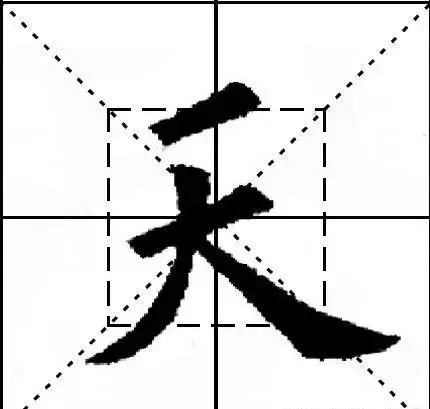
(28): Small becomes big
【original】
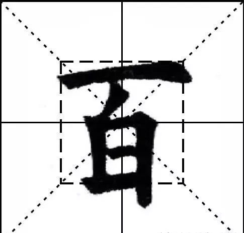
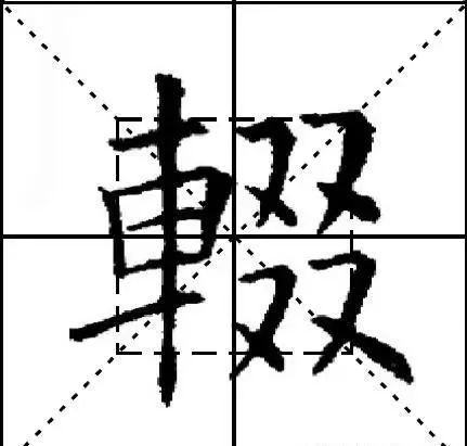
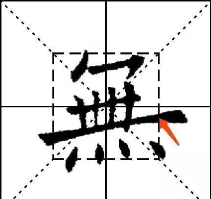
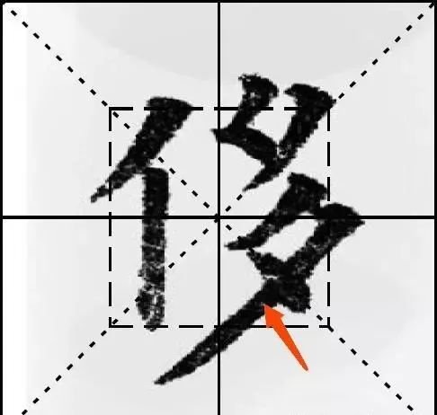
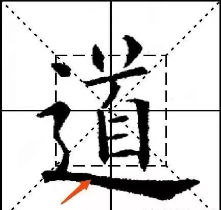
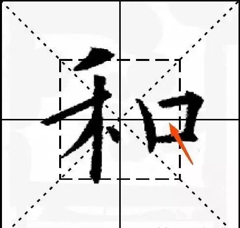
The characters are big and small, such as "men", and "辶" is the big one. When a small word becomes a big one, the shape of a character is as small as a small word, so it is said that a small word becomes a big word. For example, the word "Gu" is only in the last "乀[捺]", the word "Ning" is only in the last "亅", and "Qian" is "The word "ge" is a little bit, and the word "ge" is a little bit.
【Original meaning】
The so-called "little becomes big" means that whether many characters in Chinese characters can be written well often depends on the key strokes or the key radicals. For example, "men" and "辶", the key to writing these types of characters well is to write the radicals of this shape well. Once the big parts are written, it’s not difficult to fill in the smaller parts. For another example, the key to writing the character "Gu" well is the last stroke "乀[捺]", the key to writing the character "Ning" well is the last stroke "亅", and the key to writing the character "owed" well is to the left The key to writing the word "ge" lies in the last point.
【New Theory】
"Xiao Cheng Da" means "main writer". Whether many characters are written well or not mainly depends on a certain stroke. Although this stroke is only one stroke in the whole character, it is a minority or a small proportion, but it is of great significance. A small one can become a big one. Many people call it the "main stroke". Ignore it because it is small, otherwise you will lose the big because of the small. The main stroke does not just refer to a stroke. Some main strokes are a radical, and some are a main component of a character. Once the main stroke is written, half the success is achieved, and other strokes are relatively easy to write.
(29): Small and big forming
【original】
It is said that each character in small characters and big characters has its own situation. Mr. Dongpo said: It is difficult for large characters to be dense and seamless, and it is difficult for small characters to be broad and generous. If the large characters can be dense and the small characters are broad, it will be perfect.
【Original meaning】
The so-called "small and big shapes" means that no matter small or large characters, each has its own situation and requirements. Su Dongpo once said: It is difficult for large characters to be dense and seamless, and it is difficult for small characters to be broad and sufficient. If you can do this when writing the layout, hopefully everything will be perfect.
【New Theory】
It means that no matter small or large characters, they should have their own shapes and strengths, just like people, no matter how high or low they are, should have an independent personality. Don't write in a vulgar way because of small, or too powerful in large. Small characters should be written with a broad structure and thick strokes, while large characters should be written with light, thin and dense strokes. In addition, momentum must be created through structure, so that each character has its own independent momentum, so that each character screams. This is a difficult point in calligraphy.
(30): small big size
【original】
"Calligraphy" says that large characters make the order smaller, and small characters make the order bigger, which is naturally wide and fierce. For example, the character "日" is too small to be as large as the character "国", and the characters "一" and "二" are sparse. If you want the calligraphy and painting to be alternate with the secret, you must think about the positioning and arrangement to make it suitable for each other. Then for the top. Or say: "It is said that the top is small and the bottom is big, and the top is big and the bottom is small. I want them to be proportional." This is also a saying.
【Original meaning】
"Calligraphy" says: "Big characters make small characters smaller, small characters make bigger characters bigger, and it is naturally wider and more powerful." That means when writing big characters, you should write them as small characters, and when you write small characters, you should write them as big characters. In this way It’s easy to write appropriately. For example, the character "日" is very small and cannot be written as big as "国". If "日" is written as big as "国", it will appear extremely huge. If placed next to "国", the word "国" will appear very small. This is actually a visual illusion, but it is very important for writing. Another example is "一", "二" and other characters with very few strokes. This visual pattern must be taken into consideration when writing. For characters with few strokes, the strokes should be written thicker and their size should be controlled to make them more legible. It appears balanced and harmonious when placed together with other words. Pay attention to this issue if it is easy to write characters that are large at the top and small at the bottom or large at the bottom and small at the top.
【New Theory】
When writing big characters, treat them as small characters, and when writing small characters, treat them as large characters. The characters will not become insignificant because of their small size, nor will they appear bulky because of their large size. The characters in the entire work will be The sizes are suitable, and when placed together, one is not too big and the other is not small (the rows and grass are different, which does not fall into this category), and the whole is coordinated and beautiful. However, big characters are still big characters. No matter how thick and heavy the small characters are, they cannot be larger than the large characters. So, how to write small characters toward larger sizes and large characters toward smaller characters? It must be realized through the thickness and density of strokes. The strokes of small characters are thick and sparse, and the strokes of large characters are thin and dense (the root "small and large forming" is somewhat similar), so that the entire character can be of a suitable size.