When talking about structure, we must first talk about the basic structure of Chinese characters, which can be roughly divided into six types: upper-lower structure, upper-middle-lower structure, left-right structure, left-middle-right structure, inner-internal structure, and single-body structure. The structure of Chinese characters has been developed and passed down by Chinese families for thousands of years and cannot be changed.
However, calligraphy gives "beauty" to the structure of characters and becomes art and culture. It is the quintessence of the country and deserves to be inherited and carried forward. Ou Gong was good at creating beauty in small areas, leaving behind the treasure of "Jiucheng Palace". For more than 1,300 years (founded in the sixth year of Zhenguan in the Tang Dynasty (AD 632)), generations of calligraphers regarded it as the pinnacle of regular script. , Youdao does not dare to say that he is a calligraphy lover if he does not practice "Jiucheng Palace". The overall idea of "Jiucheng Palace" is just like what is stated in "Thirty-Six Laws", and the laws are strict. It will be of great benefit to those who study calligraphy if they follow its rules.
This article attempts to use Ou Kai's "Jiucheng Palace" as a carrier to explain the method of construction in plain and easy-to-understand language, with illustrations to support it. It is called "New Theory of Ou Kai's Thirty-Six Construction Methods, with Illustrations and Explanations". It is for the learning and use of those who are familiar with Europe. If there are any shortcomings, I hope you can criticize and correct them more!
(01): Array
【original】
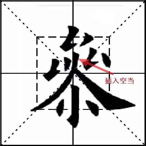
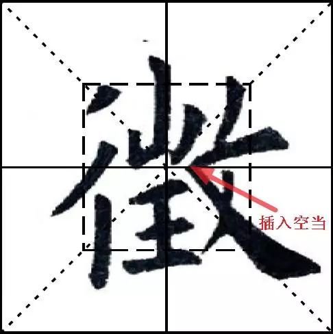
The characters should be stacked, dense and even, and should not be wide or narrow, such as "Shou", "Gao", "Hua", "Dou", "Bi", "Li", "縸", and "爨" , "tie" side, "yan" side, etc., "Eight Jue" calls "distribution of white in intervals", also known as "mixing evenly and stippling". This is what Gaozong calls "stacking" in "Singing Method".
【Original meaning】
"Pai Lai" is also called "Pai Lai", which means that the structure of the stipple painting should be evenly distributed, not neglected, and should be evenly distributed.
【New Theory】
Calligraphy is a black and white art, using ink in a square inch. What you see are black strokes. However, it is the white that really produces the visual effect. In most cases, white is evenly distributed and gives people a comfortable feeling. Therefore, calligraphy pays special attention to the white cloth. Through strokes and structural arrangements, the white is evenly distributed, which is what Ou Gong said.
It should be noted that this kind of uniformity refers to the uniformity within the characters, rather than requiring the edges of the characters to be as uniform as the interior (the entire character layout must be uniform is another level of meaning. I only talk about a single character here, not the entire character) .
Uniform white distribution is the overall requirement, and there are many ways to achieve it. Lines (not necessarily single strokes) are parallel, equidistant, and the structure is symmetrical, which is the most commonly used one.
 Ou Kai pays attention to the balance of agility and force. Sometimes the strokes are deliberately non-parallel, unequal, and asymmetrical, and the whiteness is even and even in the chaos, which is unusually beautiful. However, if it is parallel, equidistant, and symmetrical, it will look dull.
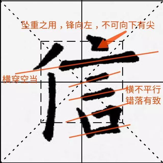
Characters with few horizontal and vertical strokes and asymmetric structure also require uniform whitening.
 Other situations are similar and will not be described again.
Calligraphy is like being a human being. It must be balanced and appropriate. It cannot be too heavy on one hand and too light on the other. Going to extremes will be very bad.
There are many principles in calligraphy that can be extended to how you deal with people, and are of great benefit.
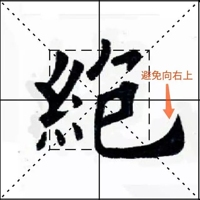
(02): Avoid
【original】
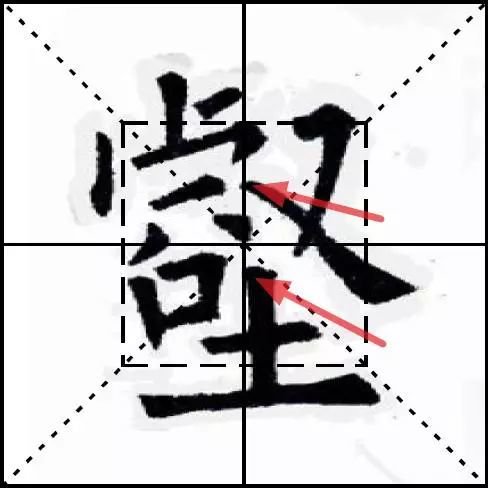
To avoid danger, make it easy; to avoid danger, make it easy; to avoid distance, make it near, so that they can complement each other properly. Another example is the word "庐". The upper stroke is sharp, but the next stroke should not be the same; the character "Fu" has one stroke downward and one stroke to the left; the character "鈥" has "辵" drawn out from the bottom, so the upper stroke must be dotted. Also avoid overlapping and keep it simple.
【Original meaning】
When considering the distribution of Chinese character stipples, avoid dense places and tend to empty places, avoid steep places and tend to easy places, avoid far places and tend to close places. The purpose is to make the stipples reflect each other. , well balanced with each other. For example, in the character "庐", if the upper stroke is sharper and longer, the lower stroke should be different; in the character "Fu", of the two strokes, one stroke should be downward and the other should be downward. To the left; the word "辶" (the traditional Chinese character for "辶" is "辵" (chuò), which means walking). When writing on the left side, the three characters above should be changed. The point is to avoid overlapping with other parts, so as to achieve a balance between complexity and simplicity.
【New Theory】
Except for single characters, Chinese characters are composed of multiple parts. The parts are written individually and all have conventional poses. However, if they are combined together, if they still maintain their original posture, they will be crowded with each other, or the density will be uneven. How to do it? It is necessary to change the original shape or structure of the parts, mostly through changes in strokes, so that multiple parts can be put together to complement each other.
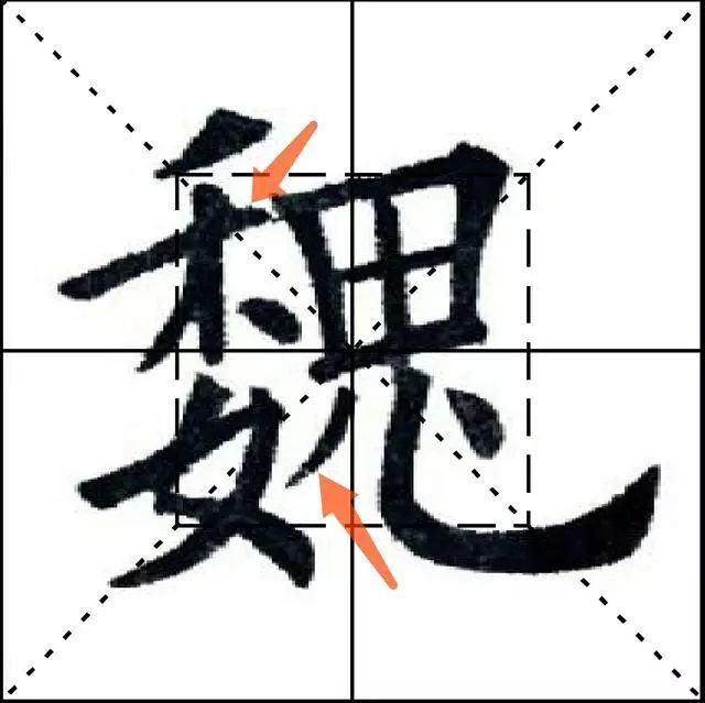
"It's easy to avoid danger" is the hardest to understand! The "risk" here is different from the "risk" in Europe. Bad phenomena such as being too dense, too branched, causing the whole character to be unstable and dull are very dangerous and should be avoided. Similarly, if some strokes are too far away, it will cause branch edges and make the whole character unstable, which should be avoided.
Calligraphy is like being a human being. You must have an overall view and put the overall situation first. When you need to avoid it, you must be humble and restrained. Just give in and give way to others. To achieve the overall situation, you are actually achieving yourself. You cannot be individualistic and heroic, and express yourself selfishly and vigorously for your own interests. That will destroy the whole and everyone will not benefit.
Everyone has seen Zhang Yimou's "Hero"! It begins with some people using wooden sticks to write on the ground sprinkled with white rice. It ends with the realization of the true meaning of "hero", that is, the real "hero" is those who have an overall view, and "individual heroism" is relatively narrow and ungenerous.
Calligraphy has its own world, and in many aspects it is similar to life.
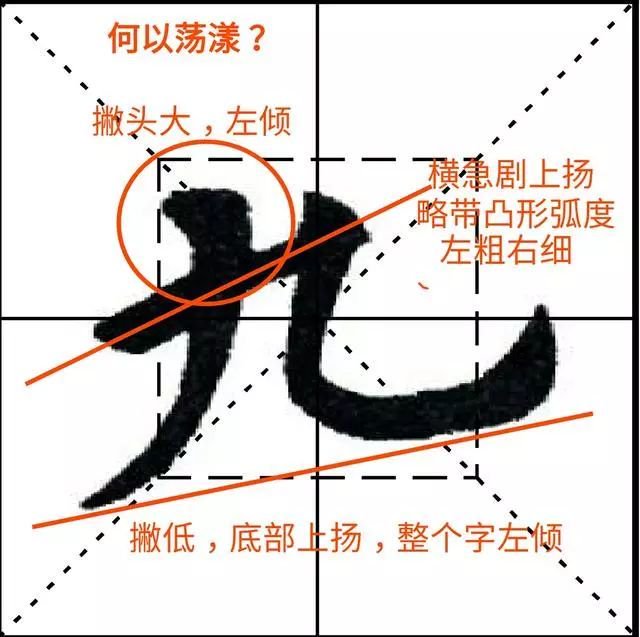
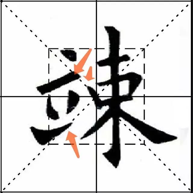
(03): top wear
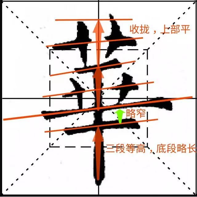
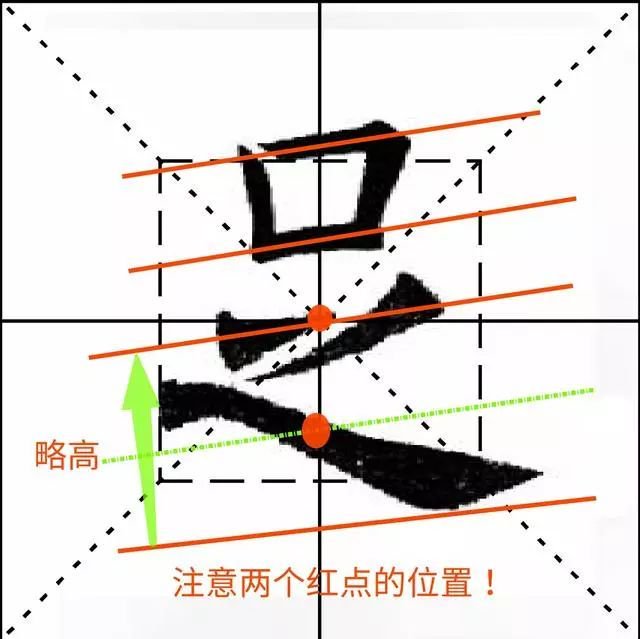
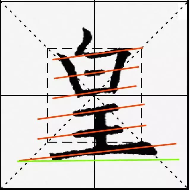
[Original text] There are many characters that are connected to the top, but the ones that are heavy on the top and light on the bottom should be worn on the top, in order to gain power, such as "曡", "雷", "Yao", "鸾", "Jing", "Lu", " "Hu", "Sheng", "Yi", etc. The so-called oblique in "Ba Jue" is just like what people call "download", and it also means that you can't be light on the head and heavy on the tail.
【Original meaning】
There are many Chinese characters with upper and lower structures, giving the impression that the lower half is pushing against the upper half. Some characters have more strokes in the upper half and fewer strokes in the lower half, giving the impression that the upper part is heavier and the lower part is lighter. Pay attention to the balance in the layout of these characters, so that the lower half can stand up to the upper half, "曡", "雷", "药", "鸾", "星", "Heron", "鬐", Words such as "sound" and "medicine". "Ba Jue" says that the writing of this type of characters is like a human being, it must be evenly balanced up and down, the top should not press the bottom, the bottom can support the top, and it should not be top-heavy. This is emphasized.
【New Theory】
Characters with a large top and small structure are determined by the font shape and cannot be changed. However, in calligraphy, you must first avoid being top-heavy, otherwise it will become a big-headed calligraphy. If you want to achieve a symmetrical pattern up and down, use light strokes instead of heavy strokes. The strokes can also be placed outward to make the lower structure stronger. For example, the horizontal and vertical curved hooks in the lower part of Rulan are placed outward, and the horizontal hooks in the lower part of Bao are similar.


There is also a method of increasing the strokes of the lower part to enhance the supporting force of the lower part so that the lower part can bear the weight of the upper part.


In addition to avoiding being top-heavy, you must also hold it firmly. This is mostly achieved through modeling, such as upper and lower concave and convex docking, interspersed and strengthened connections, etc.


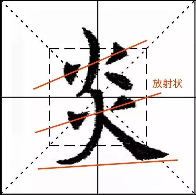
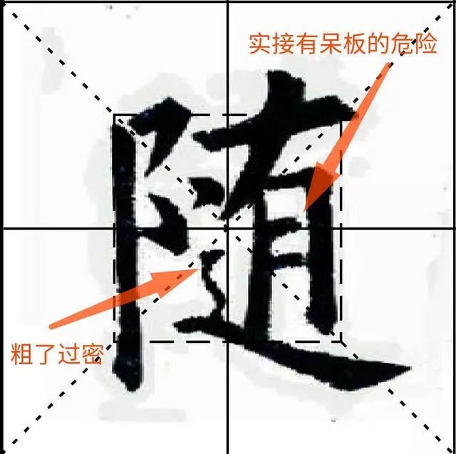
(04): interspersed
【original】
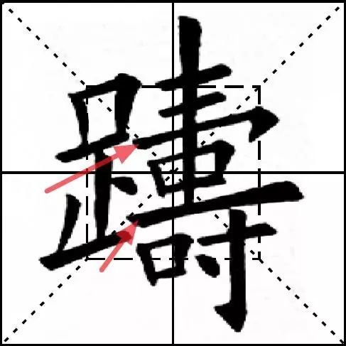
When calligraphy and painting are interlaced, the sparseness, length, and size should be even, such as "中", "福", "京", "qu", "书", "Jian", "Yu", "Yu", "Shuang" ", "er", "xiang", "yong", "er", "lou", "you", "chui", "che", "wu", "mi", etc., the so-called four sides in "Ba Jue" Stop evenly, all eight sides are present.
【Original meaning】
There are many characters in Chinese characters whose stipples are intertwined with each other. When writing, you should pay attention to the density, length and size of the stipples, such as "Zhong", "Fu", "Well", "Qu", "Ci", "Jian", "Yu", " Words such as "Yu", "Shuang", "Er", "Xiang", "Yong", "Er", "Lou", "You", "Cui", "Che", "Wu", "Mi" , this is what is meant by "stopping evenly on all sides" and "equalizing all eight sides" in "Eight Secrets".
【New Theory】
Interlaced stipples often appear in single-type characters. The position of the intersection must be accurate, the interlacing must be stable, and attention must be paid to density, length, and appropriate size. There are evenly divided positions and unevenly divided positions, both of which are arranged according to the requirements of equal weight on both sides.
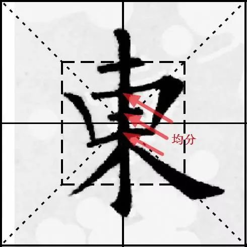
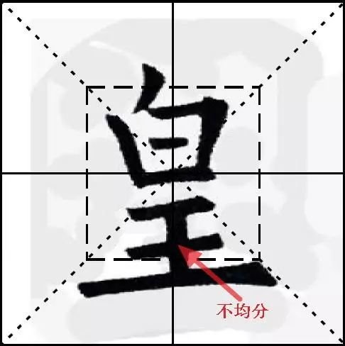
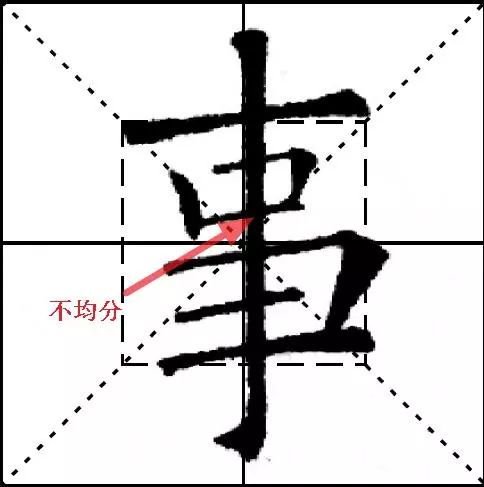
Among non-unitary characters, interlacing occurs mostly in characters with multiple components, which is reflected in the relationship between multiple components and strokes of the character. This interlacing helps to establish a connection between multiple parts, making it appear compact and avoid looseness.