Beginners must master the following basic rules:
1. Size:
The most taboo thing about regular script is that "characters are like operators", large and small, long and flat, it is best to use each one's potential. Printed characters bring convenience to our reading, but they also have some adverse effects on our understanding of regular script. For example, many teenagers understand that the characters must be the same size and that the characters must fill up the grid, etc. Figure 1:
2. Fairness:
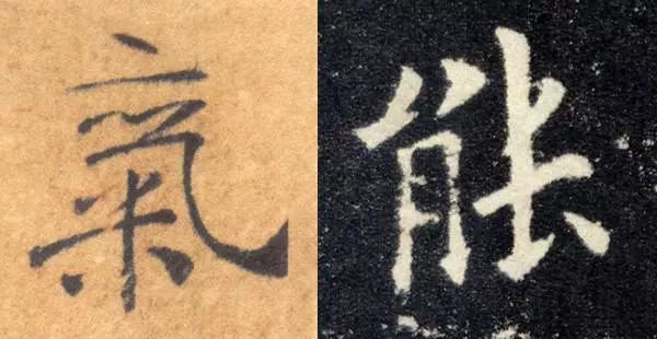
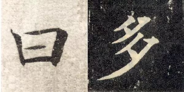
Ping refers to the balanced grasp of the center of gravity of characters, while regular script requires stability and correctness. Flat, stable, visually the words feel balanced, without losing the center of gravity; upright, relatively speaking. Regular script is generally required to be written neatly, and cursive script is rare. The word "Jie" starts with "zheng", and then moves from "zheng" to "danger". When "zheng" and "danger" come together, the secret of the word "jie" can be obtained. Don't simply understand "Pingzheng" as horizontal and vertical. Horizontal horizontal lines are rare in regular script. The horizontal lines are usually lower on the left and higher on the right, forming a certain slope. Vertical posts can play a role in stabilizing the center of gravity. It should be noted that many posts are not vertical. Such as "曰", "七" and other words. Pay attention to the plain treatment of some words, such as "power", "duo", "ge", and "mother". As shown in Figure 2:
3. Density:
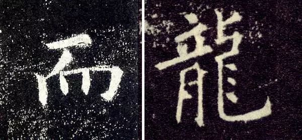
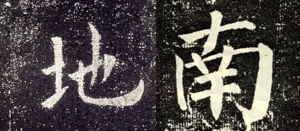
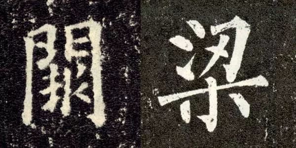
Compared with printed script, regular script requires more prominent changes in density, such as "南" and "地". As shown in Figure 3:
4. Symmetry:
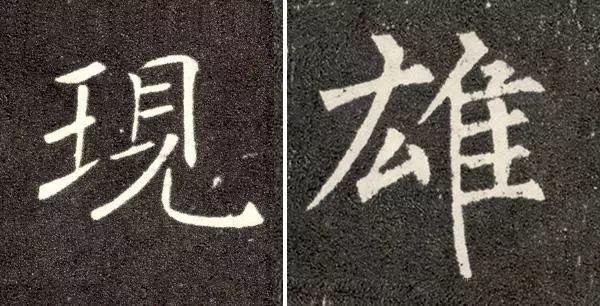
It means that the stipples within the characters are well spaced, harmonious and beautiful. Symmetry does not mean evenly arranging the stipples. On the contrary, one should pay attention to the sparseness and concentration of the stipples. Most of the problems for beginners are the inability to "gather". Symmetry not only refers to the space between the stipples, but also includes the symmetry of the stipples themselves. For beginners, symmetry can be said to be the most difficult thing to solve in knots. As shown in Figure 4:
5. Mismatch:
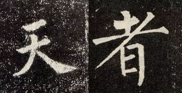
Patterning requires that the characters should not have flat heads and feet, but should be staggered up, down, left, and right, which makes them vivid. From this, we can also see some of the creative expressions of the calligrapher. As shown in Figure 5:
6. Retract and release:
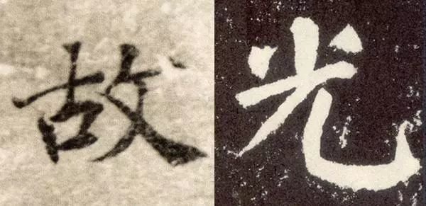
The conceptual understanding of "block characters are square characters" has influenced our in-depth understanding of the knotting of regular script characters. Regular script has extremely rich expansion and contraction changes. The most common problem that people who have never practiced calligraphy make in knotting is not knowing how to retract and unfold. For those who are more outstanding in retracting and retracting, you can take a look at "Ling Fei Sutra". Let's not talk about its artistic quality for now. As a beginner, it can be regarded as a good model for tying characters. The law of expansion and contraction includes: the expansion and expansion changes of stipple A; the expansion and expansion changes of stipple combination B; the concentration degree of the central palace of the corresponding characters of stipple C. As shown in Figure 6:
7. Give in:
It is required that the stipples within the characters are not mechanically arranged, but that the stipples respond to each other and unite into one. As shown in Figure 7:
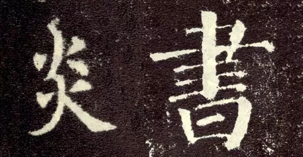
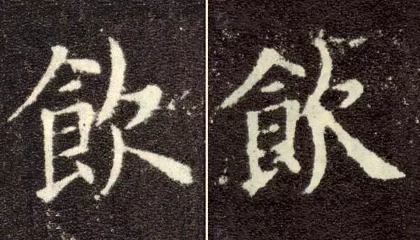
8. Similarities and differences:
Whatever is the same will be changed. Within a single character, the same stipples and parts must be changed, such as the word "yan"; between two adjacent characters, if there are similar stipples and radicals, they must also be changed. As shown in Figure 8 and Figure 9:
9. Coherence:
Strictly speaking, coherence should be attributed to the use of brushes, which is proposed in the rules of knotting, emphasizing the organic integrity of the stipple arrangement. The shapes and arrangements of all stipples within the characters should be united and connected by blood. Compared with cursive script, regular script is static, and the static arrangement of stipples is more coherent and subtle. As shown in Figure 10: