
People often ask me that I have been writing posts for a while and can write quite well. Write slowly and you can write basic strokes well. But as soon as I left the copybook, I couldn't write anymore, as if I was completely confused. I forgot how to write basic strokes and the proportions of the frame structure.
The reasons are as follows: First, I am not proficient enough. I usually do not observe or think, I just finish writing and that’s it. Practicing calligraphy is actually a process, first slow, then fast, then slow, then fast! In this process, especially in the early stage, the characters cycle repeatedly between good and bad, constantly changing.
1. Pay attention to how to use pens for hard pen exercises.
When we write pen calligraphy, it is not as complicated as a brush, and there is no need for reverse strokes, square circles, turns and other movements.
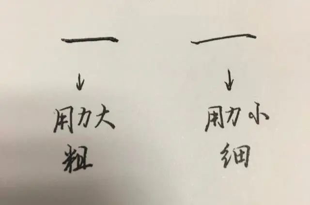
Key understanding: If the force acting on the pen tip is large, the friction force will be large (large resistance). In this case, the writing speed will be slow and the strokes written will be thicker; on the contrary, if the finger force is small, the pressure will be If it is small, the friction force is small (the force is small), the speed is faster, and the strokes will be thinner when written. This needs to be experienced slowly and mastered through practice.
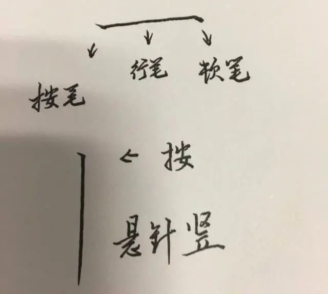
2. Horizontal painting and vertical painting (hanging vertical painting) are basically completed in three steps, namely: pressing the stroke, running the stroke, and stopping the stroke (returning to the front). These three actions are very critical.
Please see the diagram:
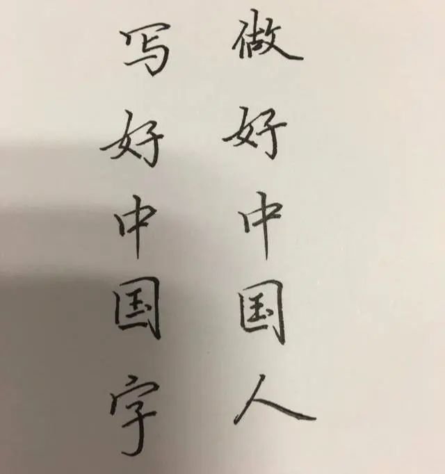
3. Chapter layout:
That is to say, the arrangement of line spacing and word spacing should be neat and the line spacing should be as equal as possible. When writing regular script, whether it is written horizontally or vertically, it must be arranged well. Line spacing and character spacing are neat and orderly. Generally speaking, the line spacing is wider than the character spacing, so that it looks more comfortable. Please see the diagram:
The line spacing should be about one-half or one-third of the word height.
4. Some strokes should be written vividly and spiritually:
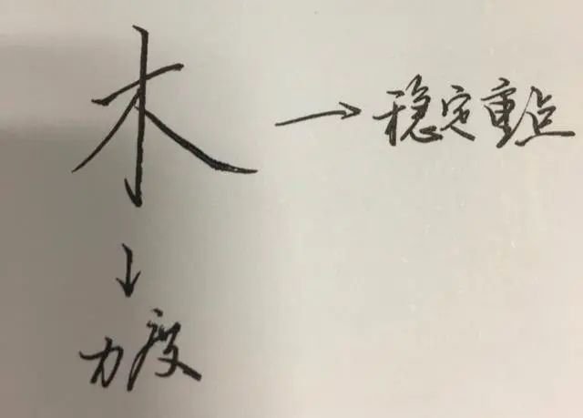
For example, Nie painting is divided into oblique Nie, flat Nie, and reverse Nie (also called long point). The tilt stroke and the stroke play a balanced and symmetrical role. Pingna is usually used at the lower part of a character to stabilize it. As shown below:
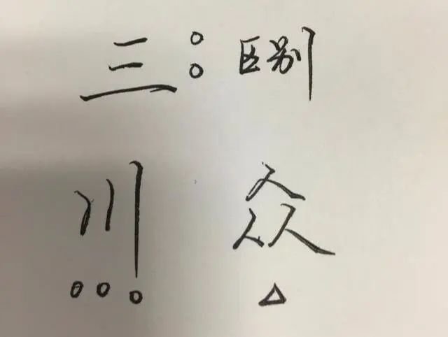
5. Processing of repeated strokes in a word:
If the strokes appear repeatedly in a word, pay attention to the difference in writing and make them well-proportioned. For example, when dealing with overlapping the same shapes, if the word is heavy horizontal (one word has two or more horizontal lines), the short horizontal line should be in the upturned position, and the long horizontal line should be in the downturned position. This is somewhat difficult and requires long-term training so that practice makes perfect. Observe more before writing.
6. Speak up, left, right, up and down
This means that when writing, you should pay attention to the circulation of Qi. The arrangement of top, bottom, left and right should be appropriate. When writing a word, don't be bound by the surrounding framework. Visual impression is important. If it is written densely and the paper is full of words, it will not look good. There is no artistic sense and it looks very uncomfortable. Therefore, when writing, you should leave appropriate white space around it. This is actually the layout arrangement often mentioned in calligraphy works.
,


