How to study "Cao Quan Stele" Ma Yuqiang
The structural characteristics of "Cao Quanbei" are mainly expressed as sparse and flat, unrestrained and unrestrained, and the fonts are mostly horizontal, with long and square knots in the middle, smooth horizontal opening, and vertical implicit and steady, so that the structure appears graceful and elegant. . The stretch of body, the indulgence of brushwork, and the mellow beauty of "Cao Quanbei" embodies the calligrapher's seeking stability in turbulence, unrestrained artistic ingenuity and creative self-confidence in freedom, which makes the works alive with pride. The unique personality and specific connotation of the elegant style of the monument is far beyond the comparison of other Han Li.
1. Before analyzing the structural characteristics of "Cao Quan Stele", let's talk about the problems that should be paid attention to when studying the structure of the stele.
First of all, the structure of "Cao Quanbei" should be written so as to "strive to be accurate in vertical and horizontal position, and the echoing gestures should be clear". "Horizontal occupation" refers to the position of each stroke and how much position it occupies in the vertical and horizontal directions. The position of the stroke is different, the position occupied by the vertical and horizontal is also different. Accurate vertical and horizontal position is directly related to writing a good structure. Then clarify the corresponding relationship between the various strokes or parts. At the same time, you must also see the gestures clearly and be able to express them in the pen. According to this method, "Cao Quan Stele" can quickly master a variety of methods of using pens, and the effect of temporary study is very significant. But before that, you must first read the post carefully, that is, you must observe the copybook carefully, and you must memorize every stroke to the entire character. Only by seeing the eyes clearly, observing meticulously, paying attention to the stippling structure arrangement in the copybook, and remembering the strokes, transitions, or the circle in mind, can we better grasp the style of the font and improve the appreciation ability. This is the first step of making a post.
Secondly, observe the words accurately. As Wang Xizhi said: "Concentrate and think, predict the size, flatness, straightness, and vibration of the font, so that the veins and veins are connected, and the intention is in front of the brush, and then the word is written." The length, slanting, thickness, turning, lifting and the arrangement of the frame structure, and keeping in mind, can the writing be accurate.
Third, the pen must be steady. That is to say, the pen must be steady during the writing process, and the end of the pen must be sent firmly, and the pen must be well-prepared. This requires the temporary students to work hard and have real skills. Only by practicing repeatedly can we be able to use it with ease and ease.
2. Let's analyze the structural characteristics of "Cao Quan Stele" in detail below
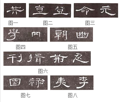
1. Flat stretch. The flat square structure is a common feature of Han Li, which is determined by the fact that the characters of Han Li are more horizontal. However, the structure of some characters in "Cao Quan Stele" is so flat that it can hardly be flattened, which is rare in other Han steles. As shown in Fig. 1, the character “total” is displayed on the upper side of the two horizontal lines, and the left and right sides are dangled. The upper two vertical and the lower two points tightly correspond to each other. Figure 2 The horizontal picture of "straight" and "deng" is like a gymnast who stretches his legs, and his upper body is well-proportioned and tightened. Figure 3 The word "Ming" is left-handed and right-handed like a big umbrella, completely covering the middle part, while the vertical hook of the word "Yuan" stretches out to the right to make the whole character elegant and stretched.
2. Different sizes. This is also the structural feature of "Cao Quan Stele". The big one is like the character "learning" in Figure 4, and the smaller one is like the character "岡". The difference between the two is about twice as large. Due to the wide kerning and sparse spacing between the lines, the big and small of the knots appear to be jagged in the orderly large chapters. They are varied and sloppy, so the big ones don’t see the big ones, and the small ones don’t. Obviously small, it has reached a dialectical unity of complementarity. It can also be seen that the author is very good at using contrast, enriching the writing of this stele through the size and oblong structure of the characters.
3. The cloth is well-proportioned. This is mainly manifested in the coordination between stipples in a character, the distance between the same stipples is roughly equal, and the combination of strokes and strokes of the character is also symmetrical. As shown in Figure 5, the left half of the word "chao" is drawn densely, and the right half is drawn less sparsely. The clearance between the strokes is very uniform, and the left and right are aligned and appear to be dense and well-balanced. Those who repeat the stippling loop, such as the two "units" in the word "you", are the same size but do not show sluggishness. Structural arrangements like this give "Cao Quanbei" a neat, stable, elegant and elegant temperament.
4. flexible. The retraction of the structure is the main feature common to all steles in Han and Li, which is particularly prominent in "Cao Quan Stele". Its retracting and unfolding are mainly reflected by the left and right stretches of wave picking and skimming. As shown in Figure 6, the word "Journal" relaxes on the left and tightens on the right, while the word "揖" is the opposite. In this way, the heights are staggered, the width changes, and the two parts are appropriately reconciled between the close and the distance, so that the characters are vivid and flexible. It can be said that the collection in the "Cao Quanbei" has reached the extreme, becoming this The indispensable main feature of the stele is also a sign of the maturity of the stele. Most of this type of writing has smooth gestures, with movement in silence, fluttering swallowtails, a relaxed posture, and a strong contrast between density and concentration. The elegant and beautiful style of "Cao Quan Stele" is mainly reflected here.
5. The pen is disconnected. As shown in Figure 7, the strokes at the left and right corners of the upper and left corners of the word "国" are all broken to write, so that it is full and not congested. Another example is the left side of the character "Lu". The second horizontal at the upper part and the vertical at the lower part should have been connected, but now they are separated and combined with the right side to form a character, and the left is broken and the right is connected.
6. Tighten and loosen. "Cao Quanbei" is a beautiful and handsome character, like a fairy descending to the earth, wishing to fly freely. In addition to being flatter than the general Han stele, it is closely related to its center of gravity and the extension of the middle and lower parts. The character "Yi" in Figure 8, the upper part is short and the waist is drawn, and the lower part is long, either upright or spread out. Another example is that the whole character of "Li" is converged upwards, tightly entangled in the upper part of the middle palace, and then escapes from a thick arc to the left, showing a sharper rhythm in the strong contrast of density. This kind of tight and loose pine structure is one of the elements that form a beautiful and beautiful artistic style. It and the simple and natural beauty of ancient and clumsy are both beautiful and non-rejectionable.
Two, vertical painting
Vertical drawing plays a role in stabilizing the center of gravity and supporting the skeleton in the character. Therefore, the vertical painting should be written upright, so that it can bear the weight and support the character. The vertical paintings in "Cao Quan Bei" are mainly written in the following ways:
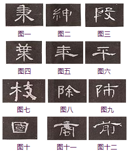
(1) The tail is vertical. The vertical paintings in "Cao Quanbei" mostly use a round pen tip to close the pen, start the pen against the front, and spread down against the trend, so that the pen is rubbed against the paper, and the force should be even. , The line is tapered. This kind of vertical painting is different from the hanging needle in regular script. It is the result of returning to the front in the air and closing the pen after being proficient in writing. It is fuller than the hanging needle and it has implicit meaning. Figure 1 "Bing", Figure 2 "Shen" and other words. The specific writing method of this vertical is: Zang Feng enters the lower right position, returns to the center and straight down, presses down slightly before going out, and then lifts up slightly to make the two ends of the vertical painting slightly thicker, slightly thinner in the middle, and the lines are round and full. As shown in Figure 3, "Yin", Figure Four·Ye, and Figure 5, "Nian" and other vertical paintings, their specific writing method is to go down the paper after entering the paper against the trend. Rich in quality and stretch.
(2) The round tail is vertical. The difference between this vertical method and the pointed tail vertical is the place where the pen is received. When it closes the pen, the sharpness of the pen is firm, and the end of the stroke is rounded, which is a bit similar to Chui Luzhou, but it is not like the writing style of Chui Luzhang in regular script. It is thicker and more powerful than the pointed tail. The vertical paintings in the characters "Ping" in Figure 6 and "Branches" in Figure 7.
(3) Short vertical, as shown in the words "Di" in Figure 8 and "Lu" in Figure 9. It hides the head, protects the nun, and fills the center. The thickness of the stipple is the same, the head and the tail are round, and the lines are more gentle and subtle. The specific writing method is: Zang Feng enters backwards and stays on the right, returns to the center and straight down, pays attention to the uniform speed of the stroke, and finally ends the stroke at the end of the stroke.
(4) Parallel and vertical. When there are many verticals in a character, you should pay attention to the difference between opposites and opposites, as well as the variation of length and thickness, straight and oblique and ending strokes. As shown in Figure 10, the two verticals of the character "国" are facing each other, the two verticals of the Chinese character in Figure 11 are opposite to each other, and the two verticals of the Chinese character "Front" in Figure 12 are two verticals, one long and one short, and one is straight and one scoop. , In the leveling, it shows a vivid and vivid state, which is endless aftertaste.
3. About strokes
1. Point painting
The brushwork of "Cao Quan Stele" has varied and varied. In modern times, Mr. Yao Hua thought that "the brush is as round and vigorous as a seal, so although it is thin and slender, and like a cone and stone, this center is the most prominent. It is a turning point, and There are both mentioned first and then pressed, there are those who go down, and those who go slightly intermittently. They are all lenient and strict due to the situation, and those who use the pen to change the pen are extremely rare, so they can be alone. Also, the knot body is contrary to the ordinary but sees the beauty, such as the word'month' which is left-handed, and goes straight down. The line is like a hanging needle, and the side is also used. Shu Lian is not always the same. , And the potential can save each other, and the changes can be realized from this." This requires temporary students to carefully experience the changes in the brushwork, that is, the form of the stroke, the form of the stroke, or the length, thickness, or direction of the change, or it may be changing all of them. The combination of strokes and strokes can be changed, which is manifested in the strokes, which appear to be multi-faceted; while the person who writes shows that he has mastered a variety of different pen methods to write strokes in various poses. Being able to consciously write a variety of strokes is one of the purposes of our temporary study. Otherwise, if the strokes are inaccurate, you will not be able to enter the structure and practice, and you will not be able to express the gestures under the pen.
The writing of dots. Point is the basis of strokes, and other strokes are extensions of points. In the official script, the dot is a shortening of other strokes. There are many changes in "Cao Quan Stele", and the pen is vigorous and unambiguous. The pen is inverted and flat out, showing a little sharpness, then lift the pen and close it out. People think that the dots in this stele are the eyebrows of the characters, and they are all used to show the spirit of anticipation. Therefore, although the dots are flat paintings, they are all facing back and have different shapes along with the characters. The stipples in this stele are mainly as follows:
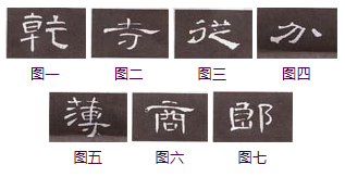
(1) Vertical point. The vertical point is like the head of a vertical painting, in fact it is a shortening of the vertical painting. The writing method is that after the Tibetan front enters backwards, it stops slightly to the lower right, and then returns to the center and straight down. As shown in Figure 1, the vertical dot of the word "dry".
(2) Down point. The point is the upper point and the lower circle, the momentum is from top to bottom, and the end of the pen looks like a hanging point, so it is called the hanging point. The writing method is to move upwards slightly, and then move downwards. After holding the paper on the belly of the pen, move it to the upper right side and lift it up and down gently. Figure 2 shows the point of the word "Temple".
(3) Make a point. Its shape is similar to that of flat skimming, so it is called skimming point. In fact, it is also flat and short. The writing method is to start against the front, stop slightly to the bottom right, and go down to the left. As shown in Figure 3, the apostrophe on the upper left of the word "from".
(4) Stop point. Its shape resembles the shortening of a painting, so it is called a point. The writing method is that the Tibetan front goes backwards and descends to the right, and stops lightly at the end, then gently lifts up to the right, lifting and closing. As shown in Figure 4, the point of "分".
(5) Pick a point. The stipple is provoked to the upper right, so it is called picking point. The writing method is that the Tibetan front moves back to the right and then stands next to the right. After returning to the center, it moves to the upper right and lifts, and then slowly retracts after a light pick. As shown in Figure 5, the lower point on the left of the north character.
(6) Horizontal dot. The stipple looks like a short horizontal. The writing method is to lightly settle into the paper, that is, parallel to the right, and lightly stop at the converging point. Be precise when writing this point. As shown in Figure 6, the upper point of the word "Shang".
(7) The head point. The stippling is similar to a short horizontal fold. The writing method is to write the short horizontally when the front is hidden, and then stop at the fold, and then move downward. As shown in Figure 7, the upper point of the left part of the character "lang".
2. Pick paintings and folding paintings
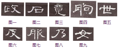
pick painting is a stroke that starts from the bottom left to the top right. Pick a short drawing in the official script, start the pen and move backward and downward to the left, pause briefly, and then turn forward and move upward to the right. Slowly and slowly raise the pen. It is not advisable to move the pen quickly. Close the pen and raise it with a sharp edge. As shown in Figure 1, the character "Politics" is drawn. It should be noted that the form of picking painting is single, and its changes are mainly in thickness, straight arc, and flat oblique, but there must be a short arrow on the crossbow, ready to go.
Zhehua is the corner where two strokes meet, and it is a combination of two strokes. It is mainly written in the following ways:
(1) Horizontal fold. As shown in Figure 2, the horizontal and vertical strokes of the word "Stone" are spliced horizontally and vertically, completed in two strokes. First, Cang Feng enters the horizontal drawing, then moves slowly to the right, until the turning point, the strokes start up, the Cang Feng enters, writes vertically downwards, and finally slowly raises the front to close the pen. When writing this kind of folding painting, the wrist should be turned over, and the connection should be natural. When writing the vertical painting, the pen should not be raised too high, so as to avoid the failure of "shrugging". Another type of horizontal fold is not to re-start the pen at the fold, but to move the pen upward and then downward. The horizontal and vertical paintings of this kind of folding paintings have an upper arc, or an outer arc or an inner arc, which is natural and ecological. Figure 3 shows the horizontal fold of the word "Jing".
(2) Ellipse fold. This kind of fold must be made with one stroke when the turning method is used when turning from horizontal drawing to vertical drawing. But this is not absolute. In fact, there are still slight lifting and adjusting forward movements at the turning point, as shown in the second stroke of "朐" in Figure 4. In this regard, you must carefully analyze and observe when you are studying.
(3) Vertical fold. As shown in Figure 5, the vertical fold of the word "世" is a fold composed of vertical and horizontal paintings. The specific writing method is to write a vertical drawing with the front of the pen first, then slightly raise the front to change direction at the turning point, and then ask the right line when the tip of the pen stays at the turning point. The interspersed use of this kind of folding painting in this stele made "Cao Quan Stele" a little bit more vigorous in the beauty.
(4) Cross-folding. This is a combination of horizontal painting and scribbling, as shown in Figure 6 with the word "anti" in the horizontal zigzag. The specific writing method is to first write the horizontal painting in the reverse direction, stop at the reversal position, and then write down to the left. However, when writing this stroke of the word "clothing" in Figure 7, it should be noted that the pen is drawn first and then the line is picked to the left, re-entered from the paper, re-entered, moved in with the trend, and then sent to the lower left. When writing this retracement, make sure that the stippling is light and agile.
(5) fold and fold horizontally, as shown in Figure 8 for the character "乃". After the first Zang Feng enters the pen and starts the stroke, the upward arc is slowly moved to the lower right of the reversing position, and the left downward is followed by the trend, and then the direction is changed. , Can't be slippery. When making this painting, you must pay attention to the changes in the radius, and send it slowly.
(6) Skip and fold. It is a fold-up painting composed of scribbling and anti-Na, as shown in Figure 9. The specific writing method is to start writing diagonally, but not to end the stroke, turn the direction at the end of the stroke, and write backwards to the lower right.
3. Hook painting
The hook paintings in "Cao Quan Monument" each have their own unique forms. Some hook paintings resemble skimming paintings, some hook paintings are similar to na paintings, some hook paintings are like dots, and some omits their hooks. They are really varied and varied. The specific hook paintings are mainly as follows:
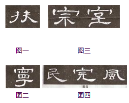
(1) Hook, like the one on the left of the word "Fu" in Figure 1. The specific writing is that the Tibetan front goes straight down, and then gradually sent to the left after halfway through, until it will be drawn up wherever possible, and the back front closes.
(2) Skip the hook. Generally speaking, the hook shape of the official script is to the left, which is similar to the writing method of "Ning" in the official script, as shown in Figure 2. The method of writing is to draw the pen and hide the front and write vertically. Lift the pen at the turning point. After a short pause, it will bend and be slightly square.
(3) Horizontal hook. The writing method is to write horizontally first, lift the pen to the end and leave the paper, follow the trend upward and forward into the paper, turn the front slightly downwards, and finally lift the front to close the pen, and the shape is slightly pointed. The writing method of this hook painting in "Cao Quan Bei" is generally divided into two strokes, but it should be written so that the form is broken and the meaning is connected, as shown in Figure 3 "Zong". "Room" and other words.
(4) Hook. Ge hook, vertical hook, back throw hook, heart hook in regular script are bent to the right in the official script, and the shape and the shape of the pen are picked together, so it is also called the hook. As shown in Figure 4, with the character "民", the long hook is opened to command the whole character. The writing method is that the counter-front will move upwards slightly into the paper and then move downwards to the right. After halfway through, press it gradually, and drag it to the bottom third place and then drag it out. The vertical hook of the character "finish", fold it at the beginning of the pen, and move the pen while lifting it. When the reversing point is off the paper, hold the pen lightly, and then press it to the lower right gradually until the end of the pen becomes heavier and drag it flat and upper right. Out of the front, make his mind far away. Another example is the back throwing hook of the word "wind". The horizontal drawing is slightly curved, and then gradually lifted to the end, the turning point is a little pause, and then the stroke downwards, the stroke is slightly lifted to the middle, and then turned to the lower right corner, gradually lifted by pressing, the pen is closed implicitly.
In short, there are two types of hook paintings in the official script, namely left-hand hook and right-hand hook. Although the length of the left hook is changed, it still has the meaning of hook. On the other hand, the right-hand hook is similar to a painting, and the two are often confused and difficult to identify. In "Cao Quan Stele", we will find that the right-hand hook has obvious changes in the process of strokes: either the stroke is slightly recessed in the middle, like a flat boat; or the middle is relatively straight or slightly arched. , There are twists and turns, in this way, it becomes the strokes such as Nahua or Xingou in regular script.
4. Skimming
In "Cao Quanbei", there is a distinction between master and deputy. The main strokes, such as straight strokes and diagonal strokes, are all classic pens in the official script. The sub-stroke extracting painting generally does not make major changes. At the same time, if there are multiple creases organized together in a word, the primary and secondary changes are not obvious, and the inclination directions and angles are roughly similar, giving a sense of order. The specific wording is as follows:
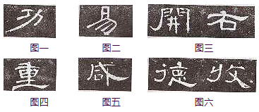
(1) Skew. This kind of skew painting has begun to take the rudimentary form of regular script skew, but it is not widely used in the official script of the Han stele, as shown in Figure 1. The method of writing is to start the pen slightly against the front, and then go down to the left after returning to center. It is advisable to use the center of the side pen, with the tip of the pen to the left, and the pen body to lean to the right. Sharp, can avoid the feeling of thinness and frivolity.
(2) Straight. As shown in Figure 2, the initials of "Yi" are left off. The specific writing method is to feed the paper diagonally down to the left after the paper is parked, and then start as soon as the paper is parked. When studying this painting, pay attention to the beginning and ending of the pen should be slow, and the stroke should be rapid, so as to be agile and vigorous, if hesitate, it is easy to lose.
(3) Hook-shaped skimming. The writing method is that the Tibetan front enters backwards, and then moves down to the left after a while. At the end, the stroke is slightly frustrated, and the front is twisted upwards. The closing stroke can be forward or reversed, and the hook can be large or large. This kind of skimming often has to make a certain stroke and change the direction of the brush in the middle of the pen, so the shape has a sense of ups and downs, and it is vigorous and powerful, like a willow in the spring breeze, like a hibiscus flower. This painting cannot be written too smoothly, and smooth is weak, as shown in Figure 3 with the hook-shaped “open” and “right” characters.
(4) Short and flat. The writing method is that the Tibetan front enters back and stays slightly, the center moves slowly to the left and slowly lifts, and finally the front is flat to the left. The tail tip is round, and the pen power is included, as shown in Figure 4.
(5) Vertical skimming. As shown in Figure 5, the second hand of the character "Xian" has no original shape and direction, and it looks like a short vertical. Its starting stroke is similar to other skimming, except that when you draw the stroke, you should pay attention to the vertical and uniform downward speed.
(6) Square tail skimming. As shown in Figure 6, the words "德", "收" and other words are summarized at the end. This kind of skimming is a more obvious feature in Lishu dot painting, and its ending point is square. This kind of writing is more used in the stele, and it is more difficult to write, so you should experience more when writing. The specific writing method is: After the counter-forward starts the pen, move down and press down slowly to the left, and send to the left in the middle section, and lift up to the right to form a square at the closing point.
