When practicing calligraphy, how can we master the structure of characters?
1. The structural principles of regular script
1. Principle of symmetry: The spacing between strokes should be moderate in density and density.
2. Principle of balance: The pen, cart or each component unit must be coordinated and balanced, so that the entire character does not lose its center of gravity.
3. Principle of give-and-take: strokes or parts should be retracted and retracted, and interspersed and avoided to depend on each other.
2. The structural form of regular script
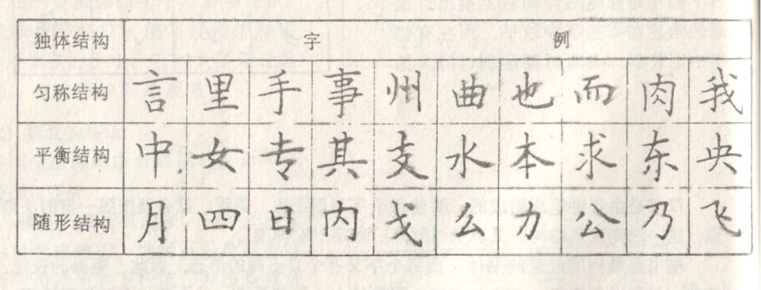
1. The single structure includes:
Uniform structure: The visual distance between strokes is roughly equal and uniform.
Balanced structure: The left and right sides are basically symmetrical, the visual effect is balanced and harmonious, and the center of gravity is centered.
The structure changes according to the shape: characters vary in length, width and width. Characters are established according to their shapes and cannot be unified.
2. The combined structure includes:
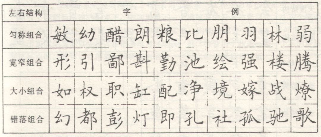
(1) Left and right structure:
The left side is small and the right side is big. The left side is small and suitable for living in the middle. The right side is suitable for growing up.
The left side is big and the right side is small. The left side should grow up and the right side should live in the middle.
The bottom stroke on the left is wide and the right is extended horizontally, so it is better to change the left to lower right.
The left stroke is large and the bottom stroke on the right extends vertically, so the left side should be high and the right side should be low.
The upper left and lower right are cross or square structures, which should be flush.
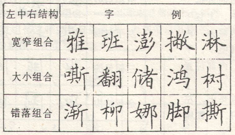
(2) Left-center-right structure:
For a combination of width and narrowness: it is better to give up the narrowness to the width, and the three should be balanced and harmonious.
When combining sizes: the small part should be taller, and the large part should be longer.
For staggered combinations: the right side should be lower and the middle left side should be slightly higher.
(3) Upper and lower structure:
Sky cover structure: that is, it is wide at the top and narrow at the bottom. The strokes on the top should extend wide and cover the bottom, while the bottom should be narrow.
Ground structure: narrow at the top and wide at the bottom. The lower strokes should be stretched wide to support the upper side, and the upper side should be narrower.

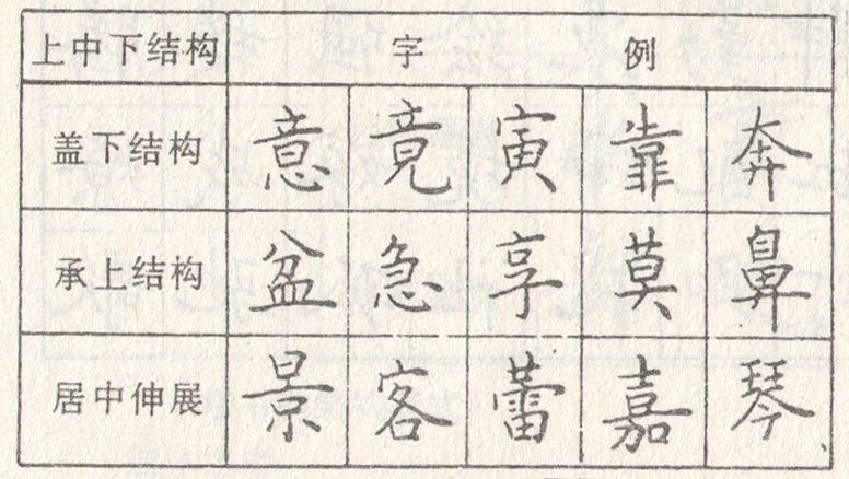
(4) Upper, middle and lower structure:
Under the upper cover: If the upper strokes are wider, the middle should be smaller, and the lower strokes should be slightly wider to echo the upper ones.
The lower part supports the upper part: the lower strokes are extended and wide to support the upper part.
Stretch in the middle: The strokes in the middle stretch to the left and right, and the upper and lower strokes are basically in harmony, so that the middle part forms a link between the previous and the following.
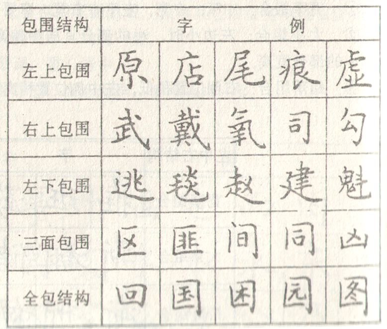
(5) Surrounding structure:
Surrounding the upper left side: not all of it is covered, and it should not be too long or curved.
Surrounded by the lower left: The main pen should be enlarged to cover the inside.
Surrounded on the upper right: The main pen should be enlarged to cover the inside.
Surrounded by three sides on the left: the outer frame is short at the top and long at the bottom, and the interior position is suitable for living in the middle.
Surrounded on three sides: the outer frame is opposite to the left and right, the right side is slightly stronger, the upper part can be slightly narrower but not wider, the middle part is centered and slightly higher, and cannot fall down.
Surrounded by the lower three sides: the outer frame should not be too high, the inner position should be attached to the lower frame and centered, and should not be suspended in the air.
Fully enclosed: The outer frame should be straight, with the left and right facing each other, and the inner strokes should be even, centered, and appropriately dense.
