The purpose of learning cursive calligraphy is not only to write more beautiful words, but more importantly, to learn to create cursive works that are pleasing to the eye and moving. A work not only has the echo and coordination between the dots and paintings within the characters, but also needs to deal with the echo and coordination between characters. Therefore, it is not enough to just understand the structure rules of pointillism. You must also understand the morphological structure rules of the universe.
Regarding the morphological structure of hard-pen calligraphy, many calligraphers in the contemporary hard-pen calligraphy community have learned from historical experience and summarized many successful experiences in the practice of artistic creation. They can be summarized as follows:
1. Let nature take its course
If the characters are originally flat, let them be flat; if the characters are originally long, let them be long; if the characters are originally slanted, let them be slanted.

2. Because of the character’s shape
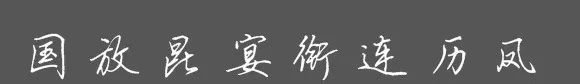
If the square is upright, let it go in any direction, such as "国"; if the upper, lower, left, and right strokes are similar, it will be divided equally, such as "fang" and "kun"; if the left, middle, right, upper, middle, and lower parts of "title" and "Yan" are similar, it will be "three points" Tianxia'; "Lian", "Li", "Feng", those who are half-baked are not exposed.
3. Break the rules
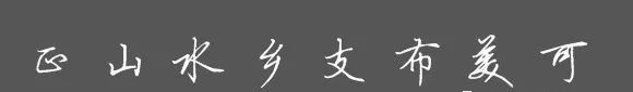
The word "正" is uneven horizontally and vertically, but the center of gravity is stable; the vertical hook of the word "水" is not centered, but it is more beautiful; the elongation of "xiang" is more interesting.
4. Shrinking strokes
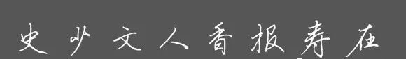
"Party" is quite flirtatious and has a stable division of labor; "History" stretches out the painting and appears graceful; "Wen" converges into the painting and expresses inner feelings; "People" changes into a strong point, with a lively rhythm and forthrightness.
5. Seek change while maintaining stability, hiding wonders in the ordinary
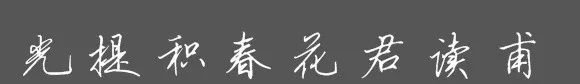
The character "Guang" is on the left side, the character "Ti" is upright on the left and right on the right, the character "Ji" is high on the left and low on the right, and the character "春" is upright and downward.
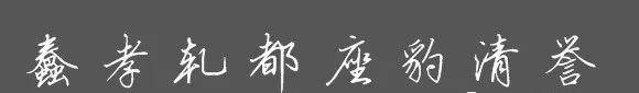
6. Adjust measures to local conditions
One big difference between running script and regular script is the variability of certain fonts. During the writing process, it is necessary to improvise according to the situation of the words. For example, the word "Stupid" is selected from Mi Fu's "Shu Su Tie", which is uncharacteristically tilted to the left, placing the center of gravity. The character "worm" looks diagonal and upright, which is extraordinary; the character "xiao" is written straight up; the character "ga" stretches the hook, making the shape more cute than a square shape. If the two characters before and after are long, the middle character should be written flat, and the characters before and after are straighter, and the middle character should be written obliquely.