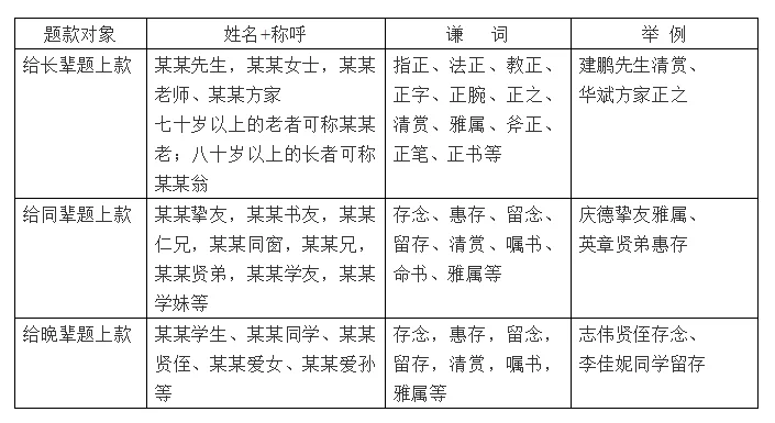
The inscription in calligraphy is also called the inscription, which refers to other words written outside the main text of the calligraphy work. It is divided into upper and lower inscriptions according to their positions. The upper inscription includes the name of the caller or recipient; the lower inscription includes the calligraphy author, writing Time, place, etc. The above paragraph can be omitted, but the following paragraph is required. The lower inscription is divided into three types: single inscription, double inscription, and poor inscription. The inscription respects the principles of "the present does not surpass the ancient", "the movement is not static", "the ancient style is the present", and the "wenzheng style is lively". The inscription is written in running script. Mostly (running regular script or regular script is also acceptable). The font size of the title should generally not exceed the font size of the main text.
1. The upper paragraph: The upper paragraph means that someone or a certain unit asks you to write. After the work is completed, the name of the person who requested the book should be inscribed, and this name should be inscribed at a higher position in the upper paragraph to show respect. Contents included in the above paragraph: name + title + modest words

2. Place payment
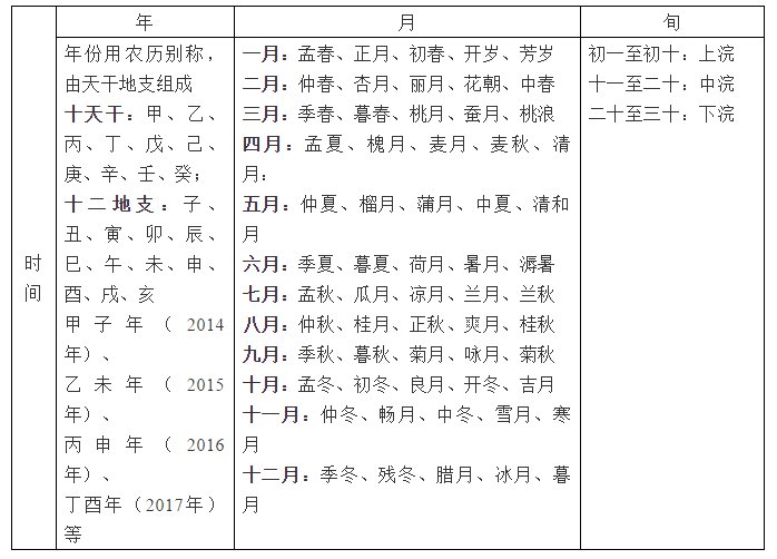
The lower paragraph contains the calligraphy author, writing time, place, etc. For example, "Meng Xia Minghua's calligraphy in Xiaoxiangzhai in the year Bingshen" includes the time, author, and place.
Time paragraph:

The Gregorian calendar is generally not used when marking time. For example: "May 2016" is the Gregorian calendar, but it is written: "Huaiyue, Bingshen Year" or "Mengxia, Bingshen Year". Note: The lunar calendar and the solar calendar sometimes differ by one month or even two months.
When signing the location, be careful not to use too vulgar place names, such as: "Booked in Yongcheng Xiang Bakery", but it is acceptable to write "Booked in Jinling Xiaoxiangzhai", "Booked in Ningbo", etc.
5. Seal
Seals are one of the indispensable components of hard-pen calligraphy works. Small seals can play a finishing touch in hard-pen calligraphy works, but if used improperly, they will destroy the charm of the entire work. . The seals used in hard-pen works can be divided into two types according to their engraving methods: Yinwen (Baiwen) and Yangwen (Zhuwen); according to the content they are engraved, they can be divided into two categories: one is the famous seal, which is engraved with the name, calligraphy, and nickname of the person who wrote it. The seals are generally small circles and small squares; the first is leisure seals, including year seals, Yaqu seals, Zhaiguan seals, etc., most of which are oval and small rectangular.
The following points should be noted when sealing:
(1) The seal should be neither slanted nor tilted, and should be able to stabilize the center of gravity of the text. Before sealing, you should carefully examine the work to determine the best location for the seal. When sealing, if you are not sure, you can use the seal rule.
(2) The size of the seal should be coordinated with the size of the inscription and main text. Generally, it should be about the same size as the character, and should not be too large. Too big looks clumsy, too small looks stingy and not filling enough. A special seal for hard-pen calligraphy should be prepared and cannot be replaced by a large seal for brush calligraphy.
(3) In one work, there should not be too many seals, no more than three. Using too many seals will distract the viewer’s attention.
(4) In traditional vertical calligraphy works, the name seal should be stamped below or on the left side of the writer's signature. It should not be stamped between the inscription and the main text, nor should it be stamped at the same level as the main text, in order to ensure the accuracy of the calligraphy. The beauty of variation.
(5) If the surname and the given name are separated into two seals, the surname is generally in the front and the given name is in the back. It is appropriate to have one round and one square or one red and one white. The distance from the last character of the title should be appropriate, and the distance between the two seals should be appropriate. There must be no spacing.
(6) Leisure seals such as year number seals, Yaqu seals, and Zhaiguan seals are mostly made into oval or rectangular shapes as introductory seals, which are placed in the empty space between the first and second characters at the beginning of the text. If it is made into a square seal, it can also be stamped behind the name seal.


