
Do you think it’s difficult and slow to write beautiful calligraphy with hard pen, and you can’t write well no matter how you write? So what do you think is calligraphy? What kind of words are beautiful?
The answer to this question is not very uniform. Some may say that it is necessary to write "horizontally and vertically", some say that it is necessary to write "neatly", some say that it is necessary to write beautiful strokes, and some say that it is necessary to have "stop strokes". What you said is all right, but they are all one-sided and do not have a systematic and comprehensive understanding of calligraphy. As a traditional Chinese art, the core of calligraphy is "beauty". In layman's terms, it means beautiful. How to write beautiful words?
The beauty of calligraphy lies in the beauty of lines and the beauty of structure. How to study calligraphy systematically and feel the beauty of calligraphy requires learning from these two aspects.
beauty of lines
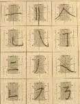
The beauty of lines lies in the shape and expression of each basic stroke. On the one hand, the length, thickness, angle, direction, square and circle of each stroke must be written in place, as shown in the picture below. Each stroke has its own standards for length, thickness, angle and direction, and square and circle. If you learn calligraphy well, you must write the basic strokes according to the standards.
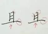
On the other hand, there is the attitude of the strokes. Different expressions require different ways of using the strokes. Different strokes make the lines show different styles. We can divide the stroke methods into two types (the two characters "and" in the picture below): one is square strokes, which tend to be "square" in strokes and turns. "Square" and "straight", the expression of this kind of lines is straight and resolute; one is the round pen, which is more "round" and "bent" in strokes and turns, and the expression of this kind of lines is round and tactful. People with different personalities like to use different pens, which leads to different styles. Beginners must find their favorite style, that is, whether they like a "square pen" or a "round pen", so that they can learn with twice the result with half the effort. Square pens and round pens are used in the beginning, stroke, closing and turning of the brush. Different brush strokes show different expressions and styles.
The beauty of structure and structure
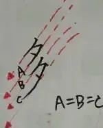
The beauty of lines is the practice of strokes and brushwork, while the beauty of structure and structure is the practice of regular methods. The "neat" and "horizontal and vertical" answers mentioned by the children mentioned at the beginning are a kind of structural pattern. "Neat and neat" actually refers to the way a word is written, and "horizontal and vertical" is the method of writing neatly. The "horizontal" in calligraphy does not mean writing horizontally horizontally, but horizontally slanting upward to the right, roughly 7°. (The specific reason why the horizontal strokes are tilted will be discussed in detail later in the text, so we will not explain them in detail here.) "Hengping" means that the horizontal strokes and vertical strokes of Chinese characters form the skeleton of the Chinese characters, making the characters vertical and the center of gravity stable. "Vertical" means that the line itself is straight and the direction is vertically downward, such as "and" in the picture below.
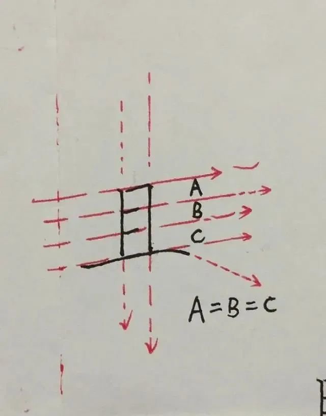
The four long horizontal lines of the character "Qie" are slanted toward the upper right corner, giving the character an upward-right slanted posture. The last long horizontal stroke is closed and drawn toward the lower right corner. This stroke direction straightens the upward-right-slanting posture of the word "Qie". This is what we call "horizontal and vertical". If you do this every day If the stroke is drawn downwards to the right, our characters will be inclined upwards to the right, making it unstable.
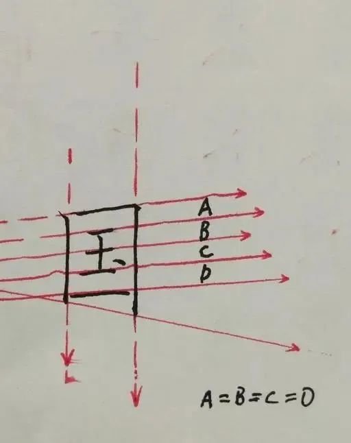
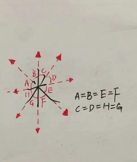
From the picture above, we can also see three letters: A, B, C. The three letters represent the space between the horizontal lines. A=B=C means that the spaces between the horizontal lines must be equal. , this is a structural law "space equality" that will be discussed next. If the word "and" is compared to our common residential buildings, then the space between horizontal and horizontal is like the height of each floor of the building. The height of each floor of the building is the same. The space between horizontal and horizontal is the same. The space also needs to be the same size. Not only the horizontal and horizontal, but also the vertical and vertical, and the left and right spaces are the same, as shown in the figure below with the characters "国", "多", and "米" (we will use a chapter to detail the rules of equal spaces later).
Once the basic strokes are written well, and "horizontal, vertical, horizontal, and equal spaces" and "equal space" are used properly, even if our handwriting is not pretty or beautiful enough, it can still be written neatly enough and comfortable enough for people to see your handwriting.
Neatness is the basis for beautiful handwriting. After the basics, the next few rules are particularly important. "Left and right symmetry", "Up and down", and "Comparison of expansion and contraction" are also very simple. The difficulty lies in proficiency. Master the application.


