
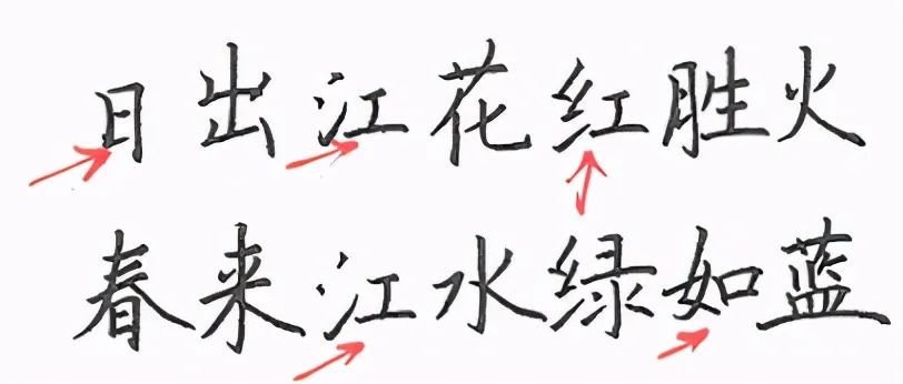
When words are written together, the direction and size of strokes of the same type need to be nearly consistent in order to unify the style.
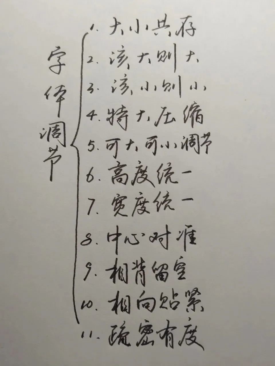
Big and small coexist
Although Chinese characters are square characters, due to their wide variety and their own characteristics, the sizes must coexist, and artificial unification cannot be achieved, nor can the sizes be unified, otherwise the overall effect will be affected due to inconsistent density. On the contrary, if you follow the size of the font itself and maintain a roughly consistent density, you will get an overall effect of coexisting and complementing each other.
It should be big
If the font itself is tall or wide in structure or has many strokes, it needs to maintain its large size.
The small is small
If the font itself has a short or narrow structure or single strokes, it needs to keep its size small.
Extra large compression
If there are a lot of strokes, the normal density will make the characters very large and appear to stand out from the crowd. Therefore, appropriate compression can be performed while maintaining recognition and clarity to cater for changes in the overall style.
Big or small
A small number of calligraphy strokes are neither too large nor too small, and the structure is neither large nor small. The size can be appropriately scaled according to the overall layout effect.
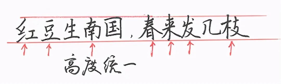
Highly unified
The typography layout will have a general tone, but some words only have height but no width or insufficient width. This requires that the height be retained to match the overall height tone, but the width cannot be deliberately enlarged.
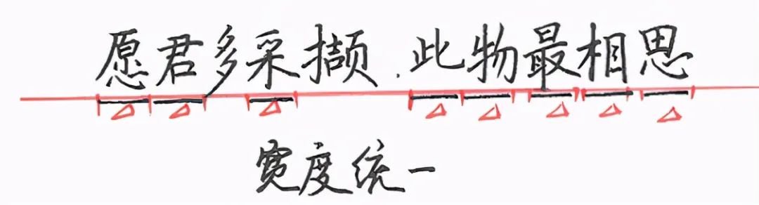
Uniform width
Some words only have width but no height or lack of height. This requires that the width be kept consistent with the overall width, but the height cannot be deliberately enlarged.
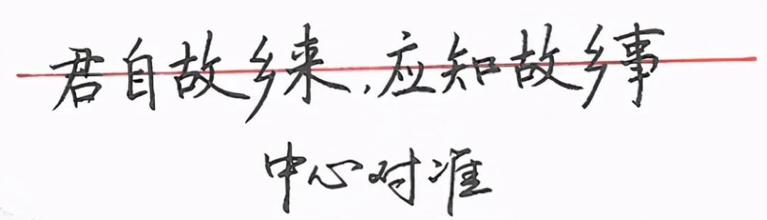
center alignment
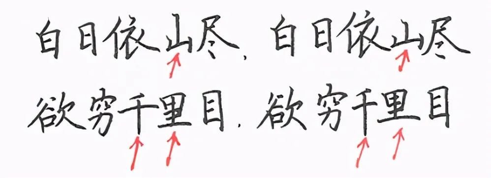
When writing, the entire line of characters often tilts to the upper right. This is a normal habit of holding the pen with the right hand. To control it, the middle position of each character needs to be strung together with a horizontal line, that is, the center position of each character is aligned.
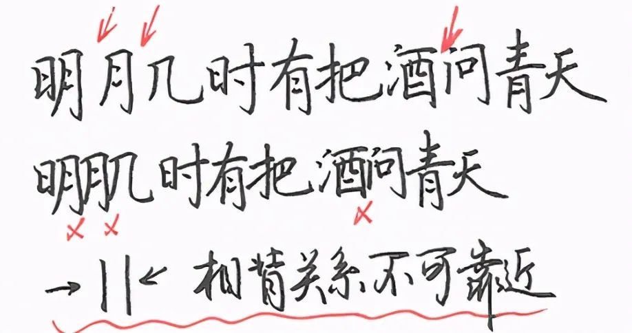
Leave blank opposite
The opposite relationship is like two walls that are vertically parallel or close to this relationship. This requires a good gap. It cannot be loose or tight, otherwise it will be scattered, and tight will be crowded. (Tip: If there is a "wall" on only one side, stay close.)
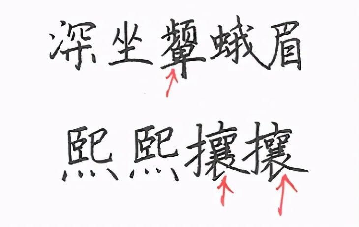
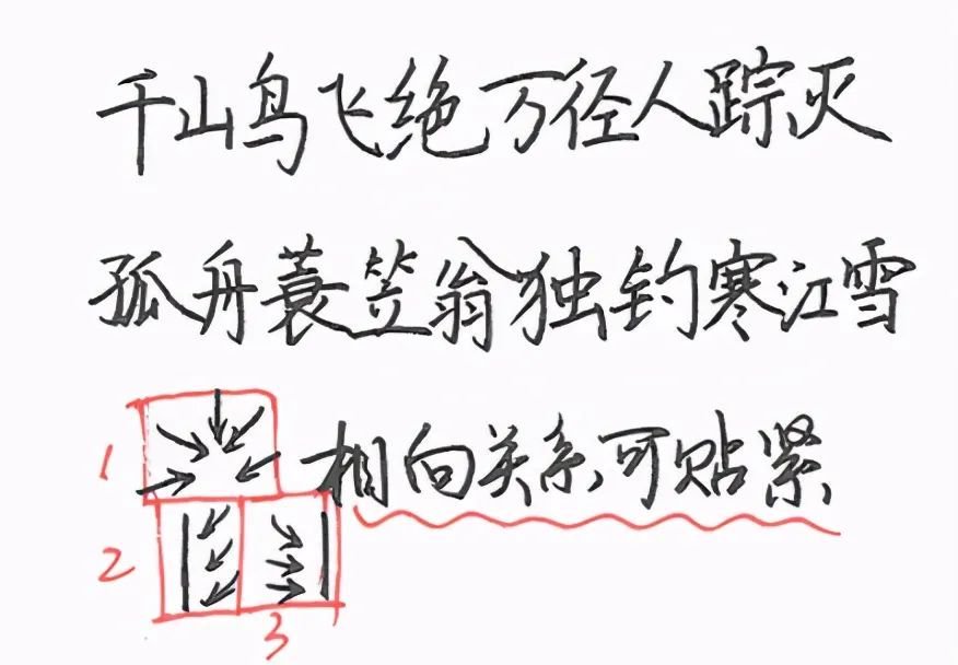
close to each other
The mutual relationship quoted here is not an opposite mutual relationship, but the strokes can each extend toward the middle. In this case, the structure needs to be close to each other. Because there are angles or intervals between the strokes, there are naturally gaps, which will not affect the density.
Density and density
The sparsity here refers to the sparsity between words, rows and rows, and columns. When we follow the principle of leaving spaces behind and close to each other, various distance relationships will appear between words. Normally In the case of hard-pen writing, the distance between characters can be controlled within the range of 0, 1, 2, 3, and 4 millimeters, which requires the comprehensive application of the above typesetting rules.


