
We often say that practicing calligraphy is a protracted battle. People who like writing can be in business for a lifetime. Even people who don’t like practicing calligraphy will show envy and jealousy towards those who are good at writing. Most of them are too lazy to practice calligraphy, because practicing calligraphy is A matter that tests perseverance and aesthetics!
There are very few people who can write well in life. It can be described as rare. Most people are at the elementary level or worse. For those who write well, those "messy" are simply "catastrophic".
So how do primary school students practice hard-tipped calligraphy? Beginners’ calligraphy training tutorial for beginners using hard pen calligraphy
1. The beginning of calligraphy practice
First of all, you need to understand your preferred style, what font you like, such as regular script, running script, official script, Shoujin, whether you prefer hard pen or brush, etc.
Determining these is the real way to start studying.
2. Beginner’s confusion
Daily calligraphy practice for beginners is generally boring, and many people are put off by it, but we need to find ways. When you are constantly changing the beautiful calligraphy on the copybook, don’t be discouraged if you don’t see the effect. If you are a beginner and have no foundation, you should start from copying, and the difficulty of copying is the same. The beginning is very big, causing great psychological pressure and a blow to the confidence of calligraphy practice for friends who have no basic knowledge. You may feel that you will never be able to write as beautifully as a copybook, and there is no hope at all.
3. Benefits of copying
When we copy, we usually just trace red lines or make rubbings. We just trace the words on the original post with a pen. What’s the benefit of this? The benefits are plentiful.
The first is to reduce the difficulty of writing. It is not like copying a post. You have to observe and observe while writing. You also need to understand the structure of the font. To a certain extent, copying is just repeated mechanical writing, but it is not so worthless.
4. The value and significance of copying
What we usually copy is mechanical exercise and repetition to continuously strengthen our pen control, to achieve complete overlap between the pen tip and the copybook, which is a great exercise in pen control ability.
In the process, you unconsciously correct the basic shape of your fonts, from being chaotic to being organized into a range of shapes, and then doing subdivision exercises will be very effective.
5. The meaning of copying
After a stage of copying, our pen control ability has been strengthened, and the fonts have also been corrected to a certain extent. In the process, our observation ability has also gradually improved by describing the strokes one by one (of course, it can also be done by reading the posts frequently) Improve your observation skills) If you come back to post at this time, your basic skills will be competent, and you will not be in the dilemma of being unable to write. The insurmountable hand tremor has been greatly alleviated, and the shape of the font is stable and within the range that can be easily adjusted. Therefore, the significance of copying is to assist in laying the foundation for the post, and it is very helpful for beginners to get started!
The observation of daily calligraphy practice is also viewed from an overall perspective. For example, we can throw away the left and right parts of the character "Chong" without looking at the hanging needle vertically, and only look at the left and right aligned parts of the two dots of water and "口", which are aligned diagonally, and the "口" In the middle of two points of water. Then observe the vertical length of the hanging needle. Generally, the starting point is slightly higher, and the length of the lower part is twice as long as the upper part. This character can be written according to this rule, and the pen control can be written several times before it is in place.
Specifically speaking of radicals, we need to observe the size and shape of the radicals. Generally, the radicals on the left side will have a right-aligned relationship. Let's look at two points of water. First, we need to write it compactly, with the right side aligned up and down. This two points of water only needs these two points. Once you master it, you can write it a few times. After that, you can try to apply it more.
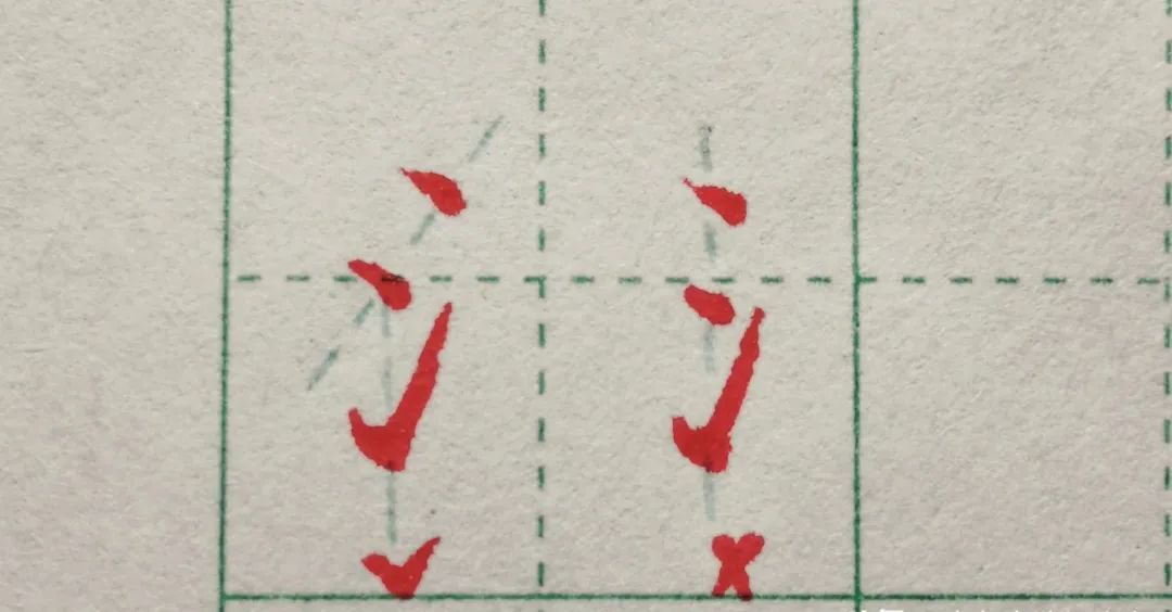
After writing Two Points of Water, you should compare and study Three Points of Water. If you look carefully, remove the middle point of Three Points of Water and it will become a large Two Points of Water. Therefore, writing Two Points of Water will also have an auxiliary effect on Three Points of Water. This is a radical "Association" practice between radicals.
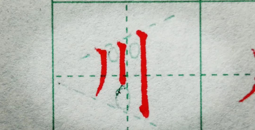
Chuan is a character with only three strokes. It focuses on the practice of equidistant vertical strokes. When viewed from above, the character is completely equidistant from vertical strokes. When viewed from below, the influence of strokes can be ignored. Don’t dwell on the differences in details.
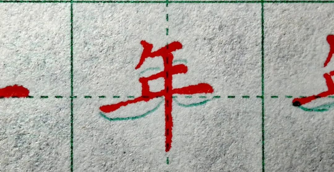
The character Nian is written in a straight-to-right way, that is, the hanging needle should be in the middle but written to the right for balance. There is also the relationship between horizontal drawing and equal distance.
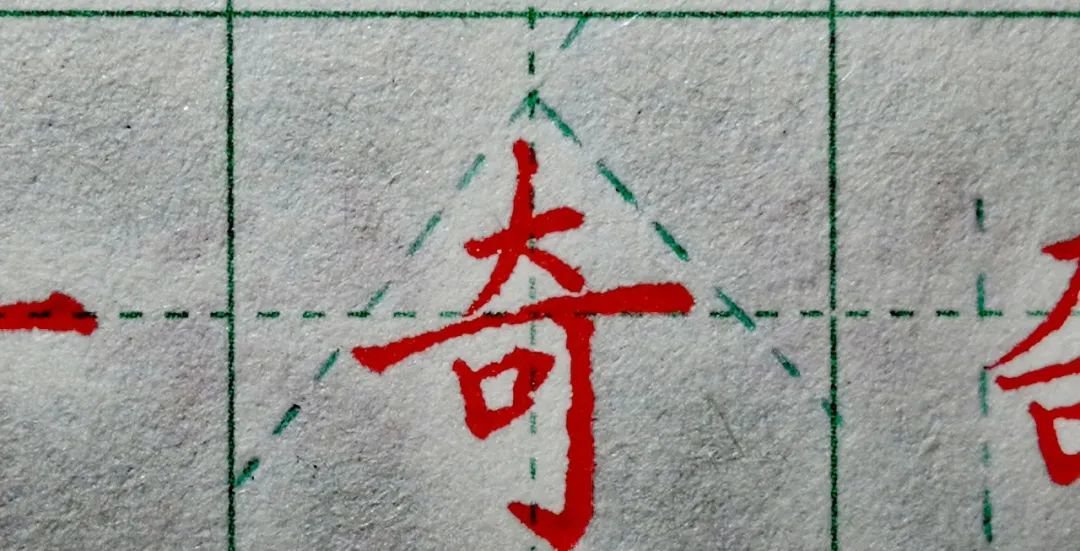
Oddly, regarding the application of the radicals of big characters, sometimes the big characters have a sky-covering structure, and sometimes they are ordinary upper and lower combinations. Pay attention to the changes in the size of the big characters.
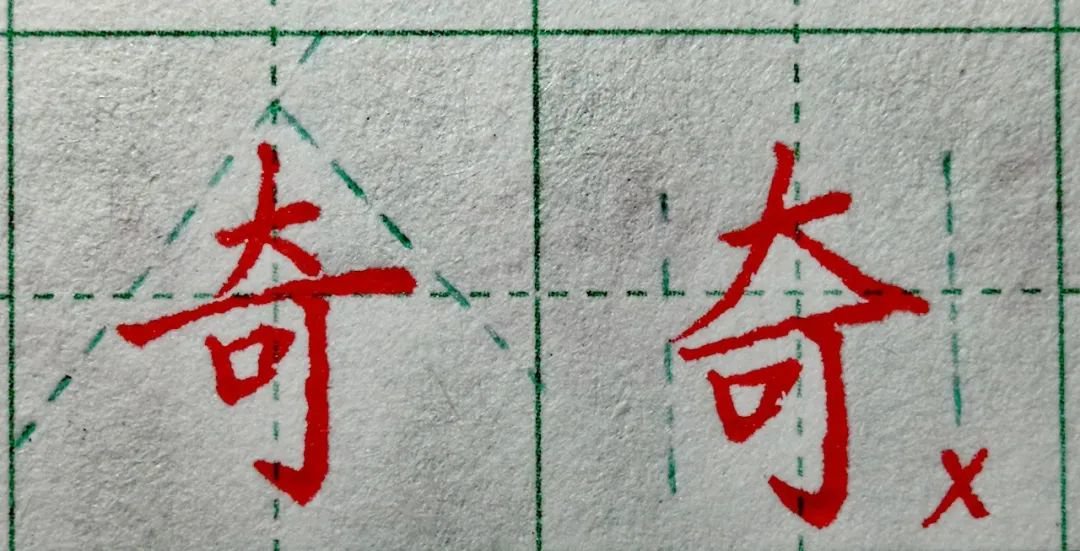
In the character Qi, the big prefix has become smaller, and the main stroke is long and horizontal. This is the structural layout of this character.
The shape of some parts cannot be changed in the font, such as the large prefix "Qi". If the large prefix is made larger, the font will be uncoordinated up and down and extremely ugly.
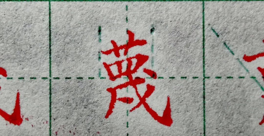
Faced with difficult writing, we have no idea how to write. After copying the word "MI" many times, we can find the pattern. The beginning of the cursive and "四" are basically the same width and the character "戍" below can be practiced separately. It is not that simple to write a single character well. But when you learn how to write, it becomes so simple. It’s not difficult for those who can learn it, but it’s not difficult for those who are difficult. That’s about it!
Finally, let’s talk about it. Pencil is also a good writing tool. It is not inferior to pens or gel pens or difficult to practice. Its only disadvantage is that handwriting retention is not particularly good. There are no obvious disadvantages in other aspects. For daily writing, primary school students Generally, HB is used. It has a higher hardness and can be written for a long time without sharpening the pencil. The character "xiang" above is written with a 4b pencil. The advantage is that the pencil is softer and can be written with sharp strokes. The color is heavier and it can be written in regular script. The writing is expressive, but the disadvantage is that it wears easily. If you can't write many words, you have to sharpen the pencil.
Practicing calligraphy is a long process from entry to mastery. It is extremely important for beginners to get started. For children, cultivating interest and writing awareness is the most important. Different age groups have different writing requirements. In the last sentence, don’t rush for success. Step by step.


