Some thoughts on "A single word looks good, but many words put together don't look good."
When writing, many people have doubts about why it looks better when writing a single word by itself, but not when writing many words together. I think the main reasons for this situation are the following:
1. Self-delusion: In fact, the writing of a single word is not really good (forgive me for telling the truth);
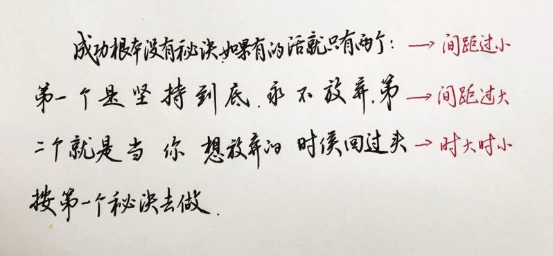
2. Different sizes: the characters are sometimes big and sometimes small, sometimes fat and sometimes thin (large and sometimes small without any pattern);
3. The spacing difference is large: the distance between each character is too close, and the words between them feel airtight; or the spacing between each character is too far, and the characters between them appear empty; or sometimes Very close, sometimes very far apart.
4. The rows and rows are uneven: a row of words is sometimes high and sometimes low, and a column of words is sometimes left and sometimes right; overall, the rows and rows are not aligned, like a dragon wagging its tail;
Let’s take a look at some common mistakes:

Now that the causes of the problems have been found, we can prescribe appropriate remedies for these problems.
1. Work hard.
Only when a single word problem is solved can we consider the next step of inter-word coordination. If you don't sweep one house, how can you sweep the world? I'm not good at single words. Even if the layout is relatively good, I still can't bear to look at it carefully.
2. Regarding the size of the characters.
When writing a work, the size of each character will indeed be different. Because of the difference in size, the overall effect will not be bland. However, the arrangement of this size is not to be written randomly. of. A more acceptable method is that when we write a work, adjacent words with more strokes should be larger, and words with fewer strokes should be smaller. Because if the characters with more strokes are written in the same size as the characters with fewer strokes. Then either the characters with more strokes will look crowded, or the characters with fewer strokes will look loose. Therefore, the basic principle is that those with more strokes should be written larger, and those with fewer strokes should be smaller, so that the whole text is well-proportioned and the flow of Qi is smoother.
3. Regarding the issue of word spacing.
It is divided into two forms: if it is written horizontally, the spacing between words should be basically the same, and it should not be dense or sparse; if it is written vertically, except for a few strokes, the author may handle them relatively stretched to enhance the overall sense of momentum. (Mostly seen in vertical paintings), the spacing between other words should also be basically the same.
4. Dealing with the problem of uneven queues.
This should be relatively simple among the above problems. When writing horizontally, keep the centers of all the words in a horizontal row basically on the same horizontal line. When writing vertically, try to keep the centers of the same column of words on the same vertical line. This requires us to use our peripheral vision to see the words in front of us during the writing process, just like when walking in step or goose during military training, we need to use our peripheral vision to mark the queue.
Horizontal writing alignment
vertical writing standard
The above are some general solutions to this problem. In the process of daily practice calligraphy and copywriting, we should not only pay attention to the writing of the words in the practice, respect the writing of the words in the original calligraphy, and not tamper with it at will. We should also learn the composition and layout of the calligraphy. During the process of practice, we should also follow the original calligraphy. The composition and layout are consistent. Through such accumulated practice over time, you will also develop an understanding of the layout of the rules.
The article comes from the Internet, and the copyright belongs to the original author!


