Detailed explanation of the format of calligraphy works
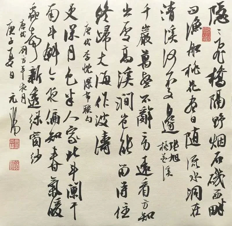
⒈Doufang:
A style of Chinese calligraphy and painting. Shaped in a square shape. Usually four-foot rice paper is cut into two pieces, two feet high and two feet wide. You can also cut the four-foot rice paper into eight pieces, which is called "xiaopin doufang" or "doufang Xiaopin". Doufang is a work of squares written in vertical lines. The written content is generally four to six lines. Because there are many rows and columns, the layout of the chapter should place great emphasis on the size, opening and closing, echo and rhythm changes of the upper, lower, left and right sides. When creating, pay attention to the primary and secondary relationship between the main text and the inscription. The inscription is generally smaller than the main text and should be natural and vivid. The signature can be written below the last line of text, and there should be room for layout. The bottom of the paragraph is generally not flush with the main text to avoid rigidity in form. You can also occupy another line or two lines after the main text, and the top and bottom should not be flush with the main text. The seal should be smaller than the character and should be separated by more than one character.
⒉Three open:
A style of Chinese calligraphy and painting. Rectangular in shape, varying sizes. If four feet of rice paper is cut into three parts, it is called four feet and three parts. If five-foot rice paper is cut into three parts, it is called five-foot three-part. By analogy, the same three-foot-long painting has different sizes. A four-foot three-foot painting is generally a three-foot screen (actually it is two feet seven inches, one-third of the eight-square-foot market). Five feet three squares is one-third of twelve square feet, and the area of each square is four feet.
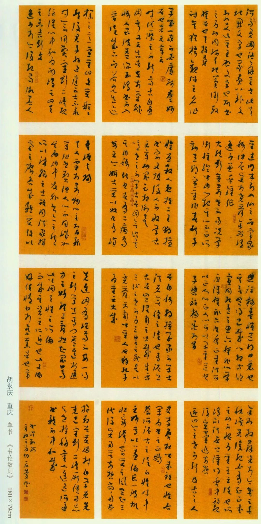
⒊Format:
A style of mounting Chinese calligraphy and painting. Usually two paintings are hung in pairs. For example, calligraphy pairs are called "character pairs" or "couples". Ming and Qing paintings have "painting pairs", which are two screen strips of equal size hung in pairs. There are also vertical scroll paintings hanging in the middle of the hall and "character pairs" hanging on both sides, or calligraphy hanging on a permanent scroll hanging in the middle and "painting pairs" hung on both sides.
⒋Nave:
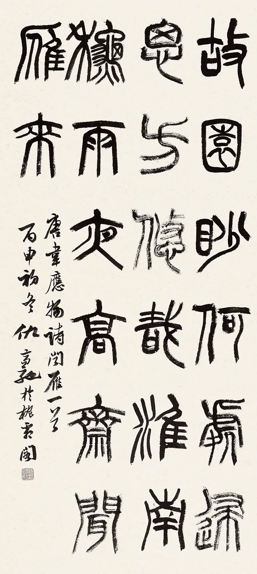
The nave is a rectangular work with vertical writing. The size is generally a piece of rice paper (divided into four feet, five feet, six feet, eight feet, etc., of which the small nave is 68CM×45CM). Because the size is relatively large, it requires the creator to have sophisticated techniques and the ability to grasp the overall layout of the work. When creating, pay attention to the primary and secondary relationship between the main text and the signature, so that they are differentiated and shine accordingly. Don't be too pretentious when signing your signature. The signature can be written below the last line of text, and there should be room for layout. The bottom of the paragraph is generally not flush with the main text to avoid rigidity in form. You can also occupy another line or several lines after the main text. The top and bottom should not be flush with the main text. The seal should be smaller than the inscription, and the seal should generally be placed one character or more away from the inscription, either below or to the left of the inscription.
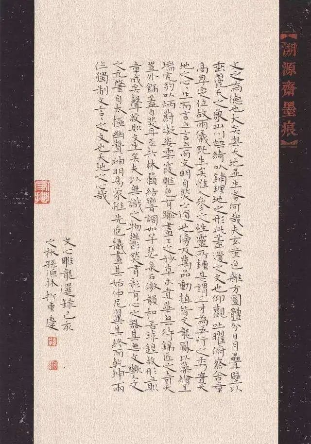
⒌Banner:
Banners are long pieces of vertical writing. The size is generally one piece of rice paper cut into half. When arranging the composition, you should be able to carefully conceive according to the characteristics of the book style and have a new idea. When creating, pay attention to the primary and secondary relationship between the text and the signature. The signature should be well-proportioned, natural and vivid. The signature can be written below the last line of text, and there should be room for layout. The bottom of the paragraph is generally not flush with the main text to avoid rigidity in form. You can also occupy another line or two lines after the main text. The top and bottom should not be flush with the main text. The seal should be smaller than the inscription, and the seal usually needs to be placed at least one character away from the inscription. It can also be stamped to the left of the inscription.
There are two common formats for banners:
①Written in two or three lines. Two line format. The left and right lines are written against the left and right sides of the paper, leaving more white space in the middle. Pay attention to the rhythm of the upper and lower characters and the echo between the two lines. The signature is usually written at the end of the second line, and the position should be slightly higher than the last word of the first line. The wording can be written in one or two lines. For the three-line format, attention should be paid to the interrelationship between the three lines, interspersed with shadows and rhythm changes. The signature can be placed at the bottom of the last line, slightly higher than the first and second lines of the main text; you can also write a separate paragraph, which should be shorter than the main text, and should not be parallel to the main text.
②Write one line (less number of words) in the center. The written content is usually a motto, aphorism or a poem. The number of words is small. When writing, you should pay attention to the opening and closing of the words and the changes in rhythm to make it vivid. The signature can be divided into single style and double style. The single paragraph is usually written in the middle position on the left side. The content of the inscription includes the writing time and the author's name, or just the author's name or number. The seals should be placed below the inscriptions, generally on two sides, and there should be an appropriate distance between the seals. When writing a double paragraph, the first paragraph is written on the upper middle part of the right side of the work. Generally, the time when the work was created is written. If the work is donated, the recipient's name or number, title, Yazheng, Huicun, Qingshang must be written. etc words.
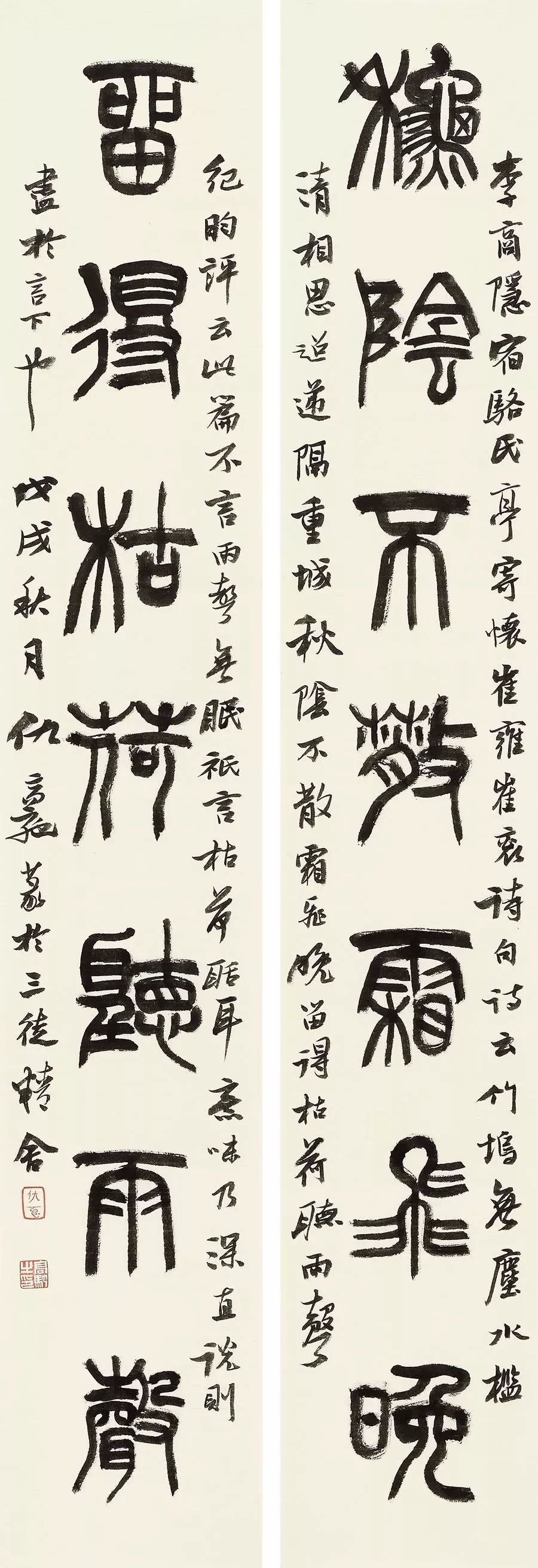
⒍Couplet:
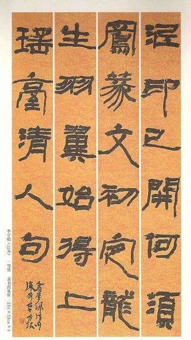
Also known as couplets. It is divided into two lines, the one on the right is the upper line and the one on the left is the lower line. The size of the upper and lower couplets can be the same as the banner, larger or smaller than the banner. The writing content of couplets is extremely strict. They can only be antithetical sentences (the upper and lower couplets have an equal number of words, are opposite each other, and ordinary words do not appear repeatedly), including couplets (commonly known as couplets) and the middle two couplets in rhymed poetry (jaw couplets and neck couplets). . Commonly used couplets include five or seven characters, and some may have as few as three characters per couplet, as many as several crosses, or as many as hundreds of characters per couplet. Rhymed poetry is divided into two types: five-character and seven-character. When arranging the composition of five-character and seven-character couplets, the upper and lower couplets should be written vertically in the center on a single line. Dual sentences with a cross or above should be written in two or more lines (pay attention to the order of writing, from right to left in the upper couplet and from left to right in the second couplet. Double paragraphs should be placed at the end of the upper and lower couplets respectively, and the paragraph characters should be slightly higher than bottom of text). The positions of the upper and lower couplets should generally be basically parallel. Handle the changes in the size and expansion of the upper and lower characters within a couplet, as well as the echo between the upper and lower couplets, so that the upper and lower couplets become a whole.

The inscriptions of couplets below the cross are divided into upper and lower styles and single styles. The upper paragraph is written on the right side of the upper line, and the lower paragraph is written on the left side of the second line. The first paragraph generally writes the author of the poem, the title of the poem, etc. For example, the lower paragraph of "Huang Tingjian's Poems on Deng Kuaige" writes the name and number of the author, as well as the place and time of writing. For example, if "Bingzi Xiantang Shu in Beijing" is a gift work, the first couplet must state the recipient's name, title, and the words Yazheng, Huicun, Qingshang, etc. For example, if "Ms. Wenying Huicun" is a work that someone asked you to write, write the name or number of the person who asked you to write it on the first couplet, plus the title plus "Instruction Letter" and other words. The single paragraph is usually written in the upper middle position on the left side of the second line. The content of the inscription includes the writing time and the author's name, or just the author's name or number. The seals should be placed below the inscriptions, generally on two sides, and there should be an appropriate distance between the seals.
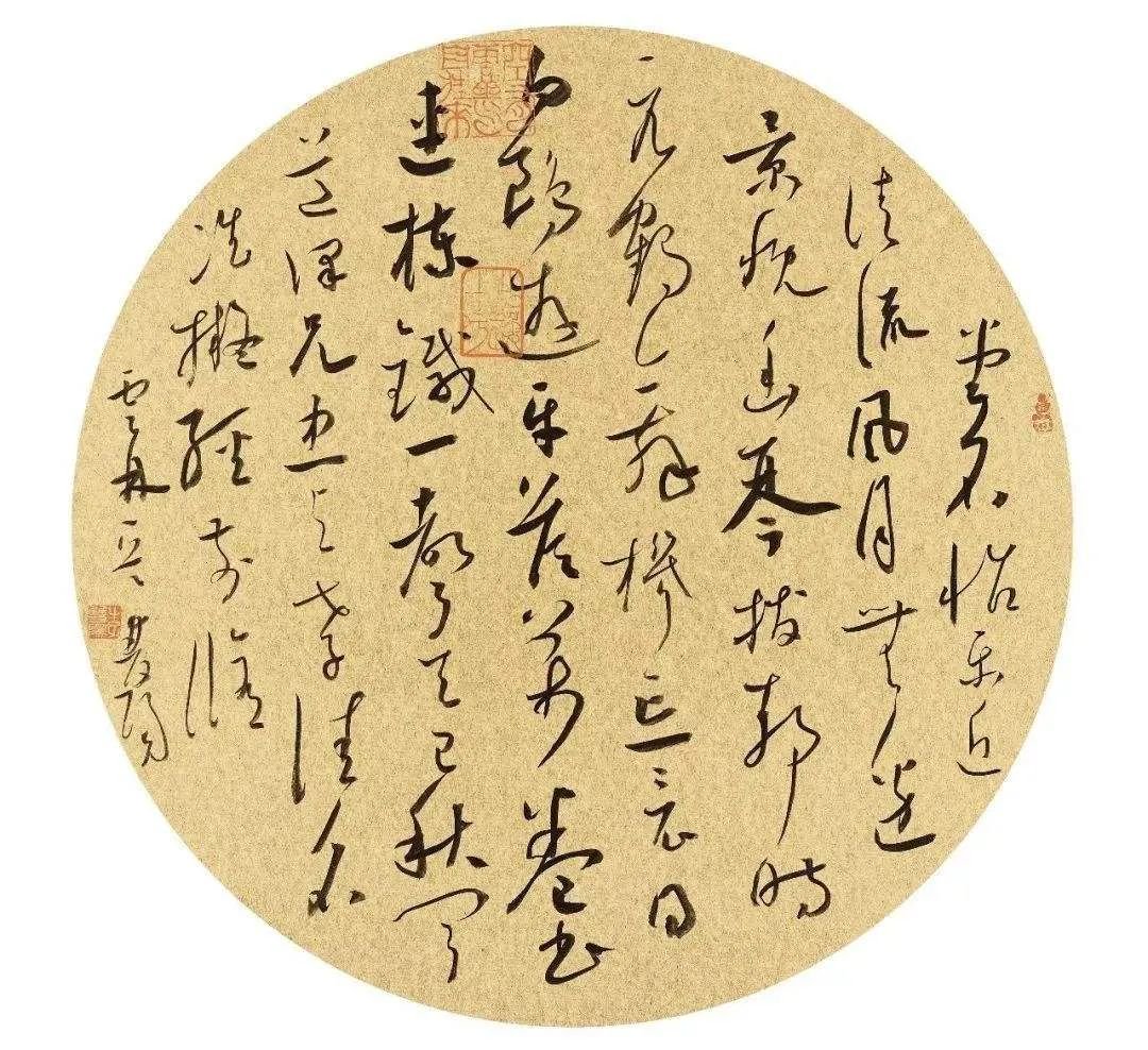
⒎Sector:
This refers specifically to the folding fan surface, which is a special form. Due to the shape of the fan surface which is wide at the top and narrow at the bottom, the fold lines and split lines are also wide at the top and narrow at the bottom. This unique style requires us to make appropriate arrangements when creating.
There are three common forms of fans.
(1) Make full use of the upper end and leave the lower end unused. In this format, it is appropriate to write two words per line, arranged in order from right to left. The signature is written on the left side of the text. The inscription should be longer, the inscription should range from one line to several lines, and the seal should be smaller than the main text.
(2) Write a small number, using the width of the fan from right to left, and write two to four characters horizontally. It should be retracted and opened appropriately. You can write several lines of small characters when signing, so as to complement the main text.
(3) The upper end is written in sequence, and the lower end is written in alternate lines, forming a staggered pattern of long and short lengths. This can avoid the situation of being sparse at the top and crowded at the bottom, and achieve harmony throughout the text. In this format, long lines should be written first, preferably about five characters, and short lines of one or two characters should be written first. The signature should be wonderful, usually written at the end of the text, and can be one line or several lines. That is, the chapter should be smaller than the words signed.
The signature and seal of traditional calligraphy creation styles
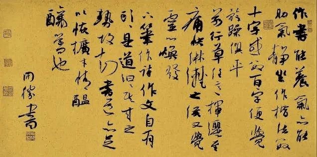
The signature comes from "recognition of style". It was originally an inscription on the bronze vessel explaining the reason why the vessel was cast. The extension is used to explain the author and content of the calligraphy and painting works. The signature content includes the author's name (including font and number), time, writing content, and even the writing place, environment or climate, mood, etc. The signature can be divided into upper payment and lower payment. The author's name is referred to as the subsection. The person to whom the book is presented is called the first recipient. Generally, the last name is not written in the above paragraph, only the first name is written to show intimacy. If it is a single name, the first name is written together. Under the name, you should also write a title, usually "comrade" or "sir", and then write "zhengzhi", "zhengshu", "zhirecti" or "zhishu", "zhengzheng", "yazheng", "zhengzhi", "zhengshu", "yazheng", Huicun" etc. The upper paragraph can be written in the upper right corner of the book or after the end of the text, but the upper paragraph must be above the lower paragraph to show respect. Generally, it is not flush with the main text, but can be slightly lower, and the words are smaller than the main text.
Before creating, you must first choose the content to write. The content must be healthy and positive, and you can also write ancient or contemporary poems or famous sentences. After the content is determined, you can consider the writing form, whether to write in the nave, couplets, banners, banners, albums, or squares; whether to write in large characters or small characters, how many lines to write, and how big is the paper? Also leave a place for your signature. The text content cannot be written flush with the top of the head, and there must be white space around it. The upper and lower margins (called Tiantou and Ditou) of vertical calligraphy such as nave, couplets, and banners should be larger than the two sides. The upper sky of a stock is greater than the lower sky. For example, when writing a banner, leave ten centimeters of white space at the top, seven centimeters at the ground level, and three to five centimeters on each side. The left and right spaces on the banner are equal, but they should be larger than the sky and the earth, and the sky and earth should be equally spaced. The squares and blank spaces around the album are roughly the same. After the four sides are left blank, fold lines or grids according to the number of words and the size of the paper.
When creating, after writing the big characters, change to a small pen to write the signature. The signature can be written vertically. You can write two lines, or you can write only the author's name on one line (called poor money). Depending on how much blank space is left, you can write the source of the content, the year, and finally your name, "someone's book." Generally, the signature characters are smaller than the characters in the main text, and the calligraphy style can be the same as the main text or regular script with lines to show the difference. Finally stamped.
Seal refers to stamping. There are two types of seals: Zhuwenyin and Baiwenyin. Zhuwenyin is also called Yangwen, that is, the characters are convex, and the words printed on the paper are red; Baiwenyin is also called Yinwen, that is, the characters are sunken, and the words printed on the paper are white. According to the content of the seal, there are also name seals, fasting number seals and leisure seals. Generally, there is a name seal after the name of the person who signed the name. If it is too empty, you can also add a Zhaihao seal. Do not stamp the name seals of two parties with the same content at the same time. It can be stamped with a surname seal or a name seal, usually one in red and one in white. In order to make the top and bottom of the book echo each other, a first seal is often stamped on the upper right side of the book, also known as the first seal. Beginners can choose the content of the seal to read "Xuehai", "Quest", "Xueshu", etc. The size of the seal is related to the size of the writing and the font size of the writing. Generally, large-format books have large inscriptions and large seals, while small-format books have small inscriptions and small seals.

Taboos about using seals
When writing and sealing calligraphy and paintings, the seal should not be larger than the characters. It is natural to put a big seal on a large area and a small seal on a small area.
The Chinese painting should be stamped directly under the inscription, straight down to the bottom corner, and no corner stamps can be stamped. For example, if you sign the name on the upper right, you can stamp the leisure seal on the lower left corner; if you sign the signature on the upper left corner, you can stamp the leisure seal on the lower right corner. If the seal of the above paragraph is close to the lower corner, there is no need to stamp the free seal.
When inscribing the Chinese chess piece, the left and right corners should not be stamped with idle stamps. If you sign on the upper right corner, you can stamp it with a square stamp on the lower left corner; if you stamp it on the lower left corner, you can stamp it with a square stamp on the lower right corner. If there is no need to stamp the seal here, but to stamp it reluctantly will be self-defeating.
Rectangular, round, and oblong seals cannot be placed on the lower corner of the square seal.
The square seal should not be placed on the blank space at the top of the calligraphy and painting, otherwise it will take over the main function.
When inscribing a traditional Chinese painting in a straight line, the characters at the end of each line should not be neatly aligned with the length of other lines. The same goes for seals.
Two seals, one square and one round, cannot match. Same-shaped prints can be matched.
Seal two seals, one large and one small, to match. Same size available to match.
Two seals, one rectangular and one oval, cannot match. Same-shaped prints can be matched.
The two seals, the upper Yang text and the lower Yin text, cannot match. And upper yin and lower yang can match.
The two seals, upper Yangwen and lower Yangwen, cannot match. And upper yin and lower yang can match.
The two seals, the upper inscription and the lower inscription, cannot match. And upper yin and lower yang can match.
No inscriptions are allowed after the signature is signed and sealed. If there are restrictions on the upper and lower parts of the seal, the natural phenomenon will be lost.
Once the payment has been made, the calligraphy and painting have been stamped, it would be disrespectful to make another payment and give it away after payment.
Flower heads, bird tails, branches, and mountain tops cannot be stamped or stamped. This is the most basic common sense for painters and must be understood.
Craftsman-engraved seals cannot be used for calligraphy and painting. An artistic seal engraver is required, and stone seals are the best.
Ordinary sealing is not suitable for calligraphy and painting, and Babao sealing pad must be used.
When applying two seals, the distance between them should not be too far or too close. One seal should be separated by just the right distance.
The two seals have different seals, seals, and sword techniques and cannot be matched. The seal must be carved with the same knife technique.
Do not write doggerel on the painting. If you know it, you will laugh at it. If it fails, the work will be derogated as vulgar.
Don't put a leisure seal on the top of the money. People are very taboo about putting it on a person's name. Firstly, it's disrespectful, and secondly, it ruins the picture.
The stamped corner seal should not be too small. The rice paper should be opened in four quarters and should be printed with a square stone seal, about three centimeters, which is relatively moderate.
When stamping the corner stamp, do not stamp on two sides, one side is just right. The distance between the seal and the edge is about one. Five centimeters is moderate.
The seal is not stamped under the inscription, but is stamped on the left and right sides of the inscription, separated from the line of inscription, and becomes an object outside the painting, except in special circumstances.
On calligraphy and painting, do not put a big seal on it, as it will become a giant seal bomb, destroying the beautiful picture, which is very scary.
Small paintings cannot be inscribed with large characters, and large paintings cannot be inscribed with small characters. Small spaces should not be filled with many inscriptions, and large spaces should not be filled with few inscriptions.
Name seals on calligraphy and painting should not be stamped with more than three stamps in a row. Two stamps should be stamped, or one stamp is appropriate.
The upper, lower, left and right sides of calligraphy and painting should not be stamped arbitrarily. It is better to cover too much than not to cover too much, and it is better not to cover well if the seal ink is not good.
When sealing a second seal, don't stagger around. How to seal the seal, how much force you use, and how to maintain the seal and ink pad are all issues that must be studied with concentration. These are issues that cannot be ignored.
Do not use vulgar words or inscriptions on paintings, as this will affect the aesthetics of the painting, and it will inevitably lead to vulgarity.
For the first calligraphy quadruple, a small long seal can be stamped on the upper right corner, but the rest cannot be stamped. If all are stamped, the flow of Qi will be destroyed.
Commonly used closing words
1. Title
⒈Elders: my teacher, Taoist priest, senior, sir, madam (miss);
⒉ The same generation (or younger generation): brother, younger brother, dear brother, respected brother, eldest brother, wise brother (brother), school brother (brother), Taoist brother, Taoist friend, Xueyou, Fang family, Mr., Miss, Legalist (right) Calligraphy and painting or expertise in a certain field);
⒊The relationship is relatively close: Xue (benevolent) brother, my brother (brother);
⒋Teacher to students: learn (benevolence) brother, learn (benevolence) Di, Xianqi, Xiandi;
⒌Classmate: senior, senior, classmate, classmate, seatmate.
2. Greetings or words of honor
Yashang, Yazheng, Yapeng, Yajian, Yajiao, Yacun, Zhencun, Huicun, Qingjian, Qinglan, Qingpin, Qinggen, Qingshang, Qingzheng, Qinghe, Qingjiao, Qingwan, Jian Zheng, knock right, benefit Zheng, grant Zheng, ax Zheng, Fa Zheng, Fa Jian, Bo Jian, Zun Jian, Chang Jian, Dharma teaching, Bo Jiao, Dajiao, Daya, patch up the wall, paste the wall, is Zheng, Jiao Zheng, Tell the truth, observe the truth, ask for the correction, two corrections, get it right, point out the correction, learn from it, correct it, correct it, laugh at it, teach it, correct the wrist, act correctly, keep the mind, belong to charm, one charm, charm. , Yixiao, Xiaoxiao, Xiaocun, Xiaojian, Belong, Jian, Play
3. Greetings or words of honor when making a payment
1. Calligraphy inscriptions are used for: letters of respect, letters of worship, letters of sincerity, letters of indignance, letters of instructions, letters of intoxication, letters of intoxication, essays, plays, festivals, books, recordings, inscriptions, pens, writing, writing, and seal script;
⒉Painting inscriptions are used: respect, respectful gift, special gift, painting blessing, writing blessing, writing tribute, pause, title, parallel title, play title, title, title sentence, respect, note, inscription, remember, and Inscription, postscript, inscription and postscript, worship, recording, parallel recording, praise, self-praise, inscription praise, self-deprecation, handwriting, essay, play ink, caricature, lead title, draw, write, write with care, write with respect, imitate;
⒊Seal cutting edges are used for: carving, recording, making, curing stones, and seal cutting.
4. Summary of the traditional lunar calendar name for the inscription time of calligraphy works
⒈January: Mengchun, Chuchun, Shangchun, Duanyue, Chuyang, Duanchun, Mengzou, Chunyang, Shouyang, Zhaochun;
⒉ February: Zhongchun, Zhongyang, Zhongzhong;
⒊March; Ji Chun, Late Spring, Qi Moon, Flower Moon, Late Spring, Jia Yue, Silkworm Moon;
⒋April: Mengxia, early summer, first summer, Weixia, Huaixia, Yu month, Qinghe month;
⒌May; midsummer, super summer, durian month, May month;
⒍June: Jixia, late summer, late summer, summer month, lotus month, extreme heat month, and period month;
⒎July: Mengqiu, early autumn, Shaoqiu, Xinqiu, Zhaoqiu, early Shang, Lanyue, Liangyue, Xiangyue;
⒏August: Zhongqiu, Zhongshang, Guiyue, Zhuangyue;
⒐September: Jiqiu, late autumn, late autumn, Qiuqiu, Qishang, Jishang, Jibai, Juyue, Yongyue, Xuanyue, Qiongqiu;
⒑October: Mengdong, early winter, upper winter, Yang month, Kun month, auspicious month and good month;
⒒November: Midwinter, Zi month, Jia month, Chang month;
⒓December: Jidong, late winter, late winter, poor winter, severe winter, severe month, Jiaping month, twelfth lunar month, and Chu month.
Chinese calligraphy and painting rice paper size
1. Three-foot rice paper - specifications are 100×55 (length×width) (unit: CM)
⒈Three feet fully open: 100×55 (standard three feet)
⒉ Large three-foot: 100×70 (standard three-foot length remains unchanged, width is two feet)
⒊Three-foot extension: 136×50
⒋Three feet horizontal batch: 100×55 (standard three feet)
⒌Three-foot single strip (vertical axis): 100×27 (standard three-foot length remains unchanged, width 1/2)
⒍Three-foot couplets: 100×27 (standard three-foot length remains unchanged, width 1/2)
⒎Three-foot cube: 50×55 (standard three-foot rice paper length is 1/2, width remains unchanged)
2. Four-foot rice paper - the specification is 138×69 (length×width) (unit: CM)
⒈Four feet fully open: 138×69 (standard four feet)
⒉Four-foot horizontal batch: 138×69 (standard four-foot)
⒊Four-foot single strip (vertical scroll): 138×34 (standard four-foot rice paper length remains unchanged, width 1/2)
⒋Four-foot couplets: 138×34 (standard four-foot rice paper length remains unchanged, width 1/2)
⒌Four-foot cube: 69×68 (standard four-foot rice paper length is 1/2, width remains unchanged)
⒍Four-foot three-part: 69×46 (standard four-foot rice paper length is 1/3, width remains the same)
⒎Four feet and six inches: 46×34 (standard four feet rice paper length 1/3, width 1/2)
⒏Four-foot square: 69×34 (standard four-foot rice paper length 1/2, width 1/2)
⒐ Four-foot-eight rice paper: 35×34 (standard four-foot rice paper length 1/4, width 1/2)
3. Five-foot rice paper - the specification is 153×84 (length×width) (unit: CM)
⒈Five feet fully open: 153×84 (standard five feet)
⒉Five-foot horizontal batch: 153×84 (standard five-foot)
⒊Five-foot single strip: 153×42 (standard five-foot rice paper length remains unchanged, width 1/2)
⒋Five-foot couplets: 153×42 (standard five-foot rice paper length remains unchanged, width 1/2)
⒌Five-foot cube: 77×84 (standard five-foot rice paper length is 1/2, width remains unchanged)
4. Six-foot rice paper - specifications are 180×97 (length×width) (unit: CM)
⒈Six feet fully open: 180×97 (standard six feet)
⒉ Six-foot three-part: 60×97 (standard six-foot rice paper length 1/3, width remains the same)
⒊Six-foot couplets: 180×49 (standard six-foot rice paper length remains unchanged, width 1/2)
⒋Six-foot cube: 90×97 (standard six-foot rice paper length is 1/2, width remains unchanged)
5. Seven-foot rice paper - specifications are 238×129 (length×width) (unit: CM)
⒈Seven feet fully open: 238×129 (standard seven feet)
6. Eight-foot rice paper - specifications are 248×129 (length×width) (unit: CM)
⒈Eight feet fully open: 248×129 (standard eight feet)
⒉Eight-foot screen: 234×53
⒊Eight-foot square: 124×124
7. One foot and two feet of rice paper - the specification is 367×144 (length×width) (unit: CM)
⒈One foot and two feet: 367×144
⒉ One foot and two square feet: 180×142
⒊Small size: 360×96
8. One-foot-six-foot rice paper - the specification is 503×193 (length×width) (unit: CM)
⒈One foot six feet: 503×193
9. One-foot-eight rice paper - specification: 600×248 (length×width) (unit: CM)
⒈One foot and eight feet: 600×248

Appendix: Chinese calligraphy and painting on the sale of rulers
The "foot" mentioned here refers to square feet, and one foot is equal to 33.3 centimeters. Why not call it a square foot but a "foot"? This is related to the specifications of rice paper. The specifications of rice paper include three feet, four feet, five feet, six feet, eight feet, two feet, etc. For example: the specifications of four-foot paper are four feet long and two feet wide, with an area of eight square feet. Cutting four feet of paper in half is called a square, which is four square feet. Everyone knows that buying and selling cloth depends on the ruler. I don’t know when it started, but selling calligraphy and painting has also been calculated in this way.
Common calligraphy and painting sizes
Sketch: 41(cm)×28(cm)
Three-foot full sheet: 96(cm)×52(cm)
Three feet square: 50(cm)×50(cm)
Three-foot folio: 96(cm)×26(cm)
Four-foot full sheet: 136(cm)×70(cm)
Four feet square: 70(cm)×68(cm)
Four-foot folio: 136(cm)×34(cm)
Four feet three inches: 70(cm)×44(cm)
Six-foot full sheet: 180(cm)×96(cm)
Six-foot square: 96(cm)×90(cm)
Eight-foot full sheet: 245(cm)×120(cm)
Eight-foot square: 122(cm)×120(cm)
Small size: 360(cm)×96(cm)
Two feet tall: 360(cm)×142(cm)


