Lu Zhongnan, male, was born in Wuhan in December 1950, and his ancestral home is Jiyuan, Henan. A famous calligrapher in China, he enjoys special government allowances from the State Council. He is currently a director and member of the Chinese Calligraphers Association, deputy director of the Hard Pen Calligraphy Committee and a member of the Regular Script Committee of the Chinese Calligraphers Association, a member of the 10th and 11th National Committee of the Chinese People's Political Consultative Conference, director of the Design Department and Research Librarian of the Military Museum of the Chinese People's Revolution, China Research librarian of the Military Museum of the People's Revolution, member of the Chinese Museum Society, and consultant of the Chinese Painting and Calligraphy Masters Research Institute. In July 2009, at the invitation of the Ministry of Foreign Affairs, he created regular script works for the new building of the Chinese Embassy in the United States.
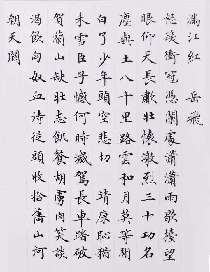
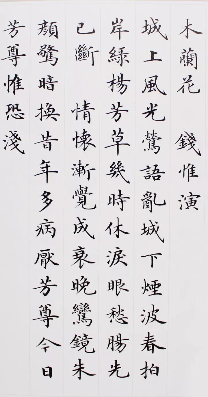
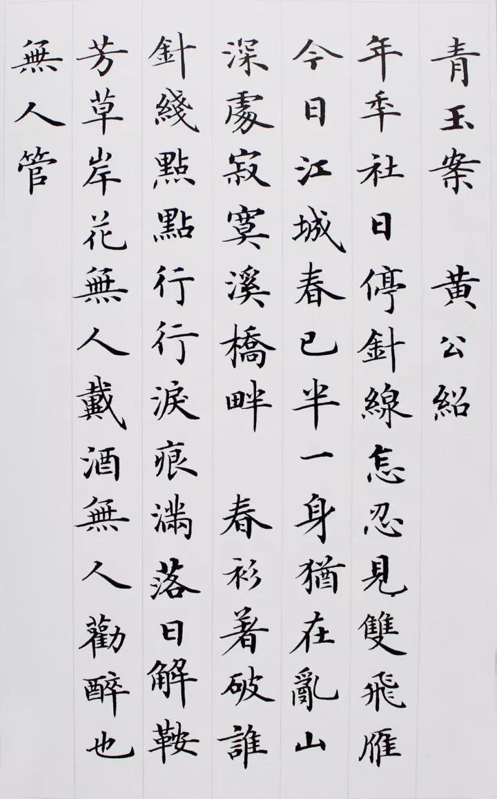
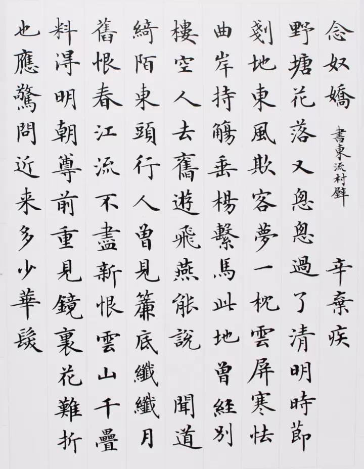
Let’s take a look at Lu Zhongnan’s small regular script first:


How to practice Lu Zhongnan Xiaokai? The main areas that need attention at the technical level include the following aspects:
1. Reasonably arrange the font size and determine the font and line spacing.
Because regular script emphasizes rows and columns and neat rules and regulations, it is generally written in regular script. Therefore, it is very necessary to master the word spacing and line spacing and leave a reasonable and visually comfortable space. It is also the key to the organization of the entire work. , neither should the words be written too big, filling up the grid and leaving no space, nor should the words be written too small, too sparse, making them appear empty.
For characters with many strokes, make the strokes thinner and lighter; for characters with fewer strokes, make the strokes bolder and heavier.
2. Be well proportioned and pay attention to balance
1. Pay attention to parallel and equal distances
There are a lot of interspersed horizontal and vertical strokes as well as diagonal strokes in the glyphs. The relationship between the strokes must be arranged according to the writing principle of "parallel and equidistant".
The so-called "parallel and equidistant" means that firstly, the direction of the strokes should be basically the same (in order to pursue changes, individual characters with few strokes can be slightly different), which is called "parallel"; secondly, the distance between the strokes should be basically equal, which It's called "equidistance."
When writing a regular script structure, the principle of parallelism and equidistance must not be ignored. The principle of "parallel and equidistant" in the structural layout of regular script can be said to be the most basic requirement and the basis for dealing with the spatial distribution between strokes.
Although regular script strokes have relatively accurate spacing, it by no means means "accurate". It just feels like the distance between strokes should be basically even. In some cases, it is not uniform.
2. The cloth is white and even
Taking the word "木" as an example, four horizontal and vertical strokes are focused on the center of the word. We use circles of different sizes and diameters to indicate the space occupied. We can see that when the angles of the strokes and strokes are inconsistent, the angles of the wooden characters above are almost equal, and the circles showing the space between them are also equal. Since the space layout is basically equal, the glyph feeling is comfortable. On the contrary, there will be an unequal situation, the white cloth will be uneven, and the feeling will be uncomfortable.
3. Take care of each other and avoid giving way
The glyphs are facing each other and mostly appear in the left and right structures. The left and right parts (including the three parts in the left, middle and right structure) greet each other, just like two people sitting face to face, stretching out their arms and legs, as if embracing each other, but not hindering each other, especially the left and right parts. When there are many strokes such as pressing, lifting, and dotting, they will inevitably fight with each other. Therefore, they must be appropriately contracted and stretched reasonably.
If everyone does their own thing, refuses to give in to each other, and shows their strengths, there will be no arrangement. Also, when dealing with this type of glyphs, of course we should take care of each other and not interfere with each other, but we should also be careful not to go to extremes and become two "independent" parts. You are you and I am me, so the characters will be loose and not It’s compact.
All that's left is to finish practicing, keep persevering, and believe that one day you will become a master!
This article is published by 15CiLian.com, please indicate when reprinting: https://www.seowhy15.com/a/379.html


