Ouyang Xun's calligraphy combines the characteristics of Han Li and Jin Dynasty regular scripts, and also incorporates the six dynasties' inscriptions, so it can be said that he draws on the strengths of each calligraphy school. The main characteristics of the style are rigorous and neat, upright and vigorous. Although the font is slightly longer, the intervals are white, neat and rigorous, the middle palace is tight, and the main stroke is elongated, which makes it appear vigorous and unrestrained, sparse and dense, all sides are well prepared, eight sides are exquisite, the charm is vivid and just right. The combination of stipples and the structural arrangement are flat in the center but steep and strong. Most of the fonts expand to the right, but the center of gravity is still very stable and there is no sense of inclination, so it has the interest of combining danger with uprightness.
Today's people who study Ouyang Xun's regular script are too rigid and rigid from a strategic point of view, and have committed the following mistakes:
1. Too much stability and lack of vitality
Regular script was born out of official script, and its biggest improvement is that it "stands up." In order to pursue the rigorous and neat artistic characteristics of the European style, some people make the European regular script "sit down" again. The words they write are like sitting on the ground, a pile of fat and stable, and they have not learned the steep characteristics of the European regular script. . However, Ou Kai seeks stability in danger. Many people write stroke by stroke too slowly and accurately in order to be stable and look good, causing the entire character to lose its vitality.
2. Follow the gourd and draw the scoop, without losing your composure.
Some people have been learning Ou Kai Kai for a long time, but they use the scanning, tracing, and drawing methods to move their pen too much. They dare not and cannot use reverse strokes to start writing. They are not calm when writing, and they cannot write long and vertical strokes well. For example, next to the sharp knife in the word "Xing", Ouyang Xun's vertical hook is straight and can withstand great force. But what people learn today is curved and cannot bear force. This is the most common problem when learning Ou Kai nowadays.
3. Improper pen handling and poor filling power
For example, for the first point of the three points of water, many people write at an angle, and the points they write are not round enough, and they cannot write the taste of "point of water". Another example is the ending of a long stroke. Many people "drag" it out, with a thin line trailing behind it, a bit like the larvae of a fly. Another example is the horizontal fold of the hook. Some people write with "slumped shoulders" due to incorrect handwriting.
Improper pen handling leads to fatigue. Some people only see the compact structure and proper spacing of European regular script, and focus on using the changes in stroke thickness to piece together the font, ignoring the bones and strength that regular script should have. The entire character has not found the center of gravity and stress point of the font. It looks like it was built from a pile of loose wood. The strokes and white space are evenly placed, but the entire word is weak and weak.
4. Copying things mechanically and being too artistic
Ou Kai is easy to learn because of its neatness and strictness. In order to take a shortcut and get results in the shortest time, some people practice Ou Kai script according to the method of artistic calligraphy, copy it by rote, copy the gourd and draw the scoop, and the words they write are the same. The good-looking ones are always the ones, and some are difficult to write. The characters can only be replaced with variant characters. As time goes by, it will be difficult to go back from the wrong path, which not only delays oneself, but also ruins the atmosphere of the book world.
How to use your brain to bring European style to life?
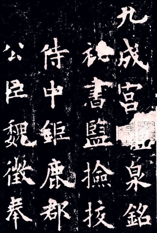
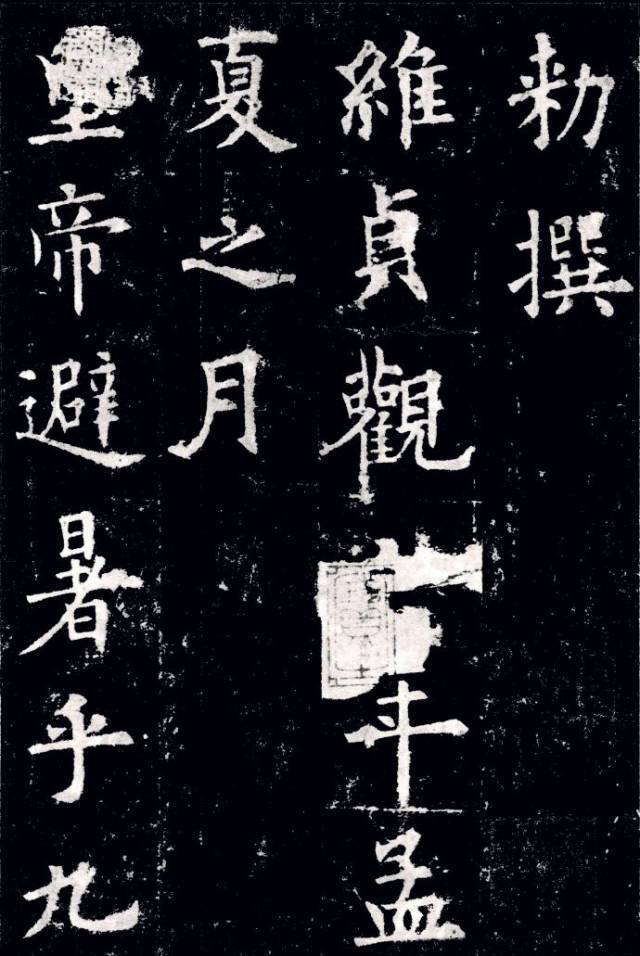
Ouyang Xun's "Jiucheng Palace" is a relatively mature work in his later years. Every word is exquisite and perfect. It can be retracted and released freely without leaving any trace. It has reached the state of "doing what one wants without going beyond the rules". This characteristic is very obvious in the words "fenyan is like a sound, and it is obvious". Beginners who learn "Jiucheng Palace" are prone to the mistake of "being cautious and not letting the atmosphere out". The more they learn to learn it to be compact and steep, the more they learn, the less relaxed they become, and the more they learn, the more rigid they become. If those who study Ou Kai cannot properly understand the subtleties of this aspect of "Jiucheng Palace", I am afraid that most of them will go astray.
1. The structure of European regular script is dangerous. It’s okay to write in Yan Kai using the European regular script structure! Qi Gong has done this before, and it works well. However, it is absolutely not allowed to write Ou Kai in Yan Kai structure! This is a common mistake that many people who are new to Oukai make.
2. The beauty of the European body does not lie in its formality. Dare to create dangers, be good at breaking dangers, compensate each other, and give in to each other.
3. Attention! Ou Kai does not have a real hanging pin vertical. This is related to the style characteristics of Ou Kai. Because the structure of Oukai is generally longer. If you always use a lot of hanging needles, it will be like a tall and lanky person wearing a pair of high heels and being too slender. This contains the principles of calligraphy aesthetics.

4. The center of Ou Kai characters is to the left, and then expands to the right. Specifically, the Ou Kai structure has a compact middle palace and an outward expansion. The center of gravity of most characters is to the left of the vertical center line, extending from a certain stroke to the right, making the center of gravity of the entire character stable. This is an important feature of European regular characters and must be known. Therefore, when writing Ou Kai, you must find the vertical center line of each character correctly.
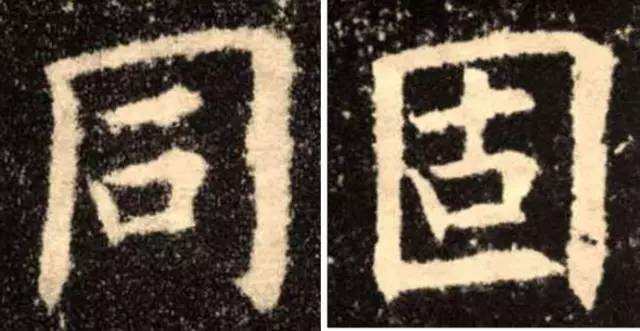
5. Looking left and right is the most classic. Below I find some words in "Jiucheng Palace" that are not compact enough in structure, to remind friends to pay attention to the richness of Master Ouyang's structural processing. A large number of characters with a left-right structure, but the middle ones are actually far apart, giving off a white air, for example:

For the characters in the left and right structure above, the areas marked in red circles are very "sparse" and have a smooth atmosphere, but if they are too tight, it will make people unable to see through. Another example:

There is more space between these three words. There are also some ingenious spatial treatments that give a sense of agility, such as:

"Yu" expands the space on the left. Few people deal with it so obviously. The space above "Gong" and "Cha" is obviously much emptier. Even if the first point crosses the horizontal line, it avoids the visual "empty". A "pine" effect is formed, and in contrast, there is a sense of looking forward to the beauty. Another example:

With these two words, it is obvious that Master Ouyang is trying to clear the space on the right.
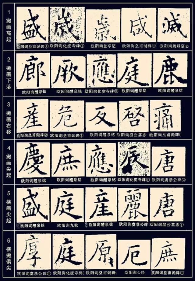
6. Ouyang Xun’s subtraction method. The art of calligraphy cannot be equated with daily standard writing. For example, the order of strokes in some fonts leads to unreasonable shadows, or dense strokes lead to ink bleeding. In response to these shortcomings, ancient calligraphers often "creatively" reduced strokes, and Ouyang Xun is a representative. For example, when two strokes are connected, the second stroke will no longer start, and the stroke will be written directly, so that the two strokes share a starting point, thereby avoiding the generation of ink balls. It should be said that this is a very scientific and very effective method, and all scholars in ancient and modern times have followed it. However, its shortcoming is that the strokes that omit the starting stroke are not as independent and perfect as the strokes that have the starting stroke.

7. The long horizontal line of Ou Kai Kai must not be written flat, which means it must resist the shoulders. Because the horizontal strokes of European style characters are mostly light on the left and heavy on the right. If it is written horizontally, it will feel like the right side is sinking, and the center of gravity of the entire character will be unstable. In addition, the long and horizontal lines cannot have curved arcs. In this regard, Tian Yunzhang and Tian Yingzhang did not do well.
8. Ge Gou's forward direction is upper right. For the vertical part in the horizontal fold, the inner outer edge should be as straight as possible, not too slanted, while the right outer edge should be slanted.
9. Pay attention to the connection between Ou Kai script, official script and running script. This is an important point! After the vertical stroke is completed, the hook is drawn to obtain the official script. The dot on "household" changes horizontally to take the official script. The short horizontal line under "IS" becomes a dot (or left pointed horizontal line), the three dots of "BI" and the three dots of water, the dots of "Jiao" and the dot of "Jiao" become a horizontal line, etc. are all based on the method of running script.

10. When making a vertical hook, it must be flat, and the hook should be short and subtle. Take the North Monument. Implicitness is the highest principle of calligraphy aesthetics, so you must know it.
11. The writing method of "Jiucheng Palace" is mainly square pen, and round pen is also used. Hengfa changed his writing method of "Huadu Temple" in which the two ends are heavy and the middle is light. The main features are light on the left and heavy on the right, starting from the square and ending in the round. The cursive lines absorb the official meaning, and the vertical curved hooks are written in the official script swallowtail style, which makes it look powerful and elegant. Vertical hooks and folds are mostly made with a square pen, which takes the meaning of Beibei's pen, but with a slight roundness in the square, which makes it appear both square and vigorous.


