Regarding font selection, there has also been a considerable amount of discussion on Zhihu. However, the answers given by many people are that they know it but do not know why. I only tell you that you can practice this, but it doesn’t explain clearly why you should start with this font in the first place. Or the reasons given are not really convincing.
It is generally believed that during the writing process, it is necessary to ensure that the center of the pen is used as much as possible, so that it is easier to give the strokes a sense of strength and texture. Therefore, some people suggest that practicing seal script first can help you better handle the strokes. In the process of practicing calligraphy and writing, attention should be paid to the strength and texture of strokes. This aspect is highly recognized by many calligraphers. In the pre-Qin, Qin and Han dynasties, seal script mostly appeared on bronzes and carved stones, so the quality of the written lines was extremely high. Calligraphers who are highly accomplished in seal script can still create an artistic effect that penetrates the back of the paper and penetrates into the wood when writing other calligraphy styles. But the question is, is there the only way to improve line quality by learning seal script?
Apparently not.
The easiest thing to think of and implement to improve the quality of lines is to do special exercises for lines. For example, specialize in drawing horizontal lines, vertical lines, curves and other simple methods for training:
Or train on a single stroke:
The advantages of learning seal script first can be replaced by other training methods. However, I haven't found any other more effective way to avoid the inconvenient aspects of learning seal script first. Because the glyphs and writing methods of seal script are so different from the regular script we use every day. If you are not a calligraphy enthusiast majoring in Chinese language, even if you have practiced for more than a year, you will often have to turn to a special seal script dictionary to write seal characters correctly. Because the character shapes are relatively unfamiliar, when we practice seal script on a daily basis, we will unconsciously focus more of our limited attention on the meaning of the characters and pay less attention to the writing itself.
In other words, if we want to learn something new, the closer the new thing is to the old thing we have mastered, and the more common elements they have, the easier it will be for us to learn it. It is undeniable that in daily life, in this society with the explosion of printed matter and electronic products, what we come into contact with most must be words written in block letters. As a newly acquired skill, the one closest to it must be regular script.
Therefore, as a beginner, the preferred calligraphy style should be regular script.
The more important reason why regular script is chosen over cursive script and other calligraphy styles is that the writing technique of regular script is the simplest and purest without increasing the cognitive load of learners. Although there are various styles of regular script, there are basically certain standards from fonts to strokes. Moreover, the writing methods of basic strokes are roughly fixed, making it easier for beginners to master the overall rules of calligraphy. Starting from regular script is equivalent to finding a certain coordinate in the field of calligraphy. Starting from here, you can then learn whether it is a more strict calligraphy style such as seal script or a more elegant and unrestrained calligraphy style such as running cursive. And benefit. On the contrary, if you are just getting started and start with a calligraphy style that requires more technical skills, such as running script, it will be easy to waste time in haste.
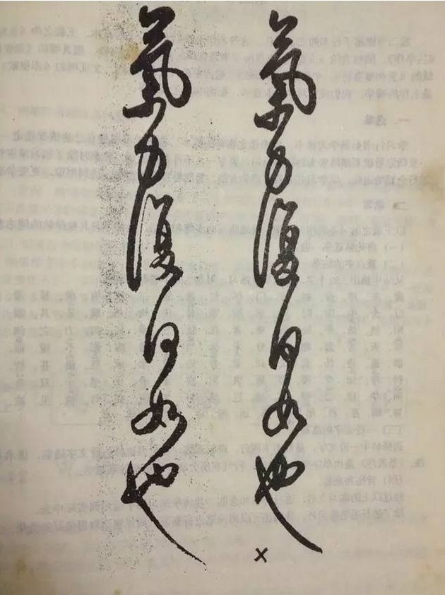
Although the origin of running script may be earlier than regular script. However, from the perspective of the relationship between calligraphy styles, running script in the mature period is still, in essence, a fast writing style of regular script. Therefore, the basic strokes of regular script may have more variations in running script, and the knots of running script are inherited from regular script and become more varied. When entering the study of running script, there are far more issues and points that need to be taken into consideration at the same time than regular script. Therefore, before the basic strokes are proficiently mastered, it is difficult to meet the requirements of running calligraphy, including the changes in weight, weight, and speed. If you try too hard, your writing will probably be stiff and rigid.
As shown in the picture.

A classic comparison of positive and negative examples:
On the other hand, many calligraphers of the older generation will think that it is easier to practice "giao" when practicing running script without the foundation of regular script. In fact, the so-called "floating" calligraphy is because running script simplifies regular script and makes it more fluid. Therefore, without a foundation in regular script and jumping directly into the study of running script, it will lead to an insufficient understanding of basic strokes. Specifically, when I write a copybook, the shape of the strokes can sometimes match up, but because I don’t have a foundation in regular script, I don’t know why the strokes are processed in this way, so the words written without the copybook will make people feel strange. Then, the characters written like this are the so-called "floating" characters.
Therefore, the first step is to choose a font that is suitable for beginners to learn. The most sincere suggestion: regular script.

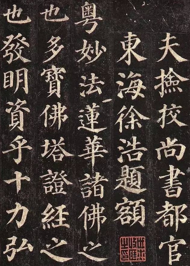
Yan Zhenqing:
There are many works that have been circulated in the world, but the style of calligraphy in the early and later periods was different. It is generally considered that the "Yan Qin Li Stele" written in his later years has high artistic value, and many people have studied it. However, Yan Zhenqing's works in his later years paid more attention to the charm, and the brushwork was occasionally random, so beginners may not be able to grasp its essence. Therefore, it is recommended to start with his early work "Duobao Pagoda Stele".
The painting method is strict, the stippling is dignified and powerful, and the structure is neutral and steady.

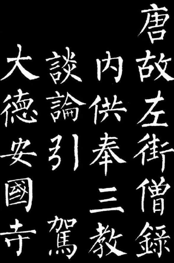
Liu Gongquan:
Together with Yan Ti, it is also known as "Yan Jin Liu Gu". Liu Gongquan's most representative works are the "Mysterious Tower Stele" and the "Shence Army Stele".
His strokes are thin, strong and strong, and his knots are sharp and energetic. The styles of the two stele are different, and the "Mysterious Tower Stele" especially reflects the exquisite strength of the willow body. Both monuments are suitable for beginners. If you are reading "Mysterious Tower", you should also refer to "Shence Army" to avoid failing to grasp the main features and making the writing rigid and lacking in spirit.

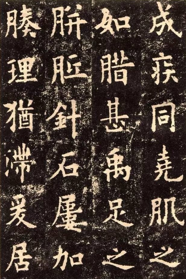
Ouyang Xun:
The representative work is "Jiucheng Palace Liquan Ming". The characters are long and straight, the structure is solemn and solemn, and there are dangers and dangers in the middle. Sometimes there are ingenious and wonderful strokes, and the demeanor is graceful without losing agility.
In life, the computer font "Kaiti_GB2312" that we often come into contact with is based on European style. Therefore, when ordinary people come into contact with European-style characters, they will feel a sense of intimacy as if they have been nurtured since childhood, and they will get started faster.


