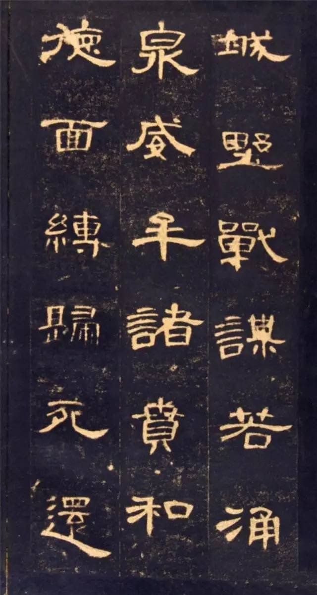
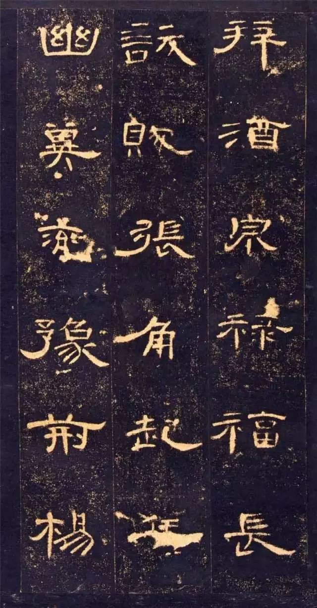
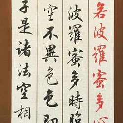
Official script is also known as Zuoshu, Fenshu, and Bafen. Because it was popular in the Han Dynasty, it is also called Han Li. It evolved from the round and graceful strokes of seal script into square and folded strokes. The shape of the characters changed from slender to flat and square, with the upper and lower edges tapered. Tight, stretch left and right, the pen movement changes from slow to short speed, thus showing a lively and diverse style, which brings great convenience to the writer. Official script is divided into Qin official script and Han official script. When learning calligraphy, you should start with official script and learn official script. We should use the dignified and rigorous Han Dynasty inscriptions as a model to lay a solid foundation, and then look to others to develop steadily.
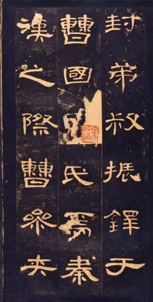
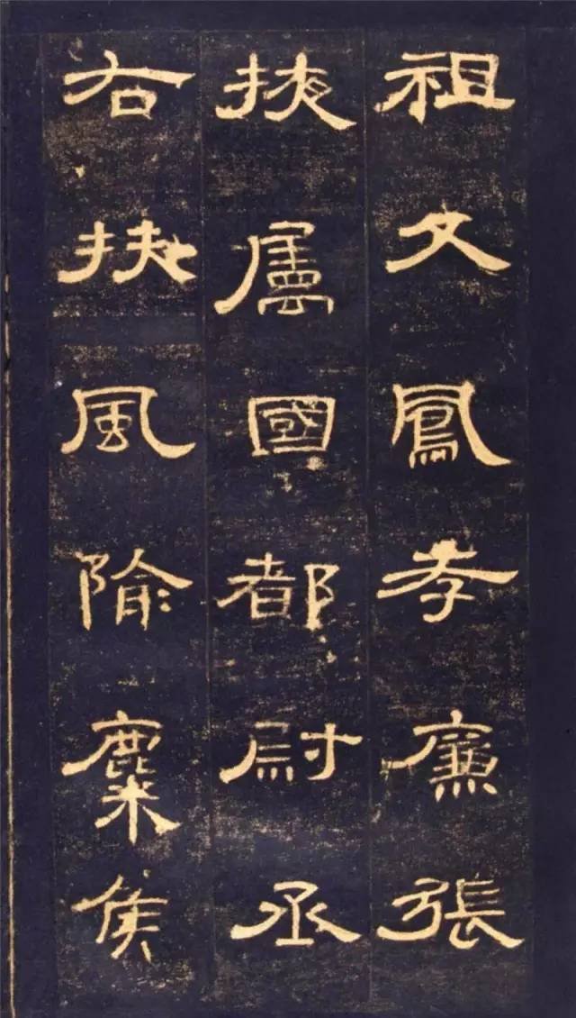
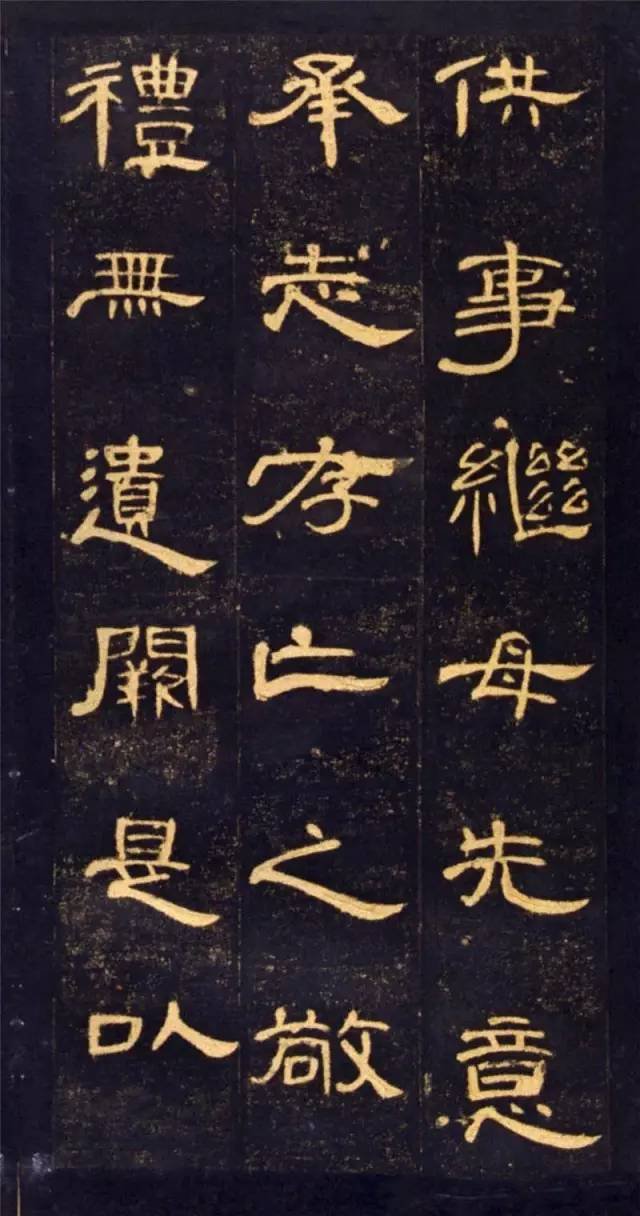
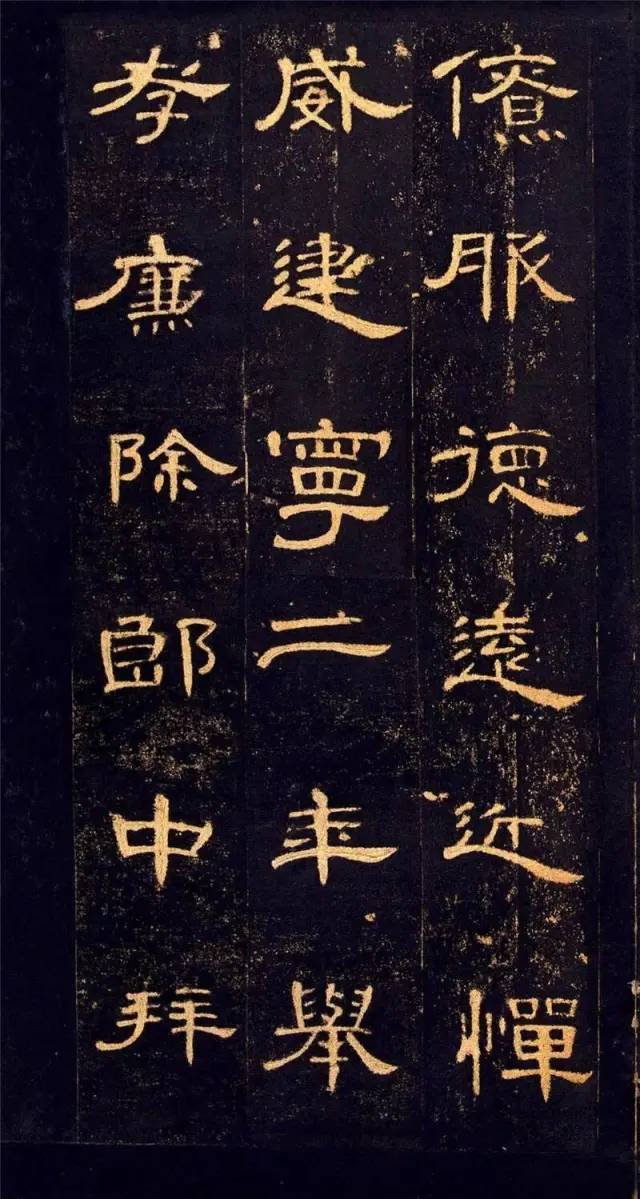
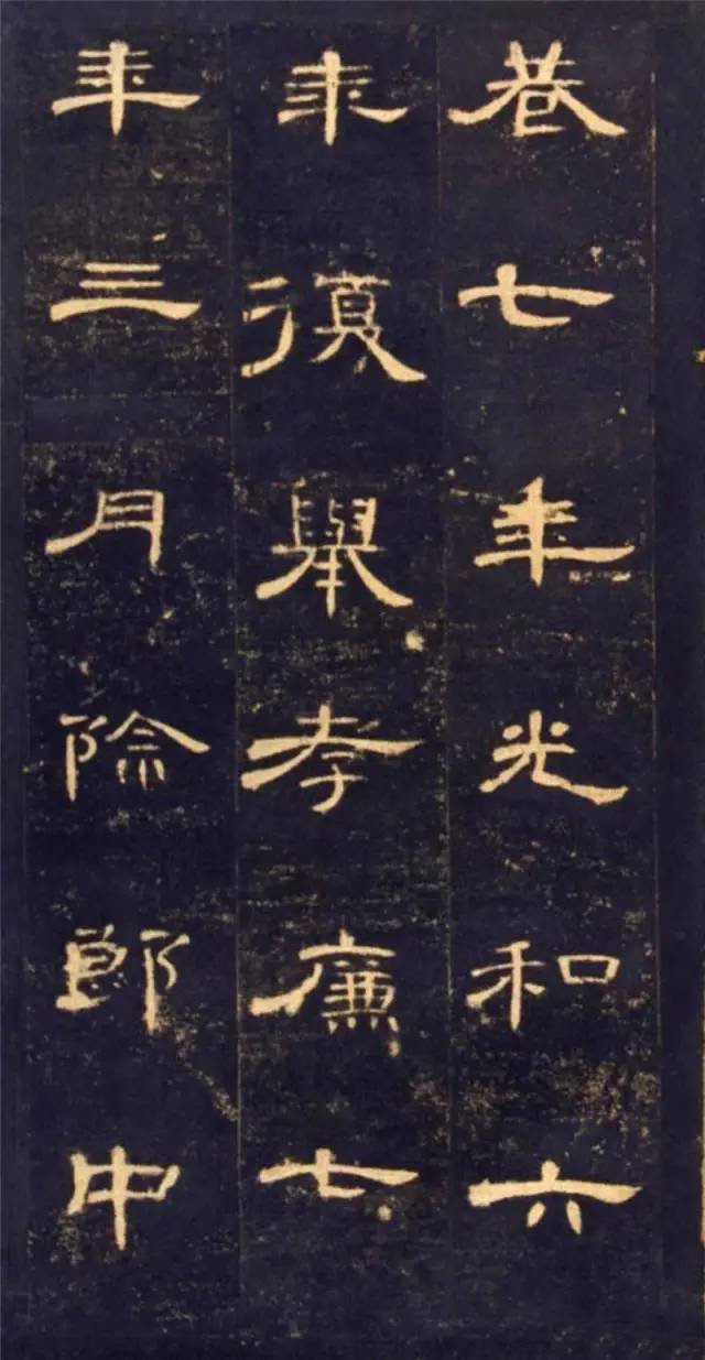
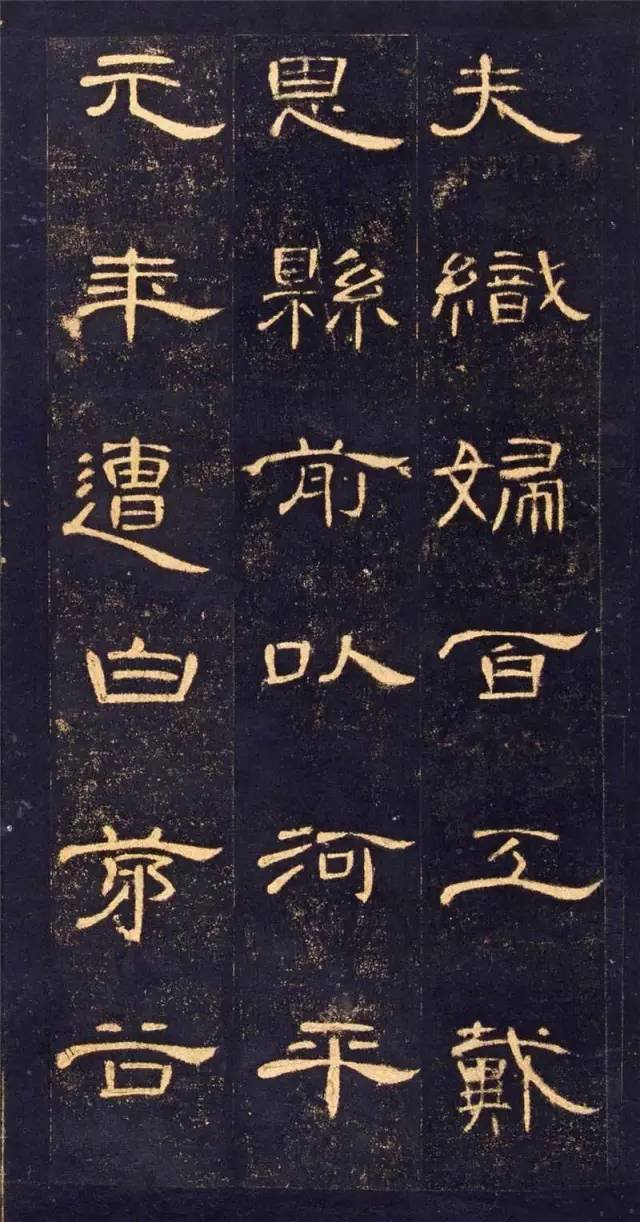
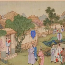
Cao Quan is a descendant of Cao Shen, the famous prime minister in the early Han Dynasty. In the second year of Jianning (169), he was promoted as a filial and honest man. In addition to being a doctor, he became the Sima of the Wu tribe in the Western Regions. He led troops to conquer the Shule Kingdom, killed its king He De, and moved to the right to Fufeng Huaili. Heyang Order.
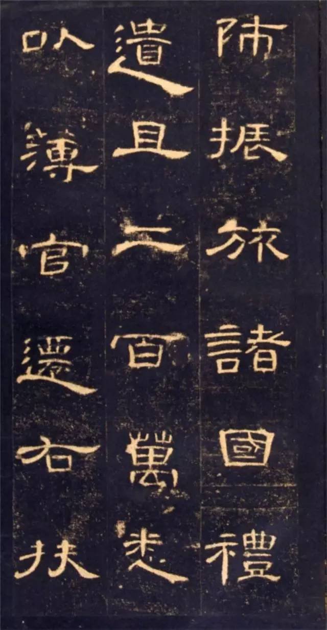
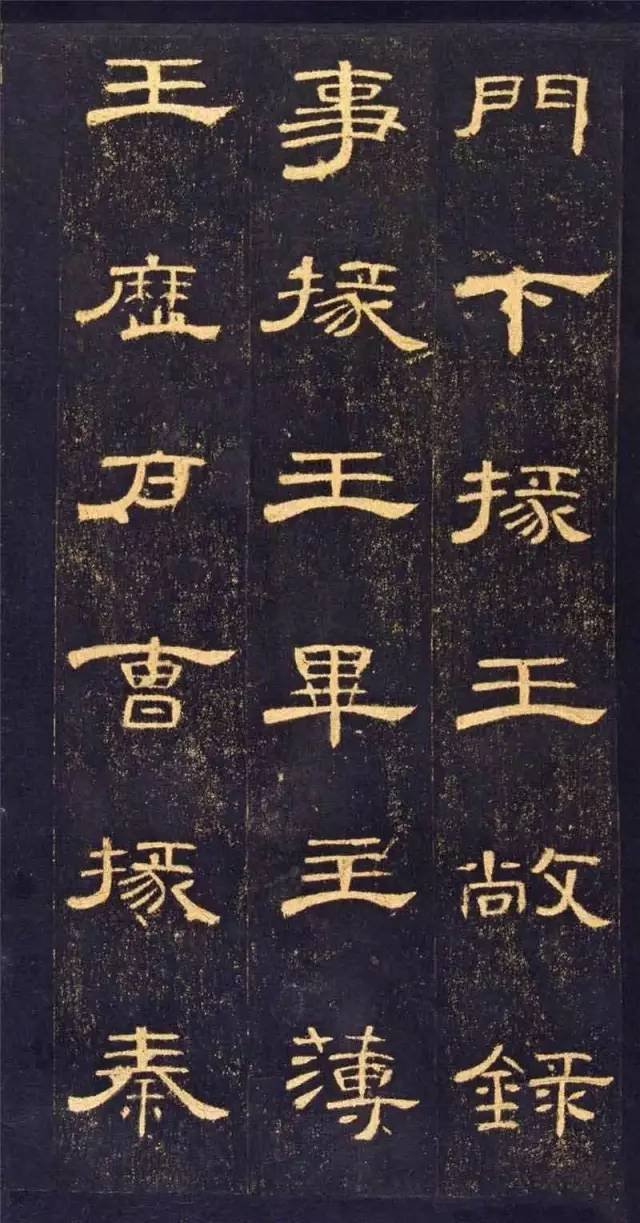
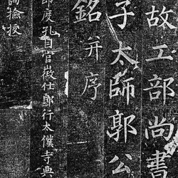
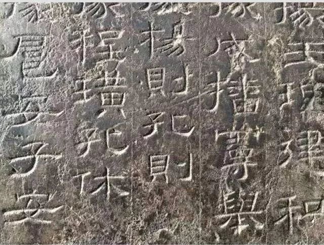
The structural characteristics of "Cao Quan Stele" are mainly as follows: smooth and smooth, stretched and unrestrained, the glyphs are mostly horizontal, with long and square structures in between, the horizontal opening is smooth, and the vertical is implicit and steady, thus making the structure appear graceful, elegant and colorful. .
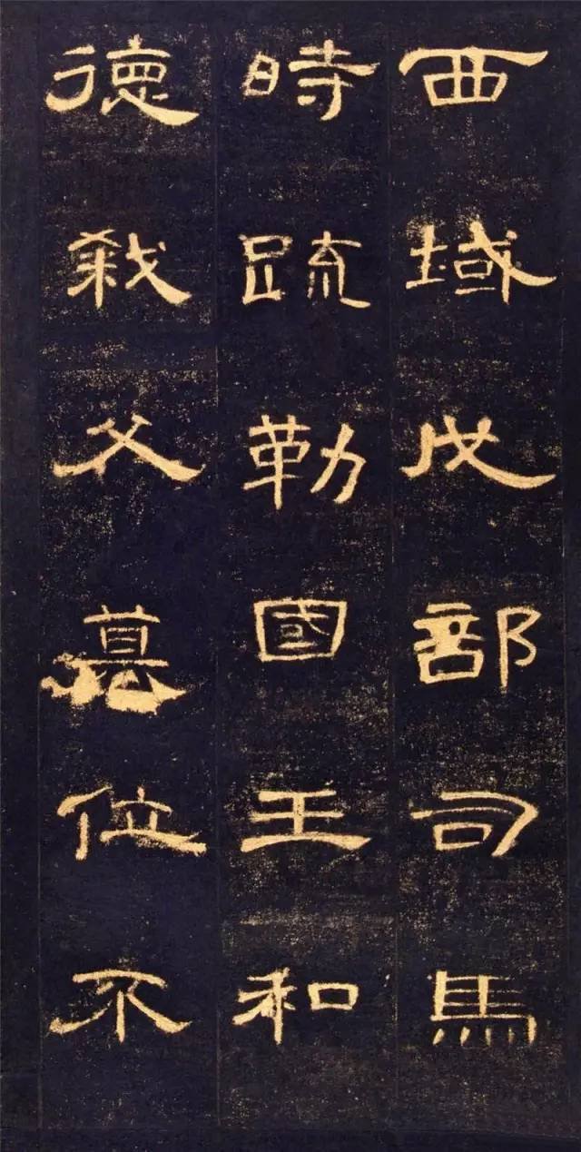
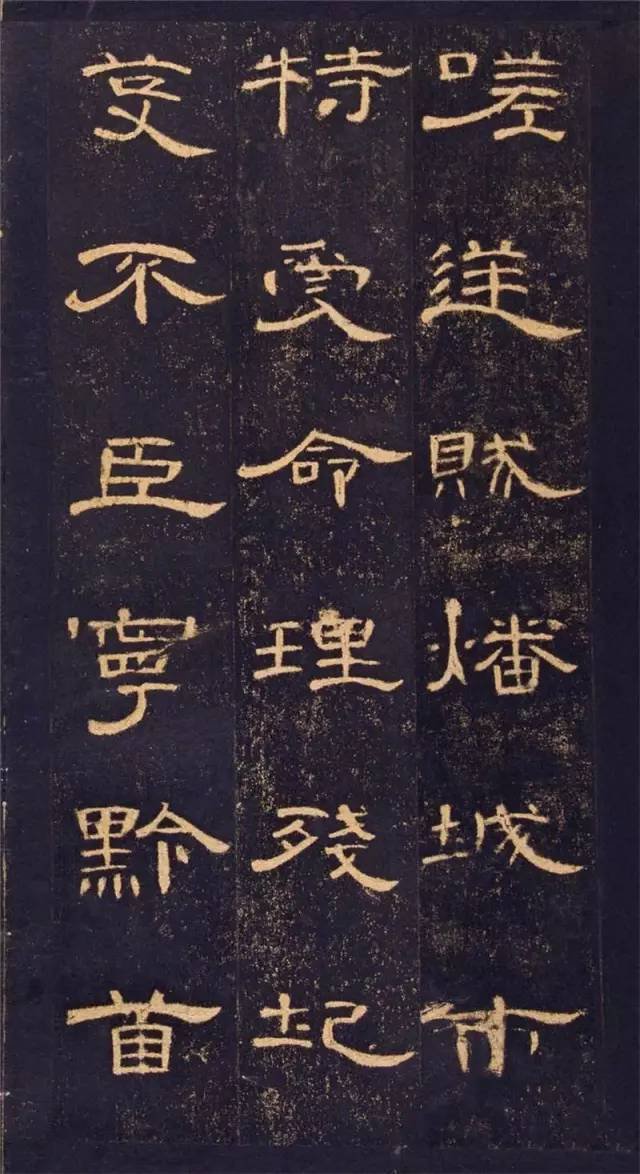
The stretch of the structure, the indulgence of the brushwork, and the mellowness of the mood of "Cao Quan Stele" reflect the calligrapher's pursuit of stability in turmoil, and unrestrained artistic ingenuity and creative confidence in freedom, which makes the work beautiful and heroic. The unique personality and specific connotation of the elegant style of this stele are far beyond the comparison of other Han li. Before we analyze the structural features of the "Cao Quan Stele" in detail, let us first talk about the issues that should be paid attention to when studying the structure of the stele.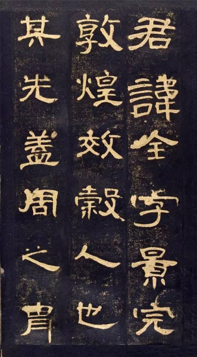 The events of Pingshule recorded in the inscription are quite different from those in the "Book of the Later Han·Biography of Shule". Because the stele was erected at that time, the events recorded therein are valued by historians. The stele records the situation of "You, Ji, Yan, Yu, Jing, and Yang all moving at the same time" during the Yellow Turban Uprising in the seventh year of Guanghe period, which is of high historical value. Moreover, the inscriptions on the inscription are exquisite in font and flowing gracefully. It is one of the representative works of the Han Dynasty and has been highly praised by calligraphers of the past dynasties.
To write the "Cao Quan Stele" well, the structure should be such that "the vertical and horizontal positioning should be accurate, and the corresponding strokes should be clear." "Vertical and horizontal occupancy" refers to the position of each stroke and how much vertical and horizontal position it occupies. If the strokes are in different positions, their vertical and horizontal positions will also be different. There is a direct relationship between correct vertical and horizontal positioning and writing a good structure. Then we can sort out the corresponding relationship between each stroke or part. At the same time, we must also see the strokes clearly and be able to express them in the pen. According to this method, when reading "Cao Quan Bei", one can quickly master various methods of using brushes, and the effect of practicing is very significant. But before that, you must first read the calligraphy carefully, that is, you must observe the calligraphy carefully, and memorize every stroke to the appearance of the entire calligraphy. Only by seeing clearly with your eyes, observing meticulously, paying attention to the stipple structure arrangement in the copybook, and memorizing the strokes, turns, or circles one by one in your mind can you better grasp the style of the fonts and improve your appreciation ability. This is the first step in posting.
Secondly, the observation words must be accurate. As Wang Xizhi said: "Concentrate and meditate, envision the size, shape, straightness, and vibration of the characters, connect the muscles and veins, put the intention in front of the pen, and then write." Before writing, you must use your brain and use your mind to figure out the words you are writing. The arrangement of length, slant, thickness, turning, handle and frame structure must be kept in mind so that the writing can be accurate. Third, the pen must be steady. That is to say, during the writing process, the strokes must be steady, the pen tip must be pushed firmly, and the writing must be confident. This requires practitioners to work hard and have real skills. Only by practicing repeatedly can you be able to use it with ease and ease. Next, let us analyze the structural characteristics of "Cao Quan Stele" in detail.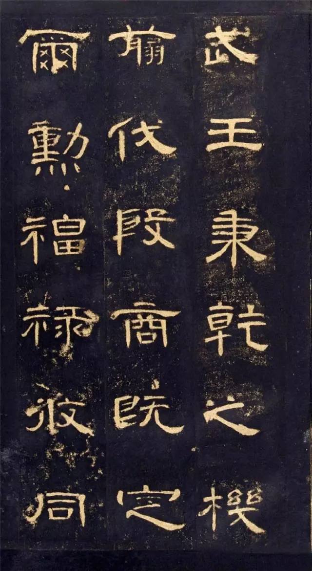
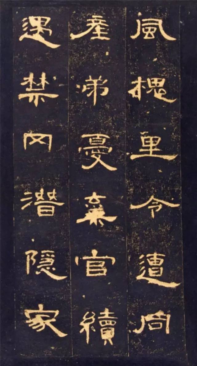
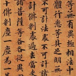
1. Flat stretch. The flat square structure is a common feature of Han Li, which is determined by the horizontal position of the knots of Han Li. However, the structure of some characters in "Cao Quan Stele" is so flat that it can hardly be flattened anymore, which is rare in other Han steles. For example, in the word "Gong", the two horizontal lines are bunched up and spread out at the bottom, and the left and right sides are loose. The upper two vertical points are tightly tied to correspond to the lower two points, which makes the middle palace tightly knotted, creating a contrast with the large wave painting in the middle. For example, the horizontal drawing of the two characters "straight" and "deng" is like a gymnast stretching out his legs, and his upper body is well-proportioned and tightened. For example, the character "ming" is tilted left and right like a big umbrella, completely covering the middle part, while the vertical hook of the character "yuan" is stretched to the right, making the entire character elegant and stretched.
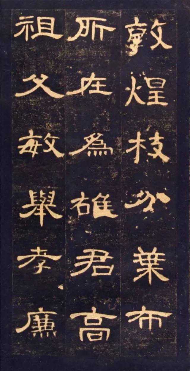
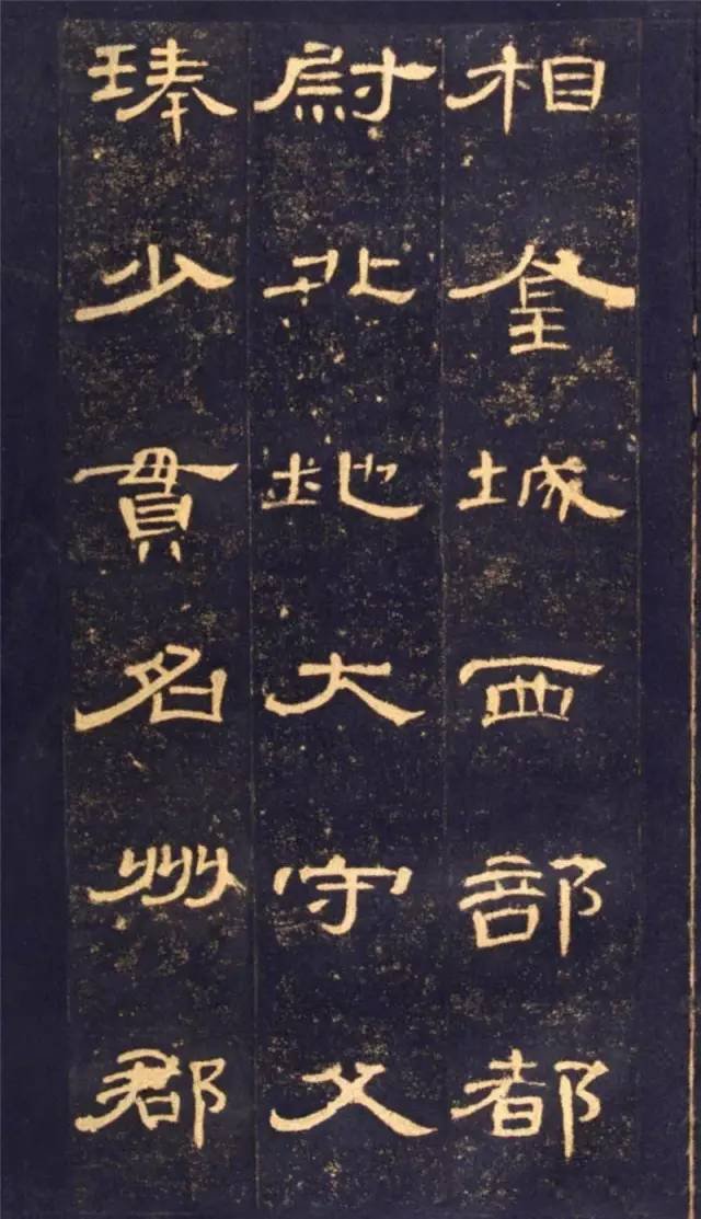
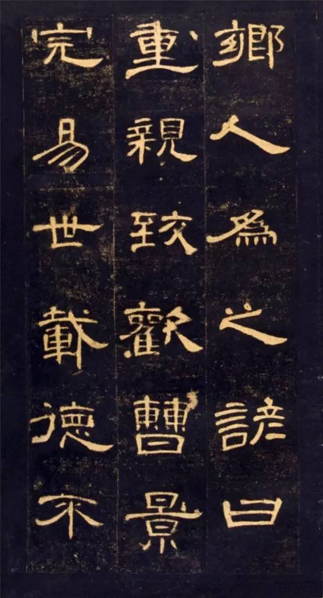
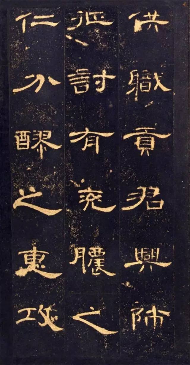
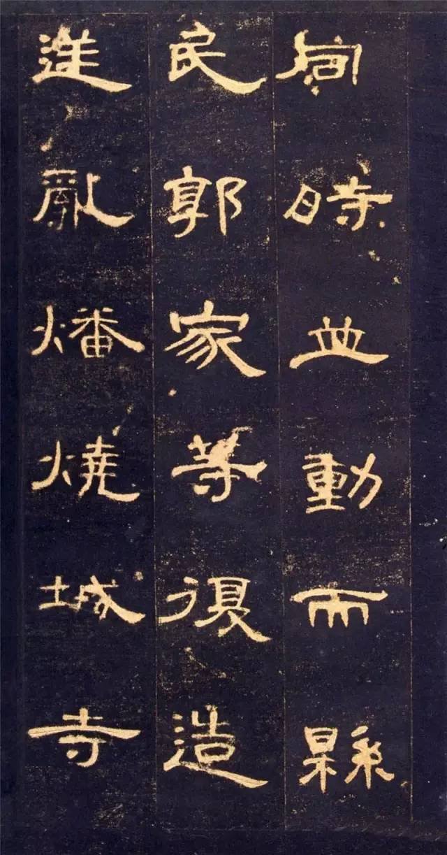
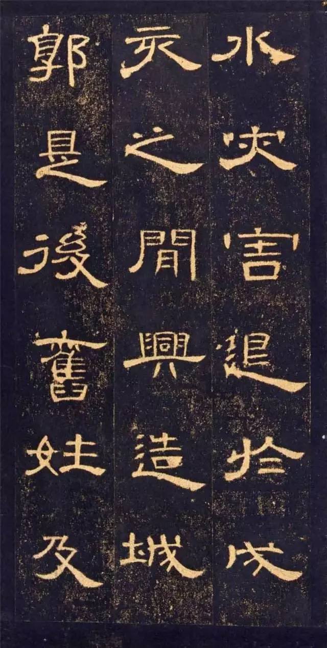
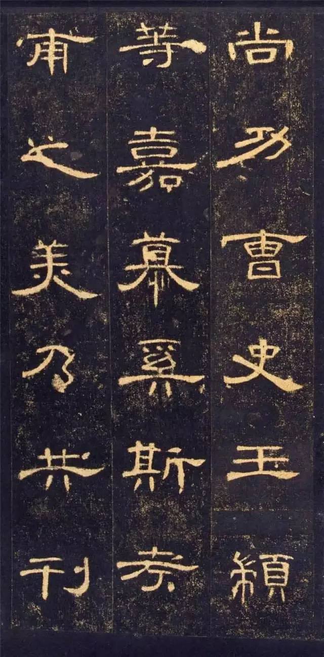
2. Small and large. This is also the structural feature of "Cao Quan Stele". The big one is like the word "学", and the small one is like the word "Gang". The size ratio between the two is about double. Due to the wide spacing between words and sparse lines on this stele, the large and small characters appear scattered in the orderly composition, full of variety and scattered, so the large ones are not as big as the small ones. Showing its smallness, it achieves a dialectical unity that complements each other. It can also be seen that the author is very good at using contrasting techniques to enrich the composition of this stele through the large and small flat and elongated structures of the characters.Cao Quan also built the Heyang city wall and actively reopened the school community, which made Heyang County's humanities flourish and was deeply loved by the people of Heyang, and finally left an indelible historical monument.
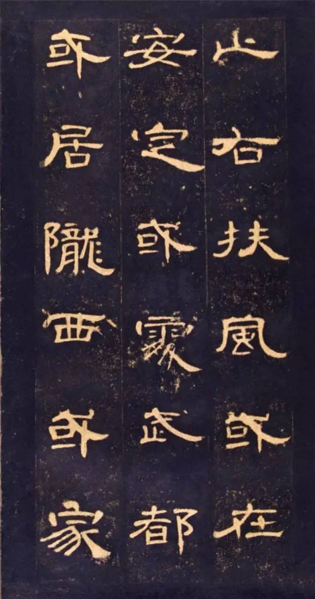
3. The cloth is white and even. This is mainly reflected in the coordination between the stipples in a character, the distance between the same stipples is roughly equal, and the stroke combination of the character is also dense and well-proportioned. As shown in Figure 5, the left half of the word "Chao" has many horizontal strokes in a dense row, and the right half has a sparse row with fewer horizontal strokes. The space between the strokes is very even, and the left and right sides are consistent and appear dense and well-proportioned. Stipples with repeated loops, such as the two "units" in the character "you", are the same size but not rigid. Structural arrangements like this give "Cao Quan Stele" a neat, stable, elegant and elegant temperament.
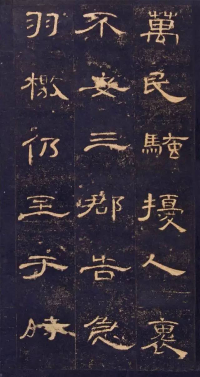
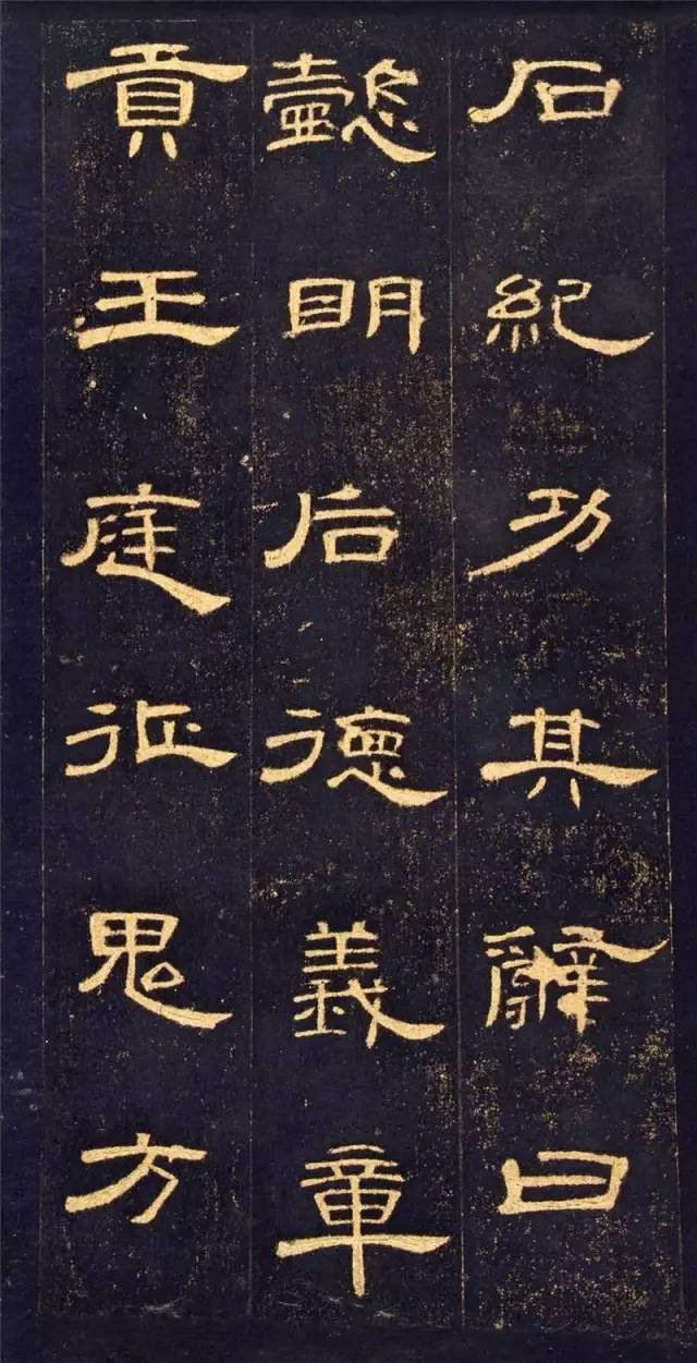
4. flexible. The retracting and unfolding of the structure is the main feature common to all Han Li steles, and this is particularly prominent in the "Cao Quan Stele". Its expansion and contraction is mainly reflected by the left and right expansion of wave picking and twisting. For example, the character "Jian" is relaxed on the left and tightened on the right. The opposite is true for the character "揖", which is closed on the left and released on the right. The character "Jing" is closed on the upper side and closed on the right. In this way, between the expansion and contraction, the heights are staggered, the width changes, and the density, distance, and distance of the two parts can be appropriately coordinated, making the characters vivid and flexible. It can be said that the expansion has been brought to the extreme in "Cao Quan Stele" and has become this The indispensable main feature of the monument is also a sign of its maturity. Most of this type of characters have smooth writing styles, movement in silence, graceful swallow tails, relaxed postures, and a particularly strong contrast between density, density, and concentration. The elegant and beautiful style of "Cao Quan Stele" is mainly reflected here.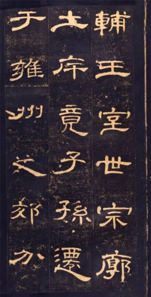
5. The pen breaks the connection. For example, the strokes at the left and right corners of the upper part of the character "国" are broken and written to make it full and not overcrowded. The "or" in the middle is drawn upward and empty downward, making it more ethereal. Another example is that on the left side of the character "Lu", the second horizontal and vertical characters in the upper part and the vertical and abbreviated characters in the lower part should have been connected, but now they are separated. They are combined with the right side to form a character, and the left is broken and the right is connected, but they complement each other.
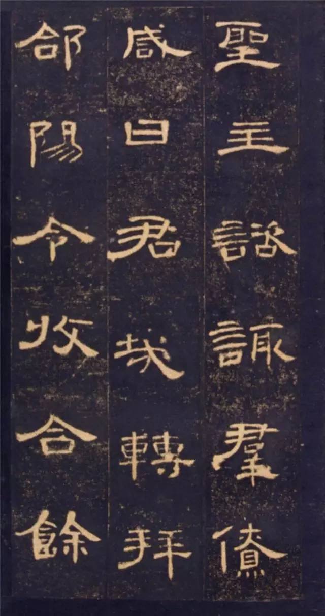
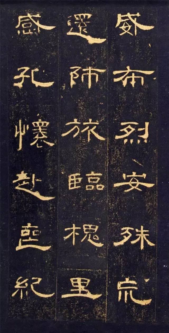
6. Tighten up and loosen up. The characters of "Cao Quan Stele" are so beautiful and graceful, like a fairy descending from the earth, floating and ready to fly. In addition to being flatter than ordinary Han dynasty stele, it is also closely related to its upper center of gravity and the extension of its middle and lower parts. For example, in the Chinese character "Yi", the short strokes on the upper part draw in the waist, and the strokes on the lower part are long and straight, either upright or spread out. Another example is the character "李", which is all upward and tightly entangled on the upper side of the middle palace. It flows away from the lower left side through a thick arc. The strong contrast between density and density makes the rhythm more lively. This structure of tight top and loose bottom is one of the elements that form the beautiful artistic style. It and the simple and natural beauty are both the embodiment of beauty and cannot be ignored.
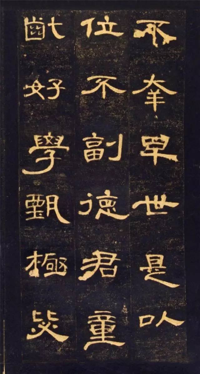
 "Cao Quan Stele" is a representative of the beautiful inscriptions in official books. There are many people studying it. You must have unique insights in your own learning process, so as to avoid being tacky due to too many people studying it.
What is so good about "Cao Quan Monument"?
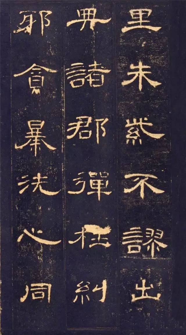
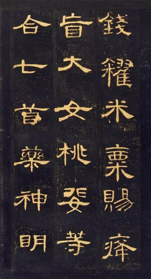
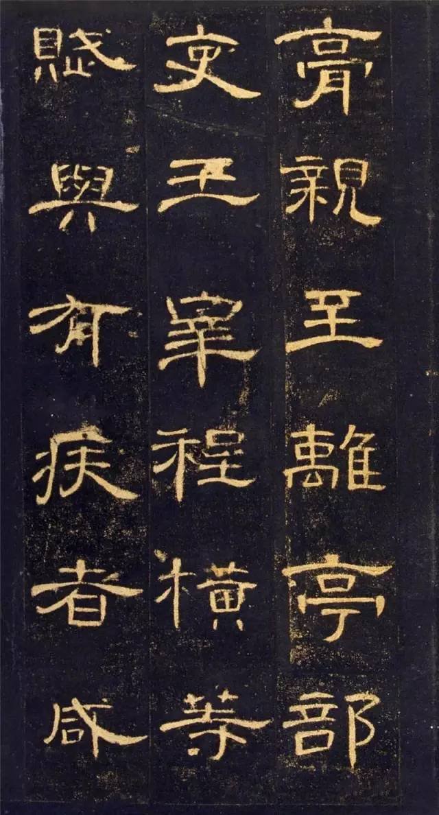
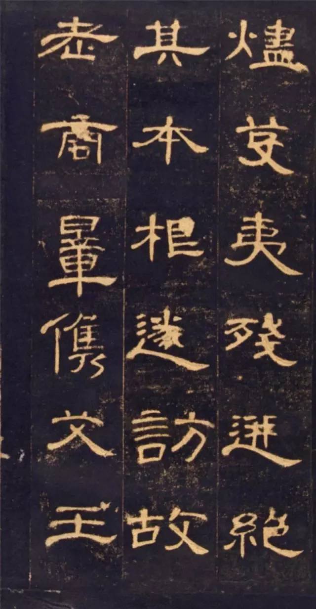
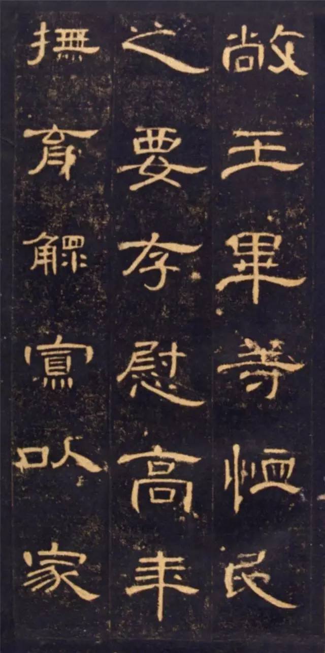
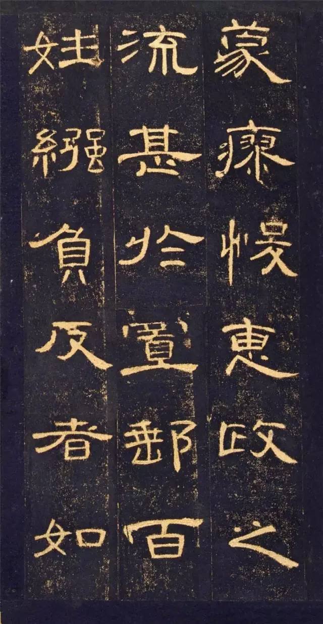
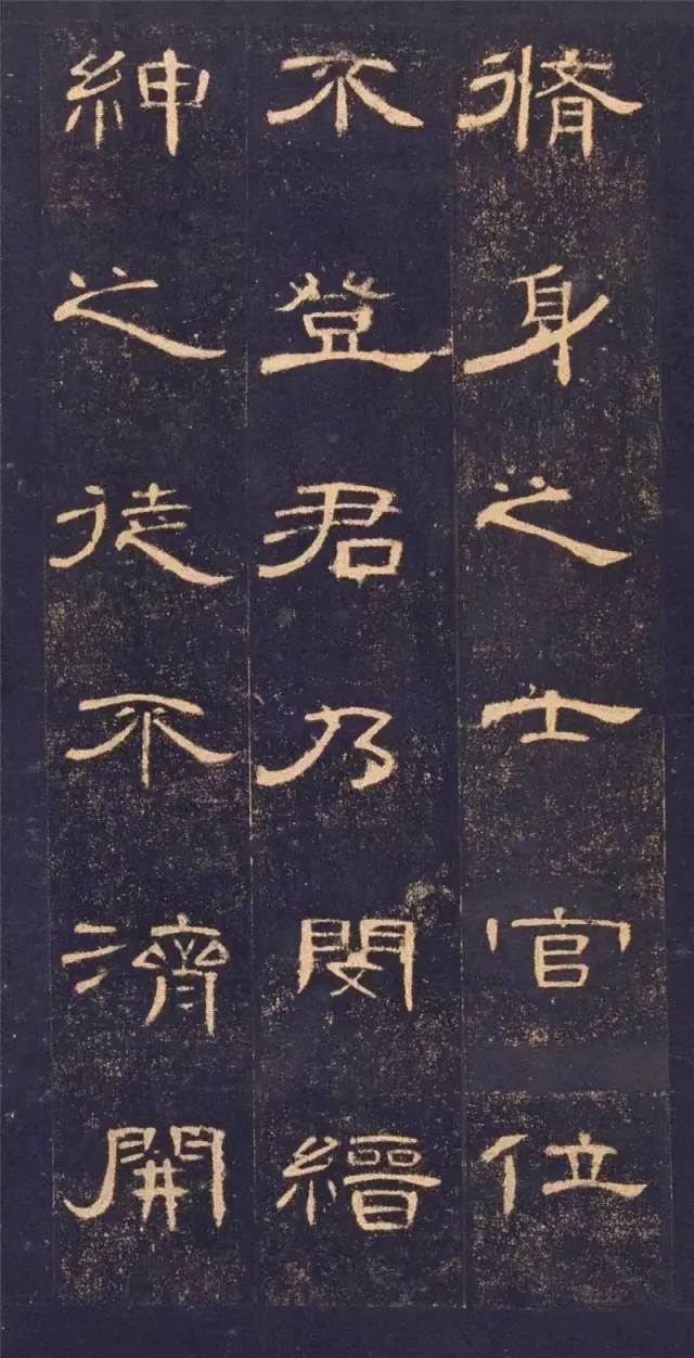
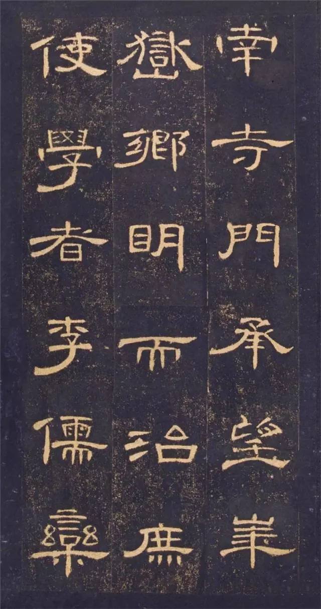
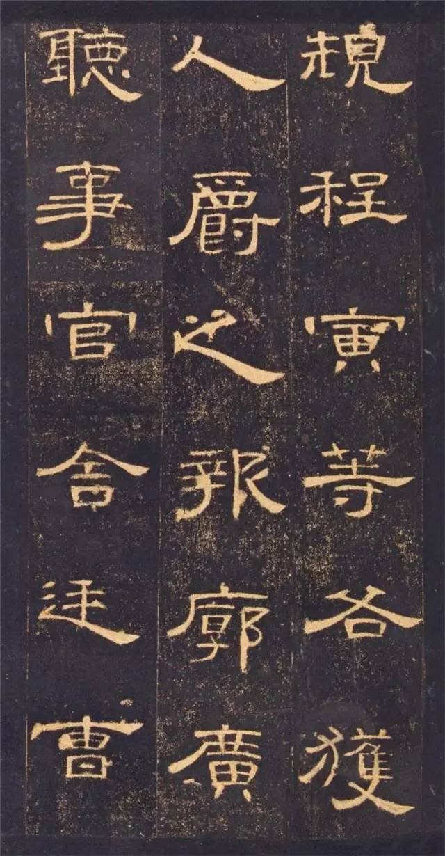
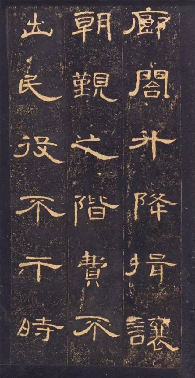
1. The characters in "Cao Quan Stele" are extremely complete, with very few defects, and the rubbings are clear. It is especially a good example for beginners to learn official script.
2. The strokes of "Cao Quan Stele" are freely retractable, interspersed with high and low, wide and narrow, with appropriate gaze, movement in silence, strong contrast, vividness and flexibility, which brings the charm of Han Li to the extreme.
3. The "Cao Quan Stele" has a flat and stretched structure. Although it is a common feature of the Han Dynasty, the Cao Quan Stele is more horizontal, which is extremely stretched, flowing left and right, and has an elegant charm.
4. "Cao Quan Stele" has uniform stroke thickness and gentle strokes. Both soft-pen and hard-pen calligraphy can be learned, so it has the best of both worlds.
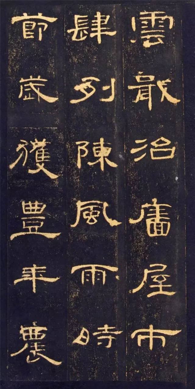
5. The characters are loose and scattered, the big ones are not wild, the small ones are not cunning, they complement each other.
6. The pen is broken and the meaning is connected, and the meaning is full of charm. The left part is broken and the right part is connected, which contrasts with each other, making it especially ethereal.
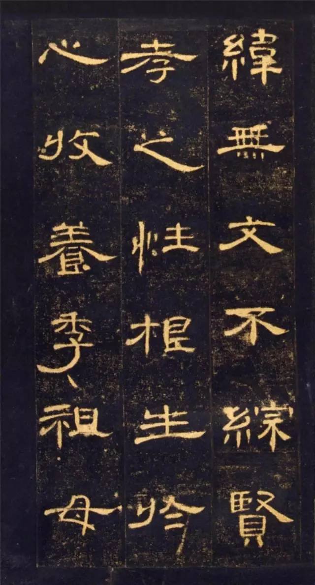
7. Tight up and loose down, you will be slim and graceful. "Cao Quan Stele" uses a lot of hanging needle brushwork, which is very rare in Han dynasty steles. Therefore, Cao characters dance gracefully like fairies descending to earth, floating and ready to fly, simple and natural.
8. The number of words is large and the font library is rich. "Cao Quan Stele" is a multi-character inscription with a character library of nearly a thousand characters, which can meet a wide range of learning needs. If you learn "Cao Quan Stele" well, it will be easy to create calligraphy creations.