1. Avoid
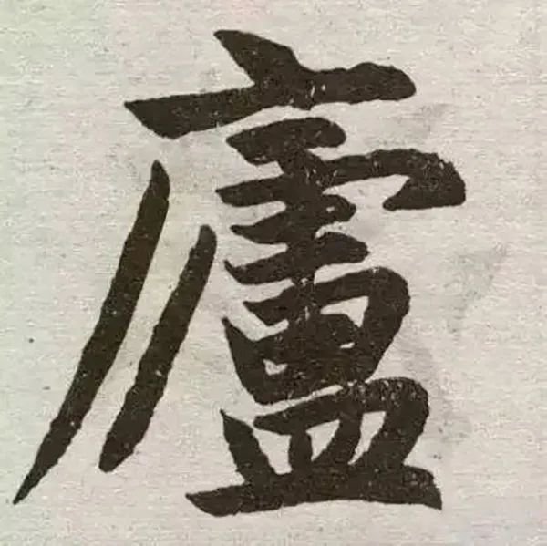
If you avoid the secret, keep it sparse; if you avoid danger, keep it easy; if you avoid the distance, keep it close. If you want them to complement each other properly, for example, the first stroke of the word "庐" is sharp, but the next stroke should not be the same. The word "Look down" means one stroke downwards and one stroke to the left. Pull out the word "辶" under the word [Feng], and then use the upper stroke to make dots. This also avoids overlapping and makes it simple.
2. top wear
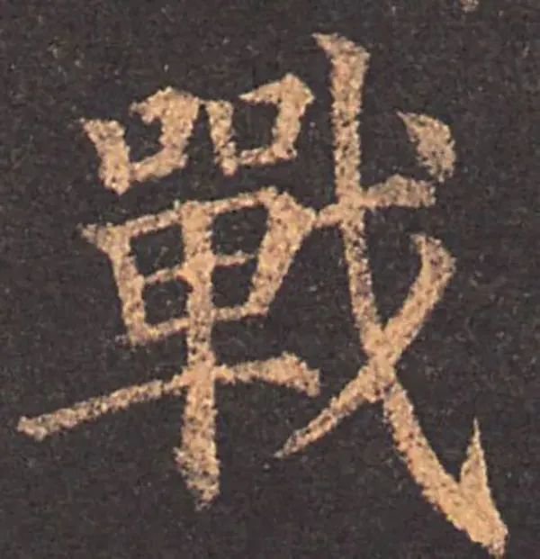
Wearing it on the top is like a person wearing something while walking, or like a person wearing a high bun with high makeup. When you look at it, you want it to be straight up and down, so that there is no side shape. When I looked at it, I noticed the exquisite pine trees and the ingenuity of the structure. Such as [Taiwan], [Xiang], [Battle], [Beijing]. Wear it as a positive sign. High, low, light and heavy, without any slight deviation. I feel the font is stable. [Shu], [Art], [甃, [鞞], Dai’s side posture. If the characters are long, short, sparse, and expressive, they will feel that the character is steep and steep. In this example, a light tail will make it lively, while a heavy tail will make it stagnant. There is no need to strive for symmetry, otherwise it will lose momentum.
3. Intersperse
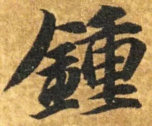
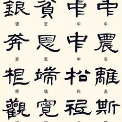
Whoever wears it, wear it at its widest part. The one who inserts it inserts it into its empty place. For example, the word [中] is pierced vertically. The words [book] are pierced by paintings. The word "Shuang" is written by writing it down. All wear methods. The word [qu] is inserted vertically, and the word [er] is inserted with [乂]. The word "Secret" is inserted with dots. All are inserted methods.
4. Turn your back
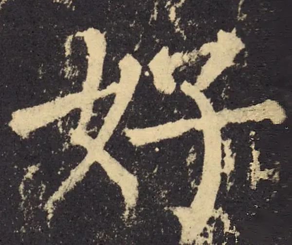
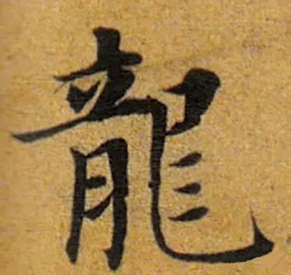
Backwards, left and right. Those who turn inward also turn toward others. Those who face outwards also turn their backs. One inside and one outside are helpful. Those who are neither internal nor external are combined. For example, the character [好] means direction, the character [北] means back, the character [leg] helps the right, the character [tic] helps the left, and the characters [楷] and [thorn] stand side by side.
5. Laterality
The shape of a single character is mostly formed by staggered oblique front and back sides, but there is one stroke that dominates the shape. Chen Yi once said that one is the main one, and the seven aspects tend to lean towards it. Before you start writing, you must first assess the situation. When the trend returns to the horizontal direction, it is right. The potential returns to the oblique side and the hook is biased.
6. Give way
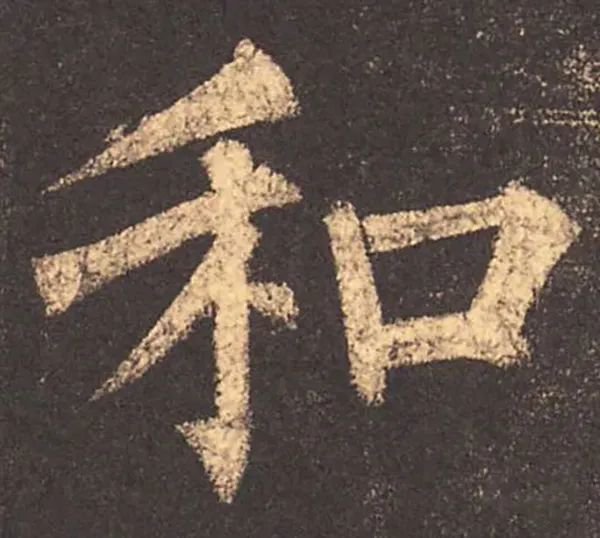
The left and right sides of the word, more or less, must give way to each other to achieve perfection. For example, the characters "马 beside the silk, beside the bird" must be straight on the left side, and then the characters can be written on the right side, otherwise it will be inconvenient. For example, the character "實" is drawn short above the central character, allowing the two characters to come out. For example, the character "辧" is drawn close to the center character, allowing the two characters to come out. Another example is the word "whisper". If the mouth is on the left, it should be closer to the top. For the words "和" and "口", if the mouth is on the right, it should be closer to the bottom. It's better if it doesn't interfere with it.
7. Fill in the blank
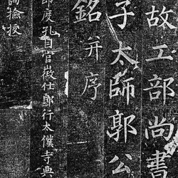
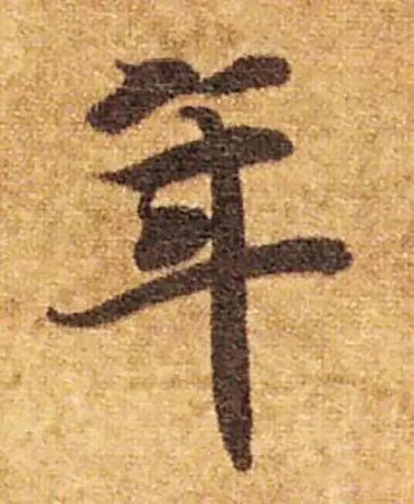
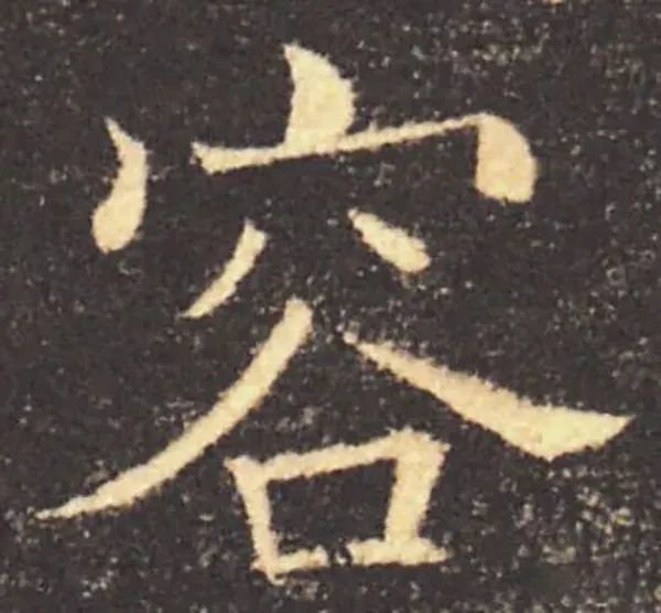
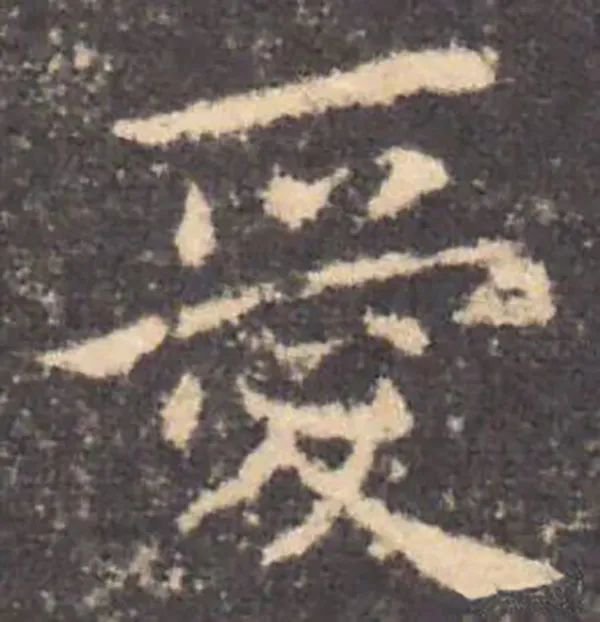
Fill up the emptiness, make up the empty place, make it the same as the perfect place, and get the four full and square parts. Also, sparse potential cannot be compensated, but dense potential can be used to compensate for it. Those who fail to make up for the sparse situation. It is said that its potential is sparse and not unified. For example, the word (less) is on the right side of the space. [Ge] The character is left empty. How can I order a supplementary prescription? Those who use the secret potential to supplement it are like Zhiyong's thousand-character document Nian, which uses left painting to supplement the right. Ou Yinzhi wrote holy characters. There are many of these in the Dharma stickers, so they complete their divine principles and harmonize their eight sides. Another example is that the word "year" means "empty one". It means that under the second painting, the position of one painting must be vacant, and the third painting should be placed after it.
8. Cover
Covering it is like covering a palace on top. The palace should be as tall as possible. Therefore, the strokes below should not be in contact with each other. The left and right strokes are intended to be able to accommodate, and then to be exhausted. For example, "Baorong" and the like, the dots must be straight and the painting must be round and bright. It is not suitable to be long at the top and short at the bottom. Xue Shaopeng said: Most of the seal scripts hang down to contain them, while most of the official scripts lean up and move upwards.
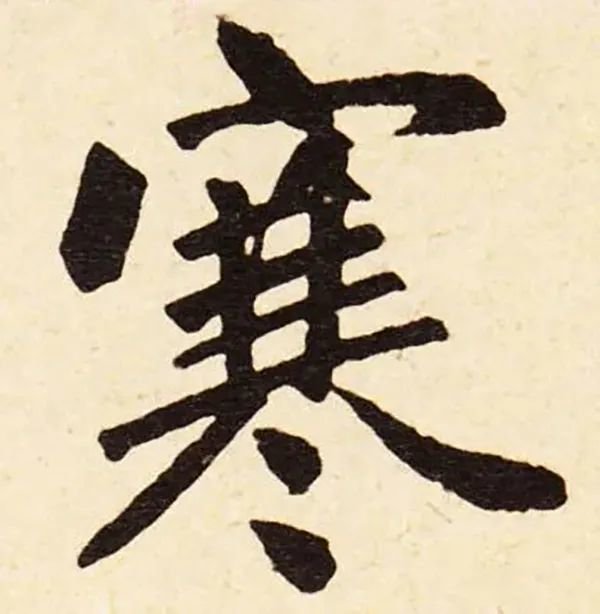
9. Post zero
It's like [making this winter cold]. Those who stick to zero tend to lose momentum because their lower points are fragmented, so they stick to it. If it is sparse, the font will be wide and loose, and if it is frowned, it will not distinguish the position.
10. Bonding
If the original character of the word is separated, it is better to stick it together and make the character stick to each other. Such as the radical characters [Wo Suan Fei Men] and the like.
Suo Jing said: For example, the wind blows in the forest, and the grass blows the trees. The branches follow the wind and turn to match. Zhao Mengfu said, "Don't be like a bundle of firewood, don't be like a frozen fly." Xu Wei said that his words were twisted blindly because he was afraid of being scattered, and it was like a fly that was frozen when the salary was tied up.
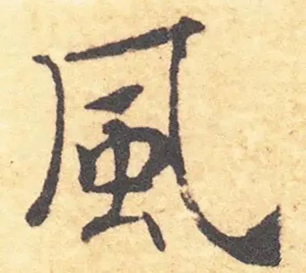
11. Speedy
Li Si said that the way to use the pen is to return quickly first, then to move down quickly, like an eagle watching a passing peng, trusting it naturally and not having to change it again and again. Wang Xizhi said that there must be urgency in each character, like a black character under the character, the first point and the last point must be urgent. , it is necessary to be late when it is horizontal and straight, and it is necessary to rush when you want to be black, this is the situation. Words such as "风鳯" also use wrist gestures, so you don't want to be late.
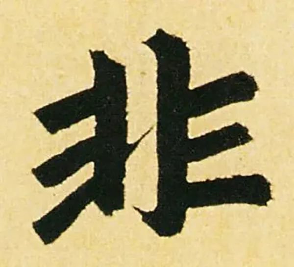
12. Be full rather than empty
Such as [Yuan Tu Guo Hui Bao Nan and four hooks across the eyes] and so on. Mo Yunqing said that the outside is called the inside, and the inside is called the outside. The words "国图" and other words, the inside is called the outside. [Chibin] and so on, the outside is also called the inside.
13. Italian connection
The characters are broken in form but connected in meaning, such as "With the heart, I will seek the water of Xiaochuanzhou". If the characters have disjointed shapes, they cannot be connected without reflecting the left and right bands, or the dots and strokes are scattered. If the brushwork has opposite meanings, it is especially necessary to follow the ups and downs and connect the empty spaces so that the shapes are not isolated from each other, so that although they are distant, they are not separated.
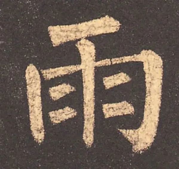
14. Repeat risk
If there is a risk again, the momentum of betting must be stopped evenly and cannot be tilted to one side. Any word that is big above it will appear below it, such as the prefix of [rain], the prefix of [acupoint] and so on.
15. Drag
Those who hang down hang to the left, and those who drag drag to the right. All are shown in one stroke to clear it up. To make it non-constrictive, if the characters are contracted to the left, they hang down to the right, and if the characters are contracted to the right, they are drawn to the left. It is natural for the characters to have momentum. It's like [Qingxiangdu Kuanyuan] and so on. Drag is like [the people walking when the water branch is short of skin to watch] and so on (draft, Xu Ye, Yin Ye, Pull Ye).
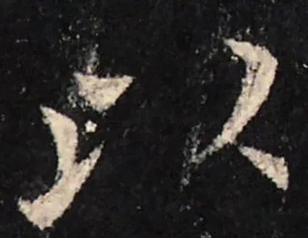
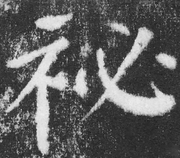
16. Borrow exchange
For example, in the Liquan inscription [Secret], the right dot of the indicated word is the left dot of the obligatory word. This is borrowed and exchanged. Another example is the word [ge] written as [鞞]. The characters are difficult to form, so they can be interchanged like this, or borrowed and exchanged. When writing characters, you must follow the correct style, and use borrowing and substitution as a last resort.
17. Increase or decrease
Characters that are difficult to form may have more strokes added due to fewer strokes, or may be omitted due to more strokes.
18. Should be deputy
If the stipples of the characters are sparse, they should complement each other, so they must be in proportion. Another example is "Long Shi Qiu Zhuan", one painting must match the other, corresponding and complementary.
What's more, those who are uneven on the left and right sides should be adjusted evenly, [Qiong Xiao's Notes on the Axis]. In the give-and-take, the meaning of the brushstrokes also corresponds to it.
19. Support
If the word is independent, it must be supported, and then the strength can be seen, such as "Ding Ting's hand is prosperous with the spear, and the bow can be bowed forever, and there are thousands of flowers and grass towels under it".
When doing vertical strokes, it is easy to make straight strokes, but difficult to make curved strokes. For example, the character "Qian Yong Xiacao" is straight and straight, but the writing force is easy to be strong. The character "Heng Mao Huan Gong" is gentle but the strokes are difficult to maintain. Therefore, it is necessary to mention the end of a character and pay attention to it. , It is better to be late than hasty, and it is better to be heavy than to be slow. As the saying goes, it is like an ancient tree leaning against a cliff, which is good.
20. Bow to the dynasty
Those who bow to the court are also called radicals. The beauty of one word is made up of its radicals, but when viewed separately, each becomes beautiful. Therefore, there is the beauty of dynasty, and there is the beauty of bowing. Just like the appearance of hundreds of things, the activities are complete and complete, each is sufficient, and there are many beautiful tools.