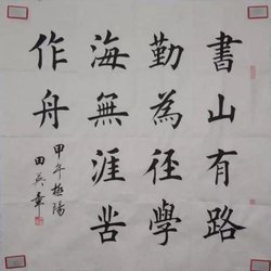
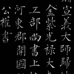
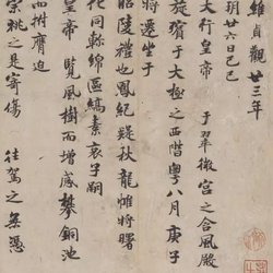
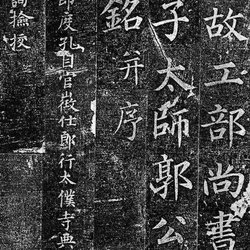
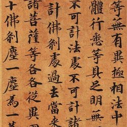
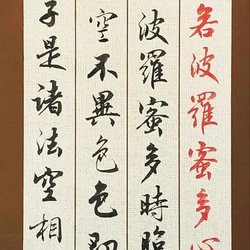
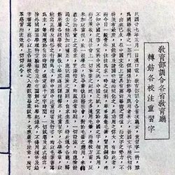
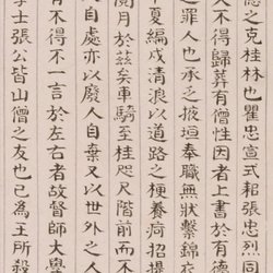
Early cursive script is a calligraphy style parallel to official script, generally called official script. In fact, it is mixed with some seal cursive styles. The early cursive script broke the rules and strictness of official script and was a hasty writing method. It is called "Zhangcao". Zhangcao is an early elegant cursive style that combines cursive script and Han official script. It has clear waves, the strokes are connected in a "wave" shape, the characters are independent, flat and square, and the pen is horizontal. Below is the cursive brush calligraphy appreciation that the editor brings to you.
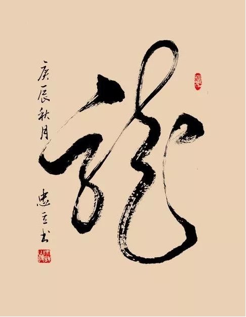
Appreciation of cursive brush calligraphy 1
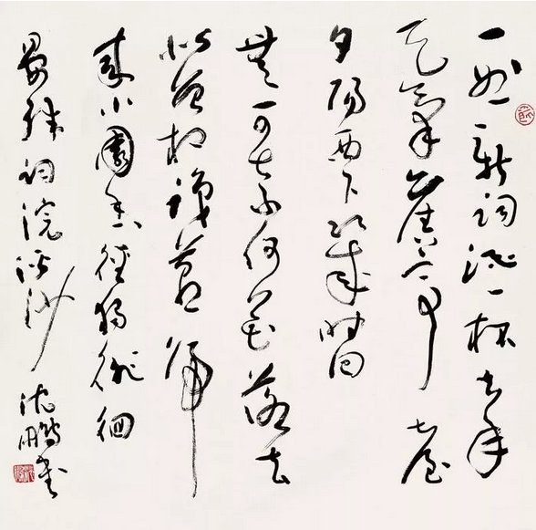
Appreciation of cursive brush calligraphy 2
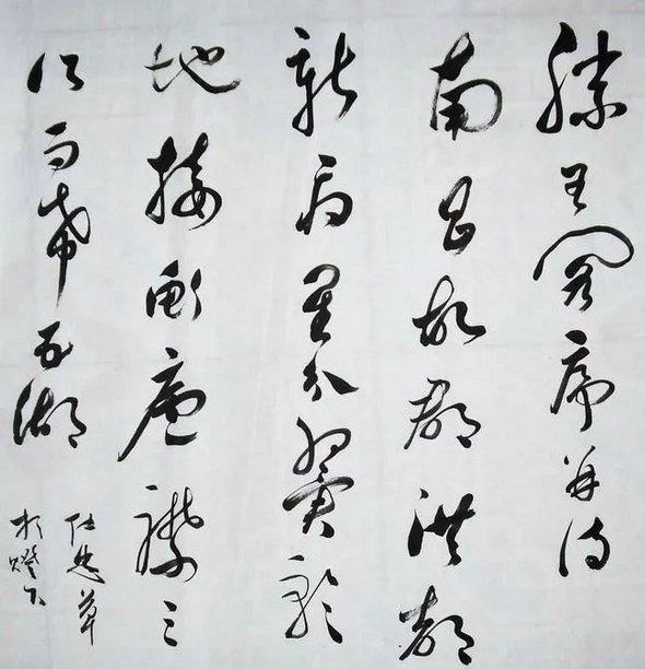
Appreciation of cursive brush calligraphy 3
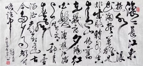
Appreciation of cursive brush calligraphy 4
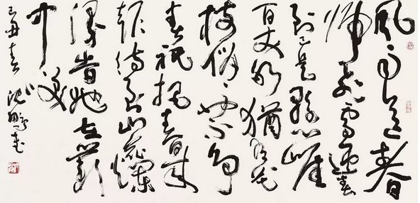
Appreciation of cursive brush calligraphy 5
The development of cursive writing brushes
Recently, it is common to see official script with an elegant style of cursive brush, which is called official script.
"Broken cursive" is the most common among modern calligraphers, such as the calligraphy works of Kuangcao calligraphers Du Haoping and Mei Xianghan. It is characterized by the combination of dots and dashes, and the use of strokes and strokes. It is mostly used by calligraphers from ancient times to the present. The structure evolved into my own style. I learned some from Wang Xizhi's calligraphy, took some from Wang Duo's calligraphy, and took the strengths of Zhu Yunming, Sun Guoting and other famous names in the past. I combined my own style and expressed it freely and freely. This writing style is consistent with Today's grass is similar.
There is a saying of "cursive writing" in cursive writing, and there are many regular scripts in the calligraphy style, which is close to cursive writing. The writing style is relatively fluid. Liu Xizai's "Shu Gui" of the Qing Dynasty said: There are "real lines" and "cursive lines" in running script. "Zhen Xing" is close to real writing but indulges in the truth, while "Cao Xing" is close to cursive writing but focuses on cursive writing. Zhang Huaiguan's "Shu Yi" of the Tang Dynasty said: Those who are both true are called "Zhen Xing", and those who are Cao Cao are called "Xing Cao", so there is this distinction.
Cursive script is a font of Chinese characters. It appeared earlier. From the early Han Dynasty, when writing official script, it was sometimes written "hastily". Because Emperor Zhang of the Han Dynasty liked cursive script, it was called "Zhangcao", which is a kind of official script cursive script. . The characters in Zhangcao are independent and close to running cursive, but difficult-to-write characters are not simplified much and the writing remains unchanged. Later, regular script appeared and evolved into "jincao", that is, regular cursive script. It writes quickly, often with upper and lower characters connected, and the last stroke echoes the beginning of the stroke. Each character generally has a simplified pattern, but it is sometimes difficult for people who are not familiar with it to recognize it. Generally, the cursive scripts of Wang Xizhi, Wang Xianzhi and others are also called Jincao.
The basic method of simplification in modern cursive script is to use simple cursive script symbols to substitute the radicals in regular script into traditional regular script (although cursive script appears no later than regular script). Often many regular script radicals can be substituted with a cursive script symbol. For convenience, the characters The structure has also changed. Therefore, it is more difficult for unfamiliar people to identify. For the arrangement of cursive symbols, please refer to "Standard Cursive Script".
By the Tang Dynasty, cursive script had become an art of calligraphy, and therefore evolved into "crazy cursive script". Its function as a tool for transmitting information has been weakened, and it has become a work of art. It pays attention to the black and white arrangement of shelves and paper, and whether people can clearly understand what is written. It doesn't matter anymore. In KuangCao, there is a "word couplet" symbol, which is to write two words (common phrases) into one symbol. Since writing at that time was mostly written in vertical lines from top to bottom, the design of word couplet symbols was also similar. "Dunshou", "Nirvana", etc. all have cursive word couplet symbols.
The structural essentials of cursive brush calligraphy
1. Dynamic balance: When writing cursive characters, you cannot write them evenly. You need to break the balance and let a certain part of the character stand aside, while the other part needs to be processed to achieve a new balance as a whole. to add dynamic gestures to strong cursive writing.
2. Echo and Gupan: Echo refers to the relationship between the front and back of the strokes, and Gupan refers to the transition between certain parts of a character. That is to say, don’t worry about suppressing one part or another part, and you must coexist calmly and peacefully.
3. Side posture: In terms of structure, cursive script can boldly take side postures and dangerous postures, striving for an artistic effect of appreciation. It is important to pursue the feeling of movement.
4. Staggered: The left and right structure of the characters should be stretched and contracted intentionally, breaking the rigid balance and making the characters staggered and interesting.
5. Contrast between density and density: "It can be sparse but can be moved by horses, but it is airtight." This is even more true for the spatial layout in cursive writing. But you don’t necessarily have to pay attention to your writing skills, use the pen properly, and be “extremely noble and natural” without deliberately forcing it to be artificial. The part to be lifted up and put down.
6. Open and close up and down: Open and close are used for words with left and right structures, so opening and closing are related to side. You can make words interesting by opening and closing them.
7. Interspersed with greetings and concessions: If one part of the character is wider, the other part should be appropriately interspersed with strokes, so that the two parts are combined together to avoid invading each other's harmonious state.
8. Concise and concise: Cursive writing can be reduced from more to less, the complex can be deleted and simplified, the structure should be changed, and it should be concise and concise. Reduce writing intensity.
9. Variety of changes: The most taboo in art is the sameness and imitation, and we must pay attention to changes. The same stroke must have changes in weight, length, twists and pitches. When the same radical is repeated, the strokes should have different postures, so as to show the artistic effect.
10. Convergence is appropriate: converging means shortening or thinning the strokes, and converging means making the strokes thinner. This is closely related to "responding to Gupan" and "welcoming and yielding". Draw inferences from one instance and apply them flexibly. The main purpose is to create contrast and difference effects.

